

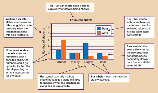
3.1 Features of a bar chart
Regardless of which type of bar chart you are drawing, there are certain features that all charts should have. Look at the diagram below to learn what they are.
If you are drawing a graph or chart by hand, you will need to use graph paper. However, creating a graph on a computer is much quicker and more convenient than doing it by hand. The computer will select the scale for the graph and it will plot it accurately. All you need to do is make sure you choose the best type of graph for your data and remember to label it all clearly and appropriately.
Activity 3: Drawing a bar chart
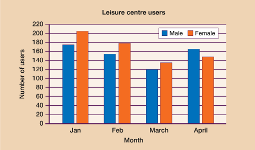
Draw a bar chart to represent the information shown in the table below. You may hand-draw your graph or create it using a computer package.
| January | February | March | April | |
|---|---|---|---|---|
| Male | 175 | 154 | 120 | 165 |
| Female | 205 | 178 | 135 | 148 |
Remember to choose a suitable scale for your chart and ensure that it has a title and axis labels. It will also need a key.
Answer
Your bar chart should look something like the example below. You may have chosen to use a slightly different numbering scale but your chart should have the following features:
a title
labels on both the horizontal and vertical axes
bars labelled with the month
accurately drawn bars of the same width
a numbered scale on the vertical axis
a key to show which bars are for males and which are for females.
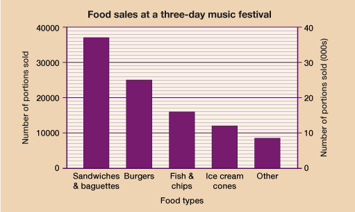
Draw a bar chart to represent the data shown in the table below. The numbers are much bigger than in the previous example so if you are drawing your chart by hand, you will need to consider your scale carefully.
Food types | Number of portions sold |
| Sandwiches and baguettes | 37 000 |
| Burgers | 25 000 |
| Fish and chips | 16 000 |
| Ice cream cones | 12 000 |
| Other | 8 500 |
Answer
Your bar chart should look something like the example below.
Note the use of gridlines to help with interpreting the data in the graph. Also note how the scale and label on the vertical axes (see the second example on the right-hand side of the graph) are slightly different. Both formats are shown here as different examples and either would be acceptable.
Your bar chart should be similar to the above and include:
a title
labels on both the horizontal and vertical axes
bars labelled with the food types
accurately drawn bars of the same width
a numbered scale on the vertical axis, which goes up in equal intervals.
Now that you understand the features of bar charts and are able to draw them, let’s look at how to interpret the information they show.