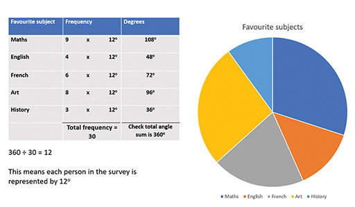
Start this free course now. Just create an account and sign in. Enrol and complete the course for a free statement of participation or digital badge if available.
Figure _unit9.3.8 Figure 24 Constructing a pie chart
Show description|Hide description
A table showing how the angles for a pie chart. In the left column of the table, favourite subjects are listed: Maths, English, French, Art, History. In the middle column the frequencies are given (in order): 9, 4, 6, 8, 3. The total frequency is listed at the bottom of the middle column, 30. In the third column the angles are given in degrees: 108, 48, 72, 96, 36.
Below the table is a statement “360 ÷ 30 = 12. This means that each person in the survey is represented by 12 degrees.”
Next to the table there is a pie chart representing the favourite subjects, using the angles given in the table. There is a key to indicate which section of the pie chart represents each subject.