Lately, a journal article by researchers at the University of Manchester and other UK institutes claimed that ‘by the end of the second week in April, 29% of the population may already have had the disease’. Many newspapers jumped on this news, which suggests that 19 million out of the 67 million UK residents have already been infected with COVID-19, with survivors now having immunity. This would allow them to return to work.
Their results are in stark contrast to the estimate by UK’s Office for National Statistics (ONS), that 0.24% of people or about 136,000 were infected at any given time between late April and early May. If we look critically at the article, as some scientists have done on social media, we can see that it arrives at this number with some very simple statistical modelling assumptions and severe extrapolations (estimating unknown values using trends in values we know already, but going far beyond the current range of values).
So where did these researchers go wrong?
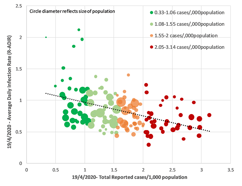
The core analysis of this study is based on a simple regression (a statistical technique of estimating the relationship of one variable with another) of average daily infection rate against total reported cases per 1000 people, for 149 local authorities around the UK, on 8th April 2020.
The analysis also tested whether characteristics of the locality are correlated (whether two sets of values have some statistical relationship) with infection rate, but none of them was found to be correlated. Only total reported case per 1000 people was seen to be correlated with infection rate, so the study used this correlation for all subsequent extrapolations. That is, they worked out the average daily infection rate using only the total reported number of cases per thousand population.
While we now understand a lot about COVID-19 transmission mechanisms on a small scale between individuals, transmission mechanisms and patterns at a population level are complex. Epidemiological modelling is a tool used to predict these patterns based on information we know, and scientists consider a broad range of factors that influence spread. A disease’s transmission depends on modelling many things, including the number of infected, susceptible, and recovered people, not at a single time point but changing over time. Also, the impact of any intervention such as a lockdown has to be considered. More complex models of transmission model the interactions as a network of people. However, this study does no such mathematical modelling.
This study is based on fitting a simple linear link between average daily infection rate and the total reported number of cases per thousand population. This is despite the fact that the fit is not very good, as can be seen from the figure above. This can be measured. In statistics, we look at the squared correlation value. In this case, it is only 22%, in other words, the analysis fails to explain more than 3/4th of the variability in infection rate.
Yet, despite a simplistic model and a weak association, the paper implies causation from correlation. Epidemiological models explicitly represent a number of cases with mathematical formulae, which allow them to predict what might happen in various circumstances. A mere correlation between two variables at a single time instance should not be used for such predictions or forecasts. We should always remember that ‘correlation does not imply causation’ – just because two variables follow some pattern, it doesn’t mean that one necessarily causes the other.
The study then makes two massive extrapolation steps. The first is to extrapolate (extend) the fitted line far towards the right of the figure, to calculate when the daily infection rate will equal to zero. This is calculated to be at 6.6 reported cases per 1000 people. This is the same as saying: at 8th April, if all statistical assumptions were met, then a hypothetical local authority with 6.6 reported cases per 1000 people would be seen to have zero transmission in the community, on average.
Statisticians always urge caution against extrapolating trends far beyond data boundaries. You can see how unrealistic this extrapolation, and this modelling, is if you consider that when you go further beyond 6.6, then this model predicts, for example, that a local authority with 7 reported cases per 1000 people should have negative infection rate. What does a negative infection rate even mean in reality?
There has been a strong political push in many countries, including the UK and the USA, to ease the lockdown and "restart the economy".
Common sense dictates that such a situation would be very unlikely, as disease transmission is possible in any community where some people are infected and some people are susceptible. Here, the study makes the second huge extrapolation, to make such a situation possible. They argue that there would be no further infections if everyone is already infected in the community. Therefore, when 6.6 cases have been reported per 1000 people, all 1000 people are actually infected. Which means, for every reported case, 1000/6.6 = 151.5 people are actually infected.
Not only are these massive and faulty jumps of reasoning, but they are also inappropriate analyses. The actual research question that this article studied is better described as, if we severely extrapolate our observed data for 8th April, what should be the actual number of infections per reported case for a locality to have everyone infected and therefore zero transmission? Perhaps you can see that this is an inappropriate way to draw inference about the actual number of infections, as the study doesn’t have any data collected about it, so it is very ill-equipped to answer this question based on the data at hand.
Nonetheless, if we ignore a complete absence of epidemiological modelling, very simple statistical assumptions, and severe extrapolations, then the results of this study can be used to make further comments about the whole of the UK. The article explains that assuming the aforementioned factor of 151 is true, then 400,000 confirmed cases by 8th April means 16.1 million people already infected.
But this number is also meaningless because it is the answer to the meaningless question – If I extrapolate from a model in which transmission has hypothetically stopped by 8th April in a local authority because everyone is infected, then how many people in the entirety of UK are actually infected? When written this way, it is clear that the premise of the question and the aim of the question are rather unrelated, so it is inappropriate to try to draw conclusions in this way.
So, it is worrying to see that despite the article being substantially flawed, it is getting media coverage uncritically, and is being described as a ‘game-changer'.
There has been a strong political push in many countries, including the UK and the USA, to ease the lockdown and ‘restart the economy’. The UK started easing some restrictions on 13th May, and some states in the USA, as well as many countries in Europe, have started to lift restrictions as well. While the decision to lift a lockdown ultimately rests on political representatives, many different factors need to be considered, including medical, epidemiological, economic and others. Ideally, to be able to avoid an increase in infection and death when the lockdown is lifted, it is only safe to reopen when the daily number of cases has fallen to low, and extensive ‘test-trace-isolate’ is in place. However, neither of these were true for the UK, where more than 50,000 people have already died, and therefore some experts have been opposing any immediate easing of restrictions, in absence of any vaccines or widespread natural immunity.
Under such circumstances, those who are in favour of immediately lifting the restrictions might be uncritically enthusiastic about this article as it supports those views. For example, the article suggests, ‘Unlocking current social restrictions as soon as possible is vital to minimise demand on the economy and the impact of prolonged social containment.’ It also comments ‘The COVID-19 pandemic has led to radical political control of social behaviour’.
Our interview with a science integrity expert had warned about a rush of poor-quality studies around the epidemic, and this study is one instance where flawed statistical analysis, unfortunately, has a possibility to influence policy decisions. For example, the lead author of this study claimed in a news interview: We believe this analysis may aid policymakers in a smoother transition to reducing social containment and sustainably managing the COVID-19 disease.’ It might be relevant to note that the study authors are experts in biology and medicine, such as being affiliated with the Salford Royal Hospital, but modelling an epidemic requires epidemiology expertise.
The USA is similar to the UK in the sense that both countries have had a very high total number of deaths from COVID-19, and a number of deaths or infections have not yet fallen to low, but some restrictions are beginning to be lifted. Some US states such as Texas which started reopening have also started to see a surge in new cases, and experts are fearing that an increase might also happen in the UK after the recent lockdown easing.
In the USA too, some national and state agencies have depended on faulty statistical analysis, which appears to suggest a steep decline in new infections, and therefore present a favourable case for reopening. We can look briefly at two examples, and perhaps you can spot the problems yourself?
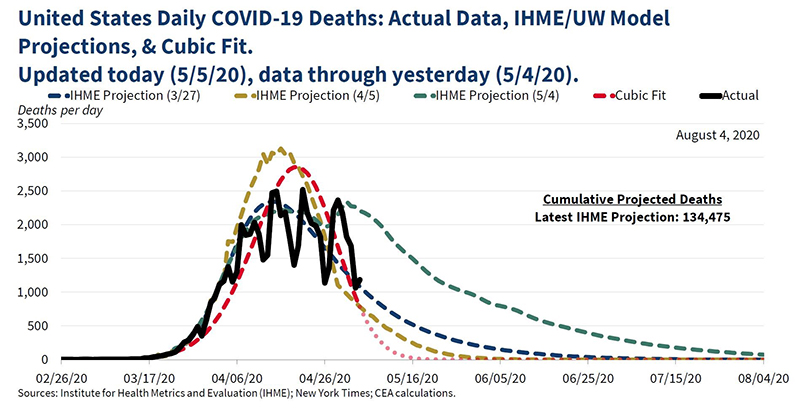
The White House’s Council of Economic Advisers posted a series of tweets on 5th May claiming to ‘track the evolution of cases and mortality projections over time to better understand the disease and inform policymakers.' It also posted the figure below, in which they show the actual daily death data (in black, with some weekly fluctuations), and their proposed model (in red). Can you see anything odd?
They claim to have fitted a cubic (time to the power of three) model, which is quite simple and evidently does not fit the data very well. Yet, just as we saw in the UK-based study above, the analysts extrapolate far outside the range of the observed values, to predict that the number of deaths will fall steeply and be zero by 16th May. That seemed unlikely as it was well-known that the epidemic was still present extensively around the US at that time, and the actual data showed no indication of a decline beyond weekly fluctuations. The date of 16th May has now passed and there are still many ongoing deaths in the US, illustrating how bad this model’s prediction ability was.
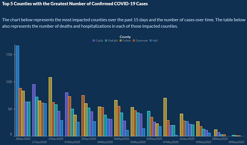
Late last April, the US state of Georgia took a decision of easing the lockdown. The state’s Department of Public Health recently posted a graph which purported to show that new cases in the five most impacted counties have dropped considerably for the past two weeks. That does appear to be the case from the figure, but look closely at the dates on the X-axis below…
The dates are actually not in chronological order – most probably the number of new cases had been sorted in descending order, so the dates are all mixed up.
After extensive criticism, the state governor’s office issued an apology and corrected the figure.
The decision to ease lockdown is a political one, but it has to take into account many factors including the health of the population. And it is vital that decisions are taken with correctly analysed data. It is also vital that as citizens we have thorough, reliable information with which to judge the political decision of our representatives. In these fast-changing circumstances, it is therefore crucial that we remain cautious about such misuses of statistics which can assist faulty policy decisions and further endanger people’s lives.
LEARN MORE:
• Read our interview with science integrity expert Dr Elisabeth Bik, where she shares her experiences and concerns around the fake news and fake research around COVID-19. Click here.
• Wondering how experts conduct research and modelling of COVID-19? We have another interview with statistician Dr Sayantan Banerjee, who explains in more mathematical terms, how such modelling is being done, and its application to the situation in India. Click here.
• To watch a thorough discussion and Q&A session on COVID-19 with experts from the OU STEM faculty, click here.
• If you are interested in the numbers around COVID-19, such as the meaning for the various terms, the modelling that’s being used to obtain estimates, or the reliability of the statistics, then head over to ‘A statistician’s guide to coronavirus numbers’ by the Royal Statistical Society.


Rate and Review
Rate this article
Review this article
Log into OpenLearn to leave reviews and join in the conversation.
Article reviews