Psychology of colour
Colour in Art Color often “speaks” to people on a personal level. For instance, a single splash of colour without form can arouse an intense reaction from a person. And when colour is used purposefully, it becomes a message carrier.
Light is seen only through its effect on colour; thus, light and colour are inseparable. Impressionist and Postimpressionist painters focused keenly on the quality of light and colour in their artwork. Claude Monet, Auguste Renoir, Edgar Degas, Mary Cassatt and Vincent van Gogh were among the many painters belonging to these famous schools of art.
The Psychology of Color:
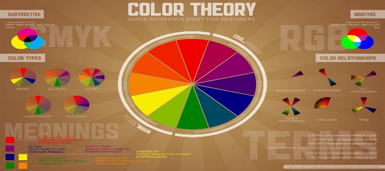
Colours are strongly associated with moods and emotions. Expressions such as “in the pink,” “a rosy outlook,” and “feeling blue” all reflect these associations. For example, most people consider yellow, orange, and red to be warm, stimulating colours, associated with fire and the sun. Blues, greens, and violets are usually thought of as cool and serene; these colours are often visually associated with cool forests, the sky, and bodies of water. lists the emotional impressions associated with six common colours.
red strong, dangerous, aggressive, loving orange cheerful, warm, festive (autumnal)
yellow bright, radiant, sunny
green restful, calm (grass, spring)
blue serene, cool, remote (winter)
The colours listed above are all pure. But any colour can be made lighter, darker, duller, or sharper. This generally alters the psychological associations of that colour. For instance, an artist who changes a dark royal blue into a light, delicate sky blue is effectively converting the colour’s emotional impact. The same is true of a bright red that’s turned into a rich, dark, wine-coloured red.
These shades and variations are what make up the artist’s repertoire of colours. Most artists have distinct colour preferences. Despite the general common reactions to colour, artists’ specific likes and dislikes may be conditioned by what they’ve experienced in life and by their dispositions. One artist’s colour preferences may include rich reds, oranges, and yellows.
Another’s may consist of tranquil blues and blue-greens. Still another artist may gravitate to earth colours—warm browns, golds, and rust-coloured reds.
As an artist, you’ll soon discover a specific range of colours that appeals to you most, and you’ll find yourself using those colours over and over in your work. Your favourites may prove to be subtle mixtures of colour that you aren’t even aware of now.