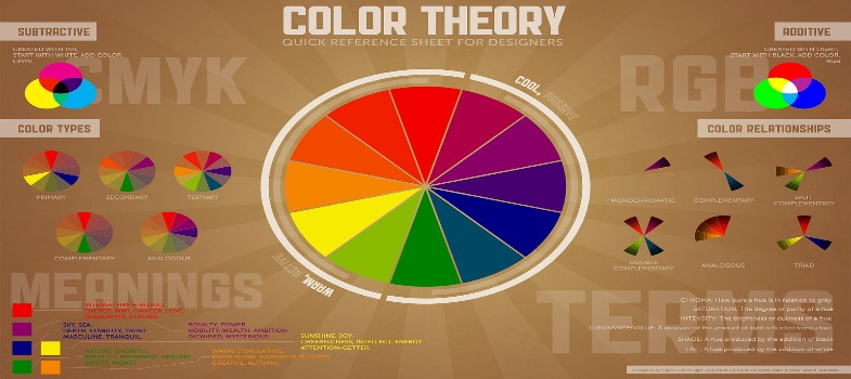
The colour circle
Primary Colors In the artist’s colour circle, the hues of yellow, red, and blue are primary, or parent, colours. This means that they can’t be created by other colours. Rather, every other hue on the colour circle is made through combinations of yellow, red, and blue. In theory, when working with subtractive colours, mixing all of the primary colours should result in black.
Pigments have impurities in them and aren’t pure in colour. Thus, when you mix the primary colours in equal amounts, the actual result is a neutral grey or brown. Secondary Colors Whenever equal amounts of two primary colours are mixed, another colour, called a secondary colour, is formed. If you mix red and blue, the result is violet (or purple).
Mixing blue and yellow yields green. And a mixture of red and yellow produces orange. These three colours, violet, green, and orange, are all secondary colours. Intermediate Colors When you mix a primary colour with a neighbouring secondary colour in equal amounts, the result is an intermediate colour.
Similarly, combining yellow and orange creates the intermediate colour of yellow and orange. Mixing colours that are side by side on the colour circle will produce even more colours than those included on this circle for as long as the eye can distinguish them. But for now, these twelve primary, secondary, and intermediate colours with their varying tints, shades, and intensities provide us with a wide range of possibilities.
Colour Theory
A secondary colour is formed from equal amounts of two primary colours.
An intermediate colour is formed by mixing a primary colour with a neighbouring secondary colour on the colour wheel.
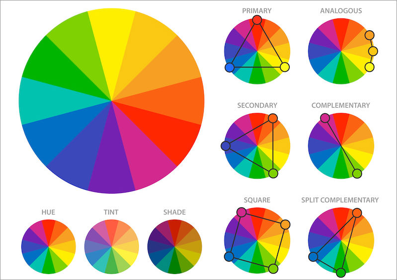
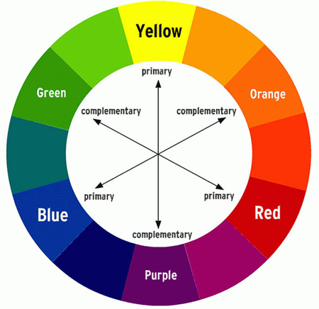
Complementary colours as you learned are located directly opposite each other on the colour circle are known as complementary colours. Orange is the complement of blue, green is the complement of red, and violet is the complement of yellow. (Orange, green, and violet are also secondary colours.)
The complement of red-violet is yellow-green. Dulling Colors When complementary colours are mixed, they lessen each other’s intensity. If various amounts of yellow are added to violet (yellow’s complement), the violet becomes duller and golden in colour.
As more yellow is added, the violet becomes duller and duller until it’s a brown or a dark grey. The ability to “dull” colours are one of the most important colour skills you’ll gain from this study unit. Utilizing this skill will enable you to obtain any low-intensity colour you wish to paint or draw. Many artists use very few pure hues.
Then they can change the value of the hues (make lighter or darker) or change their intensity (make duller). Most paintings and coloured drawings are carefully thought-out combinations of hues, values, and intensities.