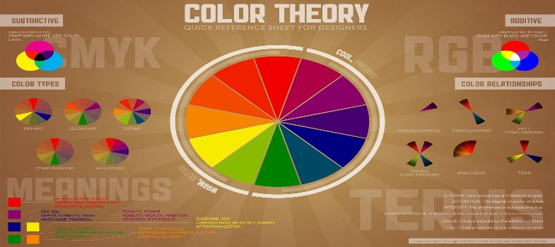
Attributes of colour
THE ATTRIBUTES OF COLOUR
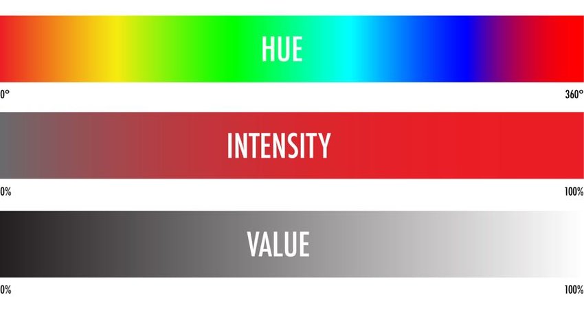
Every colour has three attributes: hue, value, and intensity. In this section, we’ll look at how each of these attributes translates to colour. Hue The name of a colour—red, blue, or green, for example—is called its hue. Only the colours in the visible spectrum are pure hues.
Most colours we see are impure, or mixtures of several colour wavelengths. For example, under the pure hue known as red are such impure hues as scarlet, rose, and maroon. Value Value is the degree of lightness or darkness within a colour. Values progress from white (the lightest value) to black (the darkest value), with graded values of grey in between.
Tints are light values that are obtained by adding white to colour. Shades are dark values that are obtained by adding black to a colour. Tones are the “middle” values of colours.
Regarding colour, the word “shade” is frequently misused. A person may ask you what shade of blue your car is while wanting to know the value of blue. Technically speaking, there’s no such thing as a “light shade.” A shade (like the shade of a tree) is always darker than the pure hue.
The value of a colour is determined by light. Areas of an object that receive less light appear darker in value, while too much light causes a loss of detail. Without changes in value, we wouldn’t be able to distinguish shapes.
Strong light and dark contrasts allow us to focus sharply upon objects. Intensity, frequently called “saturation” or “chroma,” refers to the brightness or dullness of a colour. But the intensity is different than value—value pertains to light, while intensity pertains to colour.
For example, a pure red is high in intensity, whereas a deep, duller red is low in intensity. When you lower the intensity of a colour, we say that the colour is being “toned down.” The lower the intensity, the duller the colour becomes. Colours at full intensity are described as strong, rich, forceful, and vivid. Muted blues, rust colours, and other low-intensity colours are generally described as “subdued” or “soft.”
People often label a colour like dark olive-green as “drab.” Toning down, or dulling, colours greatly expands the variety of colours one has to choose from.