
The Extended Project Qualification (EPQ) is an opportunity for you to work independently on a topic that really interests you or that you think is important. It is equivalent to an A-level qualification. These articles are designed to help you if you are enrolled on an EPQ.
See previous article in series: Writing up your dissertation
Why give a presentation?
Giving a presentation on the results of your work is a requirement for the EPQ. You are asked to:
- show evidence of how you approached and carried out the EPQ
- give an overview of the research you conducted.
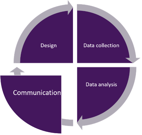 Figure 1 The research cycle: communicationFigure 1 illustrates the research cycle represented by a circle divided into four segments. Around the circumference of the circle are arrows indicating this is an ongoing process. The four segments are (clockwise) design, data collection, data analysis and communication. The communication segment is highlighted.
There can be many reasons for giving a presentation. You
might want to start a discussion, persuade others to share your opinion,
analyse some evidence, share information, inspire people to do something,
communicate an idea, teach a topic, learn something, show what you’ve been
working on ...
The purpose of the presentation affects the content you include and the style you choose to use.
Who’s in your audience and what do they want from your presentation?
A presentation is a two-way activity. Thinking about your audience and developing a rapport with them keeps people engaged with what you’re saying or doing.
Very often, a presentation will include a space for audience questions or discussion. If you have kept your audience engaged throughout your presentation, their questions will be more closely related to the content, making it easier for you to answer.
Starting your preparation by thinking about your audience – who
they are, what they want, what they are interested in, what they like, what
they don’t like – will help bring them to life in your mind.
You can imagine their characters and personalities, their interests and responses. You don’t have to think about the life story of everyone in the audience – this is about broad descriptions. But thinking about the audience means that when you are creating your presentation, you are doing it with people in mind, helping you craft a presentation that engages them as much as possible.
As an example, look at the two people in Figure 2 (or read the description) and write down five words to describe them.
 Figure 2 Possible audience membersThere are photographs of two people. One is a young woman, with long brown hair, wearing a white t-shirt and blue jeans. She’s sitting cross-legged on a cushion by an open window, working on a laptop. The other is an older man, playing a banjo. He’s seated on a stool in front of a stone wall. He’s wearing jeans and a blue jacket. He has long white hair and a white beard.
How did you describe them? You might have come up with:
- girl, writing, young, computer, relaxed, t-shirt
- man, banjo, musician, outdoors, beard
How can you use this description?
Think about starting your presentation.
If you think your audience is likely to be people like the young female writer, you could start with a (relevant!) quote from your favourite writer. For an audience of people that like to make music, you could include a piece of music that relates to your work.
Think about the content of your presentation. If you are presenting to a group of painters, you’d want to use lots of images. If you were presenting to very young children, you’d probably want to include some activities they could join in.
For example, Nisha, a researcher, gave a presentation at a science festival on the topic of ‘the future of space in society’. She characterised her audience as:
- more than 16 years old
- knowledgeable
- interested in the future
What does this mean for how she structured her presentation?
Because she
imagined her audience as adults, it’s likely she would have been comfortable
discussing quite difficult topics and using complex language.
Thinking of them as knowledgeable means she would have been prepared for some interesting, and possibly tricky questions.
Visualising them as interested in the future means she would have included some material on new developments in research, and thought about the kind of questions they might ask about future work.
Who is the audience for your presentation?
For the EPQ, your audience is likely to be your fellow students and your teachers. These are probably people you know well, and who know each other well.
- What five words could you use to describe them?
What are the guidelines for the presentation?
It’s always a good idea to know the guidelines for your presentation.
It’s helpful to have a few basic issues sorted out before you start preparing your presentation.
There are many different ways to present, so which kind of presentation should you choose? That depends on the kind of project you have done and the material you are presenting.
Every format has advantages and disadvantages. You will want to choose the format that works best for you and your work. Some common examples are:
Face-to-face oral presentation
 Figure 3 Speaking to an audienceA photograph of a woman, taken from behind, showing her delivering a talk to people seated in a lecture theatre.
Sometimes simply talking is enough. Telling your story directly to the listeners, with no distractions, is very compelling.
Oral presentation with visual aids
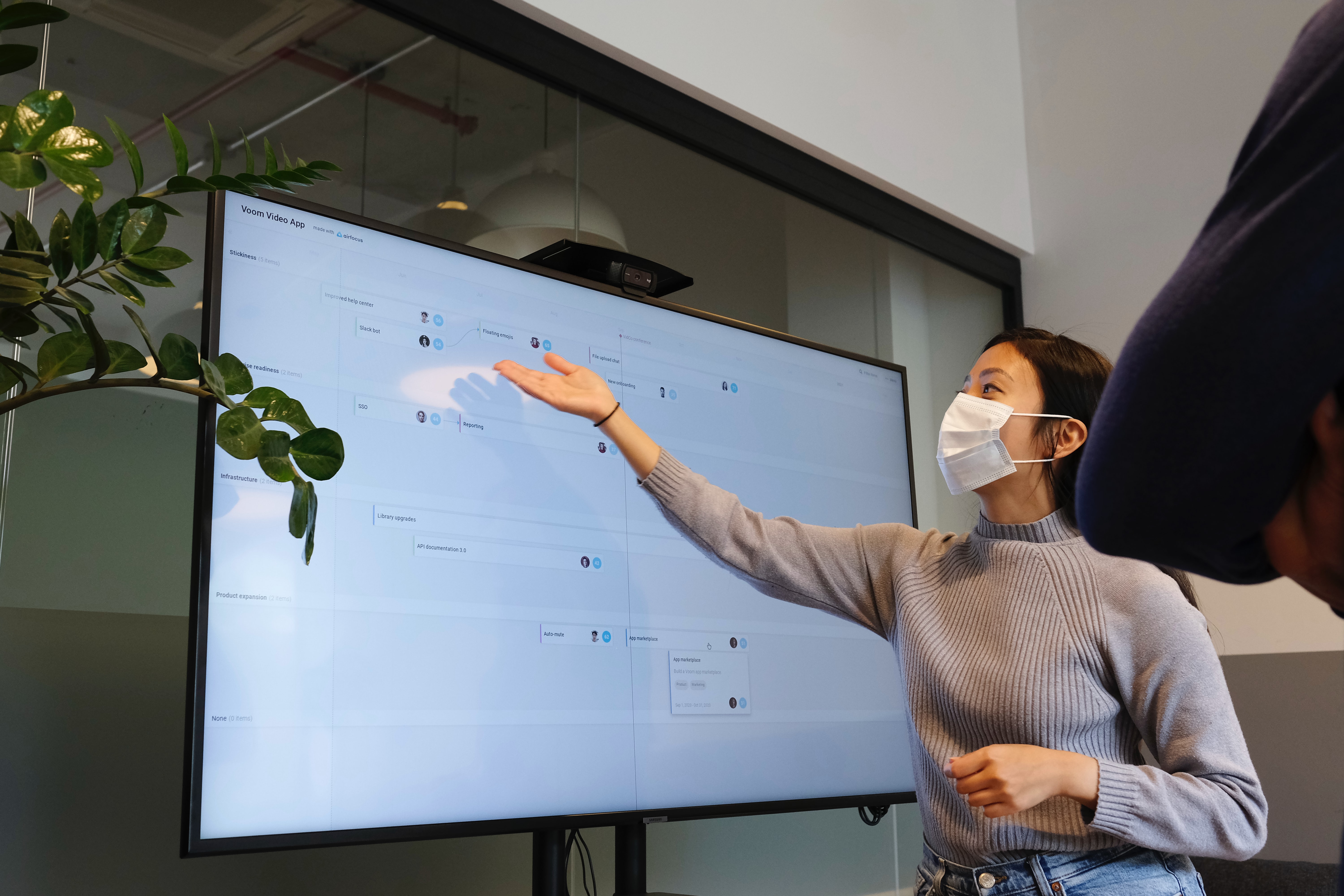 Figure 4 Using presentation softwareA photograph of a woman giving a presentation using an image displayed on a large monitor.
If you want to include evidence such as graphs, charts or images, using visual aids to support your presentation is helpful. Visual aids include presentation software (such as Microsoft PowerPoint, Prezi or Apple Keynote), wall displays, large posters or printed handouts.
Video presentation
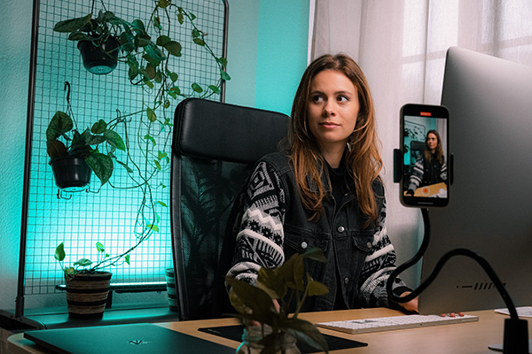 Figure 5 Recording a videoA photograph of a woman seated at a computer, using a smartphone to record herself giving a presentation.
You could choose to make a short video documenting your work. This allows people to look at or listen to the presentation in their own time.
This style of presentation is very appropriate for a project in which you have created an artefact or run an experiment and you need to show the whole process.
There’s more information about giving your presentation later in this article.
Structuring your presentation.
There will be a time limit on your presentation, so you should plan your presentation to be sure that you cover everything you need to.
One way to allocate the time for the different sections is to think about the proportions you used for the dissertation.
Check out the previous article in this series ‘Writing up your dissertation’ for more info.
| Section | Word count | Proportion (%) |
|---|---|---|
| Introduction | 800 | 15 |
| Research review | 1800 | 30 |
| Discussion / development / analysis | 2700 | 45 |
| Conclusion | 500 | 10 |
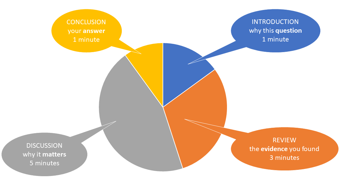 Figure 6 Structuring a presentationA pie chart showing approximate division of time for a ten minute presentation. Introduction (why this question) – 1 minute, Review (the evidence you found) – 3 minutes, Discussion (why it matters) – 5 minutes and Conclusion (your answer to the question) – 1 minute.
Introduction – 1 minute – why this question:
- the question you set out to answer
- why this question matters (perhaps to you, to your audience, to other people).
Review – 3 minutes – the evidence you found:
- a summary of how you carried out your research
- an overview of the evidence you found.
In three minutes, you probably won’t have time to cover all your evidence, so pick out the key points that are most important for you to explain.
If the audience knows there’s more you haven’t had time to say, they will be able to ask you questions about it.
Discussion – 5 minutes – why it matters:
- a summary of your key findings
- evidence for and against your question
- what the evidence means – how it helped you answer your question.
Again, in five minutes, you’ll only really have time to focus on the key points, so think carefully about what they are and which ones you want to present.
Conclusion – 1 minute – the answer:
- the answer your evidence has led you to
- the key message you want your audience to take away from your presentation.
How many slides should you make for your presentation? The
most important thing to think about is how much time you have. Ann, who is a
lecturer in astrobiology education and also teaches science communication,
discusses this issue.
What are her suggestions?
If you plan to use presentation software, it’s tempting to cram in lots of slides, because you’ve done a lot of work and you want to share it all. However, your audience will need time to absorb the material you are presenting on your slides. If you have text, they need to be able to read it; if you have images, they need to be able to take in all the details. Good communication practice suggests that you should present one idea per slide, and that it takes roughly two minutes to present one slide. So for the example outlined in Table 1, that would mean:
- Introduction – one slide.
- Review – one or two slides.
- Discussion – two or three slides.
- Conclusion – one slide.
That’s approximately five to seven slides for a ten-minute presentation, with perhaps an additional opening slide to introduce yourself and a closing slide to cover the question time (Figure 7).
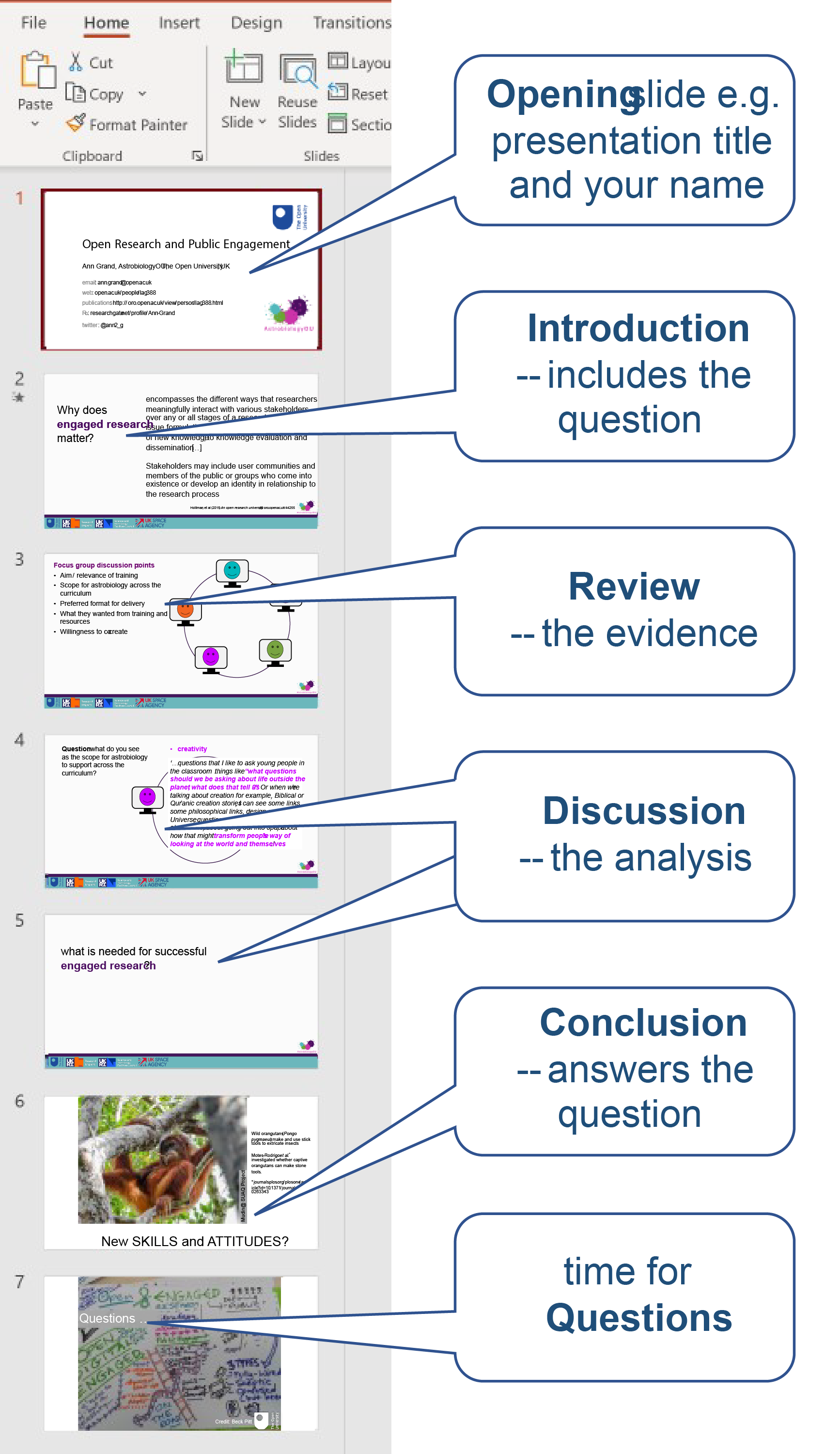 Figure 7 How many slides?This is a notated screenshot from PowerPoint. There are seven slides notated in line with Ann’s suggested structure (opening slide, introduction, review, discussion, conclusion, time for questions).
Using presentation software (such as PowerPoint, Prezi or Keynote) is probably the most common way of creating a presentation, but it’s worth taking a moment to decide whether this is the most appropriate route for the topic, the presentation and you.
If you do decide to use presentation software, following
a few simple guidelines will help
keep your presentation interesting and impactful. When deciding, think about:
What’s best for your content?
- do you have a lot of images? (useful)
- are there graphs and charts? (useful)
- is it all text? (not so useful)
What’s best for your audience?
- how old are they?
- what are they interested in?
- where are you giving the presentation – small room, large theatre, in the dark, in artificial light?
What’s best for you?
- what skills do you have – can you draw really good images or take great photographs?
- can you sum up complex ideas in a few interesting words?
A good rule of thumb is to aim for presentation slides to be
readable from 2.5m away.
Don’t try to crowd too much onto a slide. Aim for your text or images to take up no more than half the area of the slide. Keeping a good margin of white space around the content makes images easier to understand and text easier to read.
Using a widescreen (16:9) format for your slides gives you a larger area to work on, which means your images can be bigger and the text size can be larger.
 Figure 8 A PowerPoint slide in widescreen formatThis is an example of a PowerPoint slide. It contains a photograph of Simon Sheridan and Jenny Hallam demonstrating an experiment on a video set, and some text alongside the photo which explains what is happening.
Compelling and relevant images that are easy to understand will hold the audience’s attention and support your storytelling.
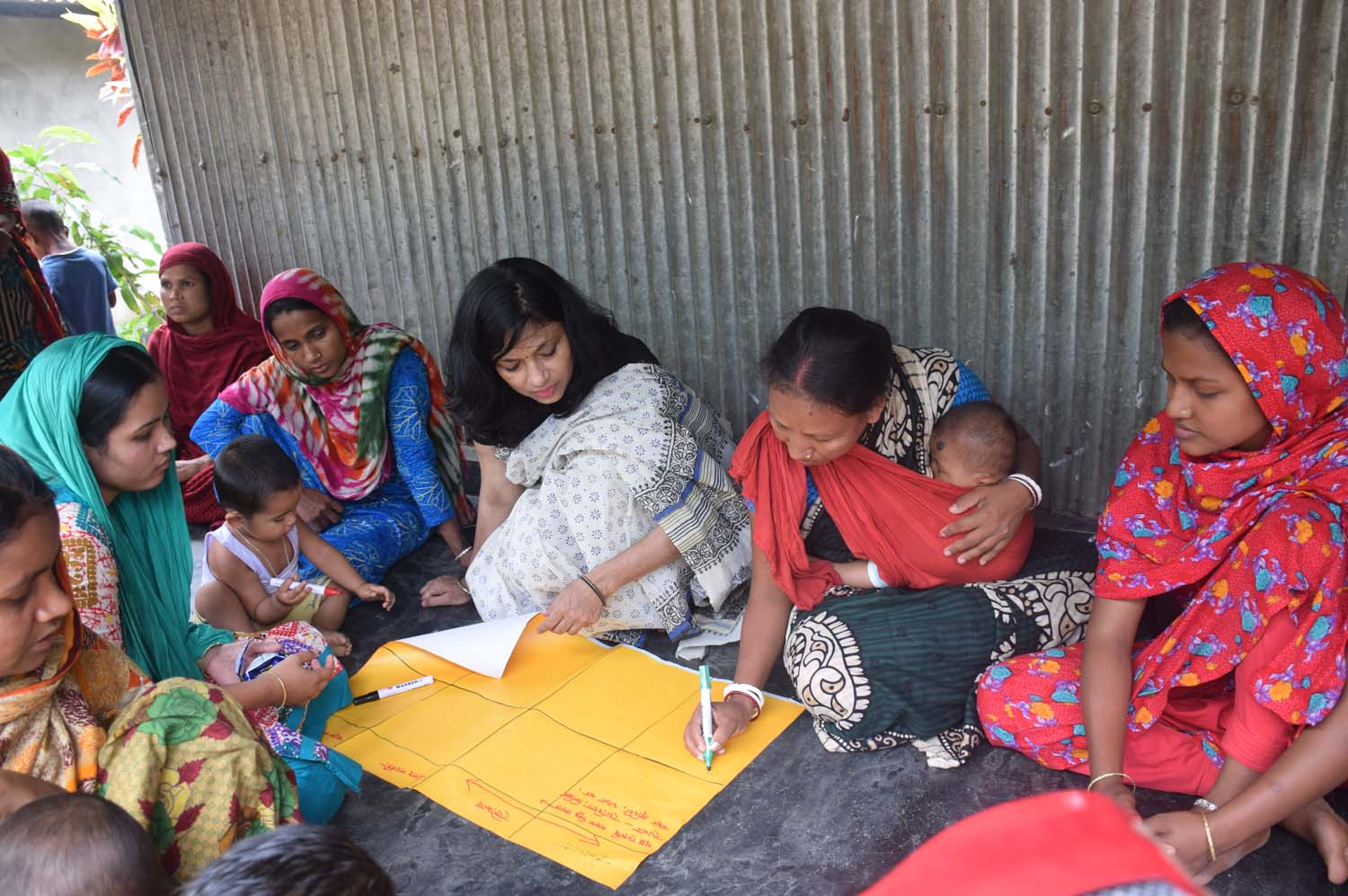 Figure 9 Women in a discussion group about health services for women and childrenA photograph of a women’s group in Durgapur, Bangladesh. The women are seated on the ground around a large sheet of yellow paper, on which one woman is writing. Two of the women have babies and children with them.
In Figure 9, it’s easy to see that the young women are sharing their thoughts by writing on a large sheet of paper. We can speculate that some of them might be mothers, as there are young children and babies in the photo.
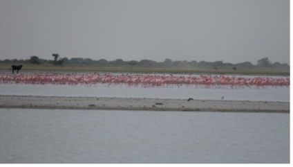 Figure 10 Possibly flamingos? Photo by S. Filippidou, AstrobiologyOUPhotograph of open water, with a flock of pink birds in the middle distance and a shoreline beyond.
Compare that with the image in Figure 10. It’s not very clear – there’s some open water, a flock of pink birds that are possibly flamingos and a shoreline beyond them. It’s not easy to work out what the subject is: is it the water, the flamingos or the land on the horizon? If you used this photo, you would have to explain what to look for. That means the photo isn’t doing its job of enhancing your presentation.
Where to find images
If you have your own photos, drawings or images, that’s ideal, because they will represent your work most clearly. As the creator of the image, you own the copyright, so you can use the image in whatever way you want.
As discussed in our ‘Writing up your dissertation’ article, you should never try to pass off someone else’s work as your own. This applies to photos and images as well as text.
If you choose to use images created by other people, look for images that are in the public domain or have a Creative Commons licence, and in your presentation, include text that acknowledges where the image came from. Websites such as Pixabay or rawPixel offer lots of usable images, with full details of how you should acknowledge the creators. If you’re using Google Images, you can also click on ‘Tools’ and then adjust the ‘Usage Rights’ settings to search for re-usable material.
Using tables, graphs and charts
Presentation software, posters or handouts are excellent for showing tables, graphs and charts that illustrate your findings. When creating your presentation, you can re-use graphs and charts that you created for your dissertation.
For more information, see Article 1: ‘Writing up your dissertation – Tables, graphs and charts’.
Less is definitely more when it comes to text on slides. Compare these two slides – which is easier to read and understand?
 Figure 11 Is this slide good or bad?A screenshot of a PowerPoint slide with two chunks of text on a plain background. All of the text can be read. Some text is highlighted in orange.
 Figure 12 Better or worse?A screenshot of a PowerPoint slide with a large amount of text across many lines, set against a photographic background.
The first slide is much better. It has a pale grey background with five lines of black text, with a few words highlighted in orange. The second slide has a large image of a woodland as the background, with approximately 25 lines of white text. The text is almost unreadable.
Good communication practice suggests using:
- a maximum of 9 lines of text on a slide
- a maximum of 10 words per line
- an easy-to-read font; preferably sans serif (common sans serif fonts include arial, helvetica and calibri)
- large font sizes; ideally 36-point text for titles; 30-point and 24-point for body text
- black text on pale grey (or pale yellow or blue) background; good contrast between background and text is best for people with dyslexia and vision problems. Avoid stark white backgrounds, as the shininess can cause problems
- colours (up to five) for contrast and highlighting.
Giving your presentation.
We can learn a lot by watching and listening to other people give presentations, picking up from their good points and learning from what doesn’t go so well.
 Figure 13 Watching a presentationA photograph showing a stage with a screen at the back and a lectern to the right. A woman is delivering a presentation from the lectern to an audience.
What’s the best presentation you’ve ever watched online or been to? Perhaps you have a teacher whose style you admire, or you’ve been to a public lecture or talk that included presentations. What made them so good?
If nothing comes to mind, watch this presentation on The networked beauty of forests from the TED-Ed community to get your thinking started. The presentation lasts about six minutes.
As you watch, consider anything about it that appeals to you. What are its good points?
You might have come up with ideas such as:
- a title that grabs your attention
- clear and relevant images, graphs and tables
- use of relevant pieces of video, audio or music
- speakers who look like they really care about the subject
- speakers who keep up a good pace, not going too slowly but not rushing either
- being able to hear the speaker clearly
- being able to see the content clearly.
You probably
came up with some other thoughts. How can you incorporate these ideas into your
presentation?
Most of us have sat through presentations that weren’t very good. What problems did they have?
Watch this video, which was produced by Keele University, and use the bingo card below to identify some of the common mistakes made in presentations.
| Problems starting presentation | Too many slides for the time available | Yellow writing on bright blue background | Entire slide filled with equations |
|
Ummm... err... so... |
Speaker runs out of time |
Jargon... jargon... |
Speaker forgets to use mike |
| Speaker never looks at audience | Computer malfunctions | Someone’s phone rings | Text too small to read |
| Really obvious spelling mistakes | Speaker uses five minutes to give outline | You don’t understand any of it | Speaker turns round to read from slide |
You probably spotted more problems than were included on the bingo card!
Of course, this was a deliberately bad presentation, but it gives us some clues about errors we can easily avoid. Sometimes speakers do things that irritate the audience because they’re nervous – people jangle keys in their pocket, chew their hair or constantly fiddle with a pen. Sometimes people don’t feel well-prepared so they read from a script, or they say ‘um’ or ‘er’ or ‘so…’ a lot. These are errors that we can avoid through good preparation and lots of practice.
Once you have designed your presentation, you need to think about how you are going to deliver it. What will you say as you present the slides?
Organise your notes
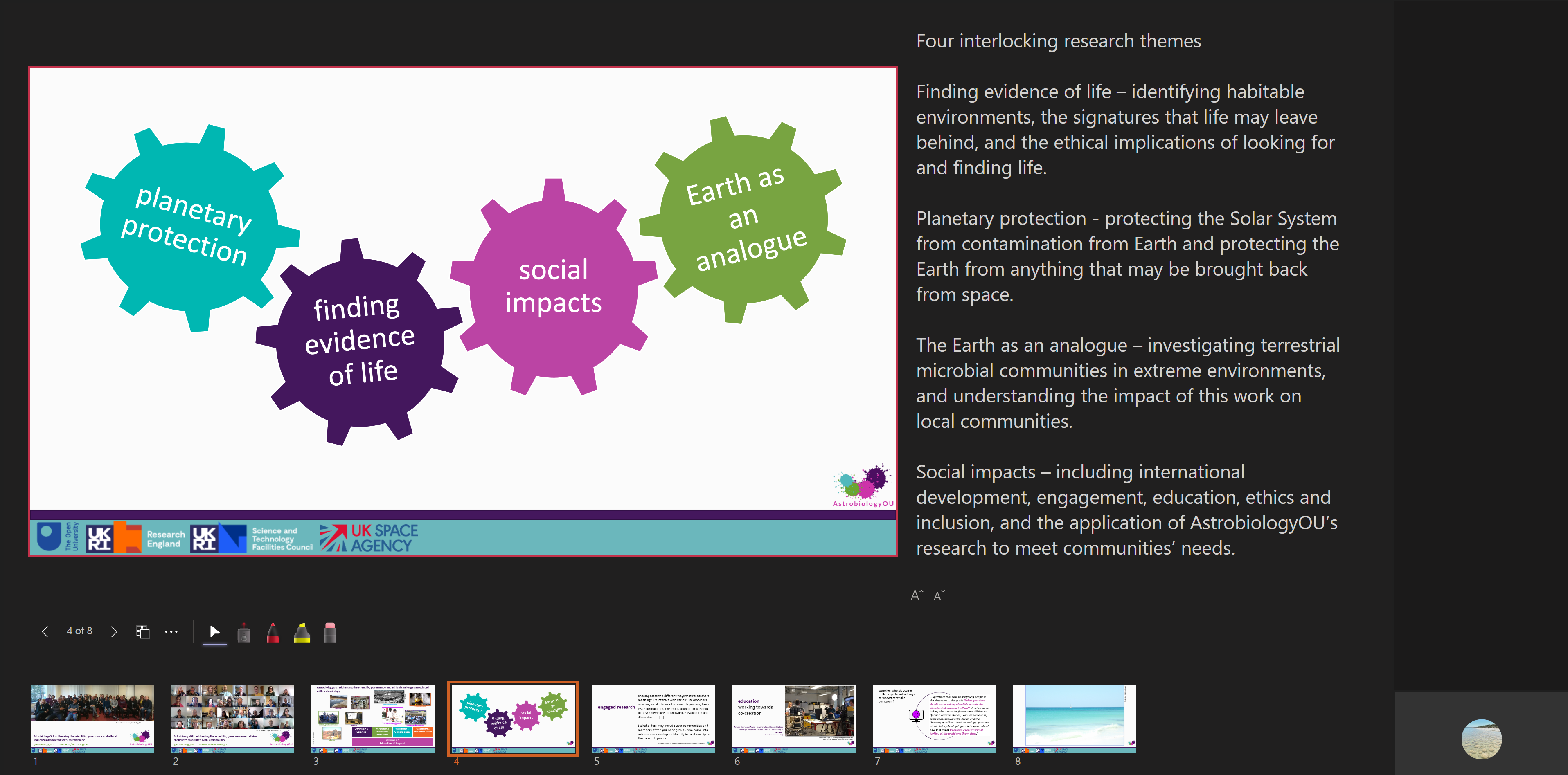 Figure 14 Using the notes function with PowerPoint in a presentationA screenshot of one slide in a PowerPoint ⟨™⟩ presentation, showing the presenter view. The slide is on the left-hand side of the screen. To the right are notes of the key points to be covered when that slide is showing. Along the bottom are thumbnails of all the other slides.
You might be very good at learning a script, but most people can’t remember the whole of a presentation by heart, and reading from a printed script isn’t engaging for your audience.
Therefore, many presenters use a ‘cue card’ system to keep on track:
- organise your notes into a logical series of points
- write a few reminder words for each point
- transfer your reminder words on to small cards (small enough to fit in your hand but big enough that you can read the reminder words easily; say 10cm x 5cm)
- have one card for the beginning, with your opening sentence written out
- have one card for the end, with a reminder of the message you want your audience to take away from the presentation
- fill in the middle with a card for each main point you want to make, or phrase you want to use.
When you are confident you have the right flow in your content, number your cue cards in sequence. Nervous presenters have been known to drop their cards and scatter them across the floor. If that happens, you’ll want to get them back in order quickly!
You don’t have to use cards, of course. You could write your reminders on sheets of paper. Or if you’re using presentation software with a ‘notes’ function, you could use that. The important thing is that you should be comfortable with whatever support you choose to use.Practising
Practise giving your presentation as much as you can. Practise to your family, practise to your friends (and be an audience for them in return), practise to the cat or practise to a tree; the more you practise, the more confident you will be.
As you practise, you will become more comfortable with the sound of your ‘presenter’ voice and feel more like you’re talking as you would to a friend.
Something else to think about as you write your presentation is your speaking speed. You will find you need to speak more slowly when you are presenting, so that you deliver each word clearly. This means you can’t pack as many words into the minutes as you can in ‘normal’ speech.
Timing yourself over multiple practices helps you judge whether you have the right amount of content. If there’s anything there that doesn’t need to be there, this will give you the opportunity to cut it out. You might need to trim back and focus on fewer points, or you might find you have the space to add more material.
Practising also helps you ensure that the order of your points is logical and tells a coherent story. And finally, through practising you’ll be able to judge whether your visual aids (if you have used them) give the right message and enhance what you are saying.
Feedback
Feedback from other people can be very helpful when you’re practising, especially if you ask for feedback on specific points that you are concerned about. Asking for targeted feedback on the delivery, the slides or the visual aids (or other points) is likely to be more useful than simply asking ‘what do you think?’.
If it isn’t possible to get ‘live’ feedback, you could video yourself and ask others to watch it back and give you feedback, or you could watch the recording yourself and reflect on the presentation. Not everyone enjoys watching themselves give presentations though!
Other articles in this series...
-
EPQs: designing your research question
Read now to access more details of EPQs: designing your research questionYou’ve already decided to do an EPQ, so it might seem a little odd to start this resource by asking you to consider why you want to do a research project. People do an EPQ for all sorts of reasons. Why do you want to do an EPQ?

-
EPQs: finding and using evidence
Read now to access more details of EPQs: finding and using evidenceFinding the evidence that will help you understand a topic or answer a question is an important stage in the research process. And once you have found it, you will need to examine it closely and carefully, to judge how reliable it is and whether it is useful to help you answer your question.

-
EPQs: writing up your dissertation
Read now to access more details of EPQs: writing up your dissertationYou have collected and analysed your evidence and considered it in relation to your research question. The next step is to communicate all that you have done. Your dissertation is the element of the EPQ that is read and assessed by others who haven’t been involved in your research.

Rate and Review
Rate this article
Review this article
Log into OpenLearn to leave reviews and join in the conversation.
Article reviews