Skip to content
Skip to main content

About this free course

Download this course

Share this free course

Could we control our climate?

Start this free course now. Just create an account and sign in. Enrol and complete the course for a free statement of participation or digital badge if available.

3.1 Global warming

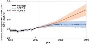
Figure 4 shows the IPCC (2013) predictions for annual mean GMST change for the lowest and highest greenhouse gas concentration pathways, RCP2.6 and RCP8.5.

Figure 4 is a line graph that plots past and projected annual mean GMST from the multi-model ensemble, relative to 1986–2005. Three lines are plotted: historical, RCP2.6 and RCP8.5. Historical data is plotted from 1950 to 2005, and RCP2.6 and RCP8.5 are plotted from 2005 to 2100. The graph shows Temperature change (in °C) on the y or vertical axis against year on the x or horizontal axis. The historical temperature change rises from a little below 0 °C in 1950 to just above 0 °C in 2005. RCP 2.6 shows the change rising gently to a peak around 2050 at close to 1 °C then it maintains steady value up to 2100. RCP 8.5 shows a steady rise to an change of about 4 °C in 2100. There are shaded regions around each line to show the 90% uncertainty range. This is typically around ± 0.2 °C or less for the historic data, around ± 0.5 °C for the RCP2.6 data by 2100, and around ±0.7 °C for the RCP8.5 data by 2100.
Figure 4 Past and projected annual mean GMST from the world’s climate models, relative to 1986–2005. Black and grey show simulations of the past, and blue and orange are predictions for RCP2.6 and RCP8.5 respectively. Solid lines show the mean, and shading the 90% range. (Adapted from IPCC, 2013)
  • What do you notice about the predictions during the first few decades of the twenty-first century?

  • They are quite similar for the two different RCP scenarios (the shaded bands overlap a lot).

Temperature changes up to 6 °C may not seem much, but estimates of GMST at the end of the century is predicted to be as much above the GMST before the industrial revolution as the ice age was below it.

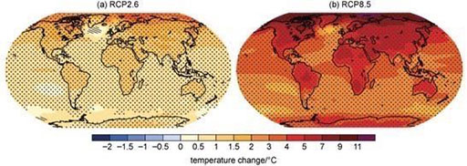
Compare these predictions with those in the maps in Figure 5.

Figure 5 is colour coded global map for mean change of temperature from 2081 -2100, relative to 1986 - 2005, for RCP2.6 scenarios. It typically shows temperature increases of about 0.5 -1 °C over the oceans, North and South of the Equator, 1-1.5°C over continents and 1.5 - 3 °C over the Arctic. Figure 5 is colour coded global map for mean change of temperature from 2081 -2100, relative to 1986 - 2005, for RCP28.5 scenarios. It typically shows temperature increases of about 1-2 °C over the oceans, south of the equator, 2-3 °C over the oceans North of the equator, 4-7 °C over most of the continents and up to 11 °C over the Arctic.
Figure 5 Predictions of mean GMST change 2081–2100 relative to 1986–2005 for the scenarios RCP2.6 (a) and RCP8.5 (b) (IPCC, 2013).
  • Comparing Figures 4 and 5, what important extra information does the full map (Figure 5) provide compared with the global mean (Figure 4)?

  • Regional variations. The global mean cannot show the fact that warming is predicted to be greater over land (i.e. where humans live) than the oceans, and that regional changes are predicted to be larger than the global mean in many places. For example, more than 10 °C warming is predicted in the Arctic for RCP8.5, while the global average is around 4 °C warming.

In terms of temperature extremes, the IPCC (2013) predicts that it is ‘virtually certain’ that hot days and nights will become warmer and/or more frequent, and that cold days will become warmer and/or less frequent by the end of the twenty-first century – for all four RCPs.