

3.1 Industrial sulfates
This section will start from a different perspective.
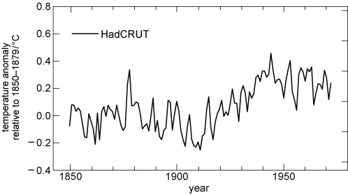
It’s 1972. The latest global mean surface temperature changes are shown in Figure 6.
-
Would you say the ‘recent’ changes in temperature since 1940 showed warming or cooling?
-
The trend is negative – in other words, ‘global cooling’.
With the benefit of hindsight, we now know that the long-term trend changed from cooling to warming. But in 1972, with climate science still a new field, it was not at all clear what was going on.
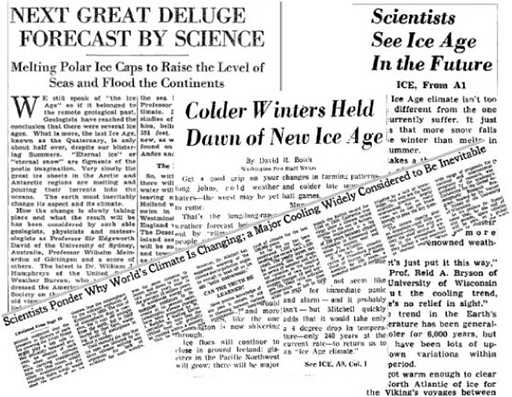
In the 1970s, some media outlets presented dramatic predictions of a new ice age (Figure 7). They were reporting – and, in some cases, exaggerating – a handful of scientific studies that examined the past three decades of GMST and suggested these may be the start of a longer global cooling period.
Watch the following sequence from the BBC’s ‘Climate Change: A Horizon Guide’ The Horizon Guide series collects sequences from BBC programmes over the past to illustrate how views on a particular scientific topic have evolved.

Transcript: Video 1 Sequence from the BBC’s ‘Climate Change: A Horizon Guide’, first broadcast in March 2015.
-
Did the scientists of the time think CO2 was still having a warming effect on the planet?
-
Yes. Professor Bert Bolin says that if we go on burning oil and coal, ‘in about 50 years’ time the climate may be a few degrees warmer than today’. But some thought the effect of sulfur dioxide pollution might be stronger, so the overall effect would be cooling.
-
Why did the predictions of long-term global cooling ‘melt away’?
-
Because ‘both the amount of sulfur dioxide pollution and the size of its cooling effect had been overestimated’.
Sulfur dioxide gas (SO2) is released when burning coal and petroleum, smelting metal and from other industrial processes (Smith et al., 2011). The gas rapidly reacts with water vapour in the atmosphere to make droplets of sulfuric acid called sulfate aerosols, or sulfates for short. (The word aerosol means small particle or droplet.) Because industrial sulfates are emitted at low levels in the atmosphere they have a lifetime of only a few days or weeks before they are rained out, but they are continually replenished.
The droplets reflect some of the Sun’s radiation, thus cooling the atmosphere. But this is not the only story, as they also have complicated indirect effects. Particles of this size can act as cloud condensation nuclei, seeding clouds by encouraging water vapour to condense, and these clouds can have a warming or cooling effect. Despite this complexity, the estimated net effect of the direct and indirect mechanisms is clear: cooling.
The IPCC estimated sulfate aerosols offset about a quarter of the estimated forcing from CO2 between 1850 and 2011 (IPCC, 2013a). The sulfate aerosol cooling effect is sometimes referred to as ‘global dimming’.
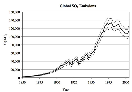
Figure 8 shows an estimate of how global sulfur dioxide emissions have changed through time. You can see the main characteristics of a long-term increase up to about 1975, and then a decrease in the last decades of the twentieth century.
-
What does this decrease in SO2 emissions mean for global temperatures?
-
It means a decrease in the cooling effect (i.e. a relative warming).
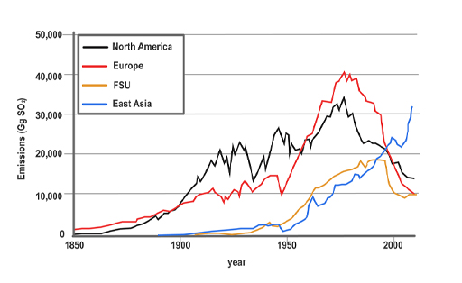
Have a look at some of the individual regional estimates in Figure 9 to investigate the regional impact of this decrease further.
-
Comparing the graphs, which regions in Figure 9 correspond with the global decrease shown in Figure 8?
-
The same decrease is seen in the emissions for North America, Europe and (later) the former Soviet Union. It is not seen in the largest current emitter, East Asia.
The declines in SO2 emissions in North America and Europe were due to pollution regulations in the 1970s, such as the US Clean Air Act of 1970, which were brought in to avoid problems such as acid rain. So – somewhat ironically – regulation to improve air quality reduced the aerosols in the atmosphere, and so has had the side effect of increasing the net global warming effect of fossil fuel combustion.
In recent years there has been a large increase in coal combustion in China, so East Asia has overtaken the other regions: the declining trend in global SO2 emissions appears to have reversed.