4 Internal variability
The third red herring is not a forcing as such but it may blur the picture. This is the idea of ‘internal variability’ where you cannot be sure you are measuring the full picture.
Look at Figure 12, which represents the Delhi Metro system. Around 2.5 million people per day travel on the system ‘flowing’ from one place to another (Sharma et al., 2014).
Imagine you have been asked to measure the total number of people travelling on the system at any one time, as well as changes in passenger numbers throughout the day.
But you only have the resources available to measure passenger numbers on the central Ring Railway (dark blue in Figure 12), so you concentrate on measuring this area.
-
Will you get an accurate measurement of the total number of passengers on the whole system?
-
No, you would only see part of the picture. A large fraction of passengers is in other parts of the system at any one time.
-
Will you get a reliable measurement of changes in passenger numbers throughout the day?
-
You can never be sure, but as passengers enter and exit the Ring Railway, you might still be able to see the overall trends. The Ring Railway is a large and important part through which many people travel. You would also expect fluctuations in that trend as people flowed in and out.
The same principle applies to climate science, and this is the third of the whodunnit red herrings. Interactions within the climate system generate spontaneous and unpredictable fluctuations in the Earth system known as internal variability.
Internal variability is not a forcing, unlike solar radiation, greenhouse gases and sulfate aerosols. Instead, the fluctuations add ‘noise’ to the long-term trend, making it more difficult to pick out ‘signals’. You have so far considered mostly surface warming. But every moment of every day, heat moves around the planet, from the atmosphere into the oceans, and back again. So if you measure only the surface temperature, you are only seeing part of the picture, as much of Earth’s heat is elsewhere.
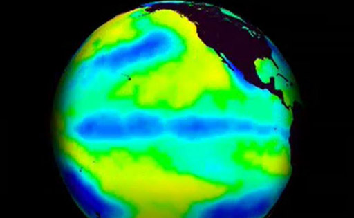
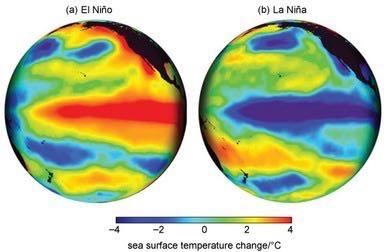
One important example of internal variability that affects GMST is the El Niño Southern Oscillation (ENSO). During an El Niño event, winds moving from east to west over the tropical Pacific Ocean weaken, which slows the circulation of the ocean below.
This means less cold water than usual is brought up from the deep ocean, so the eastern tropical Pacific sea surface becomes warmer than normal (Figure 13a). These events, and their opposite counterparts, La Niña events (strengthening winds, leading to cooler eastern tropical Pacific sea surface; Figure 13b), occur every few years and cause huge changes to ocean and surface temperatures – and weather – around the world.
Many of the brief spikes and troughs you see in the annual GMST data are caused by ENSO moving heat between the atmosphere and ocean. You can see a short animation of these dynamic transitions back and forth in the following video.