

2.5 Choosing the scales for a graph or chart
Choosing appropriate scales can take more time than other elements of constructing a graph. They can need careful consideration, as they affect the whole look of the graph. Scales are usually chosen to illustrate the data clearly, making good use of the graph paper and using a scale that is easy to interpret.
In the examples considered so far, the scales on both axes were the same and both started at zero. However, this is not always appropriate. You’re going to investigate this using the example of a nurse monitoring the weight of a woman during the last few weeks of her pregnancy. The woman’s weight each week has been recorded as shown in Table 1 below.
| Week of pregnancy | 34 | 36 | 38 | 40 |
|---|---|---|---|---|
| Weight in kg | 75.6 | 77.4 | 78.1 | 78.5 |
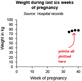
You could start both scales at 0, but then all the points would be plotted in the top right-hand corner, making the graph difficult to read, as can be seen in Figure 10 below.
Since the data on the x-axis start at 34 and finish at 40, a better scale on the x-axis would be one starting at 30 and ending at 42. Similarly, since the data for the y-axis are from about 75 to around 79, a scale on the y-axis that starts at 72 and ends at 79 would seem sensible. Using these scales, the points would be plotted as shown in Figure 11.
Hopefully you can see by comparing the two graphs that the second attempt, as well as being much clearer, just looks better! That is always a good test of how well a graph has been constructed.
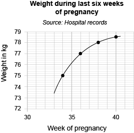
Note that as well as the scales being marked on the axes, these are labelled to show what is being measured, and in what units. The graph also has a title and source of data.
The points have been joined with a smooth curve as, in this case, you would expect the woman’s weight to change steadily between hospital visits over the period. So, it is reasonable to join the points to show the overall pattern or trend.
So, the graph has all the required elements.
If you have access to some graph paper, have a go at drawing your own graph in this next activity.
Activity 4 Drawing a graph
The data shown in Table 2 are the circumferences and diameters of various circular objects. All measurements are in centimetres.
| Diameter/cm | Circumference/cm |
|---|---|
| 4.4 | 14.1 |
| 6.6 | 20.9 |
| 8.6 | 27.0 |
| 10.3 | 32.3 |
| 23.0 | 72.8 |
(a) Construct a graph to show this data, with the diameter on the horizontal (x) axis and the circumference on the vertical (y) axis. Draw a straight line through the points.
Answer
(a) Your graph should look like this:
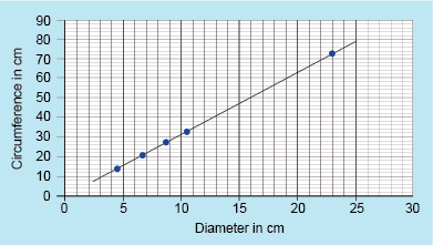
Note the title and labelling of the axes. You may have used a different scale from us if you had different graph paper. This is fine, as long as it makes best use of the paper and is easy to read from.
Finally in this section on line graphs you’re going to take a look at how to read from, and use, a graph.