

3 Bar charts
Last week, you saw data from Fáilte Ireland presented in tables. On their website they also illustrate other data in the form of bar charts, as shown in Figure 14 below. This represents the numbers of visitors participating in different activities.
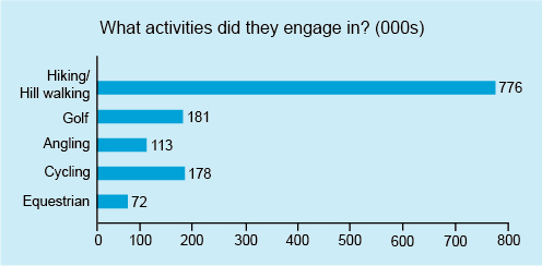
In a bar chart, the length of each bar represents the number in that category. Because the bars on this chart are horizontal, the chart is known as a horizontal bar chart. However, bar charts can also be drawn with vertical bars. Note that each bar has the same width, and since the bars represent different and unrelated categories, the bars do not touch each other and are separated by gaps.
The authors of this chart have made it easy to read as they’ve marked the values represented by each bar directly on the chart. If the values had not been marked on the bars, they could have been estimated by drawing a line from the end of the bar and seeing where it intersected the horizontal axis, just as you did with the line graph.
So, rather than spending time on reading from a bar chart let’s move on to constructing one.