

3.2 Component bar charts
In our last example of the quantity of guests from different nationalities in a hotel, you could add extra detail by showing how these totals were broken down into the different age groups. To do this you can split each bar into three different sections, where the length of each section represents the number of guests in that age group. The resulting bar chart would then be a component bar chart, as shown in Figure 16. Notice that a key (or ‘legend’) has been added to the graph to explain the shading for the different age categories.
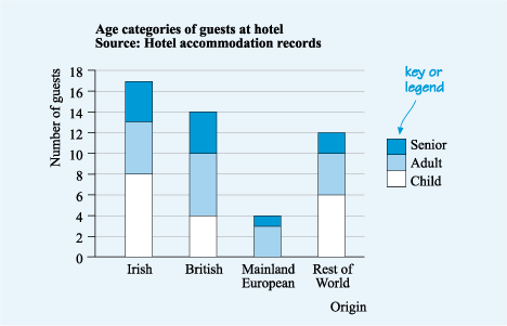
When you read a component bar chart, you need to find the height of the relevant section to determine the quantity that it represents. For instance, the top of the section representing British adults is opposite the 10 on the vertical scale. The bottom of that section is opposite the 4. Thus, the number of British adults is the difference between the top and the bottom of the section, which is 6.
Another type chart is called a comparative bar chart. This again shows more detail than a standard bar chart, but in a different way to a component one, as you’ll see now.