

3.3 Comparative bar charts
A comparative bar chart places bars representing sections from the same category adjacent to each other. This allows for a quick visual comparison of the data.
For example, another way of categorising the data that you have been working with so far would be to split each nationality into the number of females and males. The resulting comparative bar chart would be as shown in Figure 17.
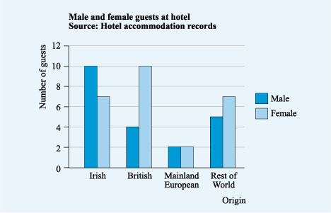
It is easy to see why this is called a comparative bar chart, as it is straightforward to compare the data – for example it is easy tell that many more visitors from Britain were female.
Finally in this section on bar charts, notice how all these charts followed the same format, with the title and source clearly labelled and the axes and scales clearly marked, but they emphasised different aspects of the data. The first showed the totals from each nation, whilst the latter two gave more detail on this data. So when you are displaying data in a graphical form, it is important to choose a chart or graph that stresses the main points as simply as possible so that your reader can understand your chart quickly and easily.
Now it’s time to look at our final type of chart, the pie chart.