

5 Reading a graph with caution
The graph in Figure 20 below shows the monthly heating bills of a house before and after loft insulation was installed.
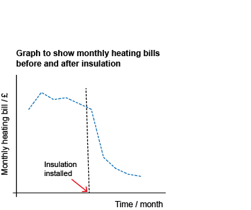
You should have noticed that there are important pieces of information missing from this graph that you now know should always be included.
The first is the source of the data. Without this you have no idea how the data were collected or how reliable the information may be. Was just one house used in the survey, or were many houses used?
The next, and this makes the graph almost meaningless, is that neither axes have any scales marked.
Suppose the scale on the vertical axis was from £50 to £51; if it was, the apparent drop in the bill after insulation would be negligible. However, if the scale went from £0 to £50, the drop might be of more interest.
What about the horizontal axis? You don’t know what time of year the data were collected or over what period. In fact, the data was collected from November to September, so the horizontal scale should have indicated this.
The graph appears to show a large drop in the heating bills after insulation was installed. However, without the scale on the vertical axis, it is impossible to say what kind of drop this is.
From the data you know that the drop in the monthly heating cost occurred in the May bill, just as the weather was warming up for the summer. So that means the reduced bills could simply be due to less heating being used in the summer.
So, overall, no conclusions can be drawn from this graph about the effectiveness of the insulation.
This illustrates an important point: when you are comparing two sets of data: you need to compare like with like. You would expect the bills for the summer to be less than those in the winter anyway, regardless of the presence or absence of loft insulation. It would be more appropriate to consider the amount of energy used for heating over two periods with similar weather.
So, although graphs and charts are very useful, it is important to read them critically, checking that all the information you need to interpret them is provided.
Another important point to note is that if the graph appears to show an association between two quantities, it does not prove that one has caused the other. For example, suppose the number of students in a town registering in a maths course rose from year to year and the number of burglaries in the town also rose – does this mean that the maths students have committed the burglaries? No, of course not! Both rises may be linked to some other factor, such as the number of people who have recently moved into the town.