

2 Pivot tables
One of the most useful, if poorly understood, features offered by many spreadsheet applications is the ‘pivot table’.
Pivot tables provide a way of creating summary reports over particular parts of a dataset, reshaping the data into grouped rows, itemised columns, and summary values within each group and item.
The screenshot of the interactive pivot table shown below, based on a widget originally created by Nicolas Krutchen at Datacritic, contains a small fragment of the Comtrade data describing milk imports to the UK.
The pivot table is organised as follows:
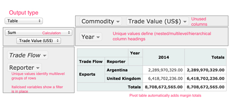
You can see how the ‘Trade Flow’ and ‘Reporter’ columns are used to group the data, with each row representing a separate group. In addition, the values in the ‘Year’ column are broken out to create separate columns (although in this example there is only data for one year, and hence one ‘Year’ column, 2014). The function that is applied to the grouped data is a sum operation, and it is applied to the selected ‘Trade Value (US$)’ column in the original dataset. A marginal total value is calculated by summing across all the columns. The ‘Commodity’ and ‘Trade Value (US$)’ columns, while part of the original dataset, are not directly used to define the pivot table’s structure; that is, they are not used to set the row or column index header labels in the displayed pivot table.
In terms of the split-apply-combine pattern, the pivot table operates as follows:
- the column names from the original dataframe that are listed in the rows panel on the left hand side of the interactive pivot table split the data into a set of groups, with each row specifying a group
- the pivot table’s columns are set according to the unique values associated with the specified columns from the orignal dataframe; these break the data down into yet smaller groups that are associated with each cell.
The selected operator is then applied to each cell level group, the results combined and an appropriately structured output table is displayed.
To create a pivot table report for a dataset, typically three actions will be needed:
- identify what elements will appear as the row index values – that is, how the rows will be grouped. Typically, groups will be created based on the unique values within a single column or a combination of values, one from each of multiple grouping columns.
- identify what elements will appear as column headings. Again, the column heading may just be the unique values of a single variable, or combined values across multiple grouping columns.
- identify what numbers will be reported on. This step may often break down into two smaller steps:
- to count the number of rows associated with a particular combination of row and column index values, select the count operation
- to perform an operation on the value of cells in another column, select that column and then identify what operation to apply to it. For example, find the sum or mean values of a numerical quantity associated with rows keyed by the row and column index values, or count the number of unique values of a particular variable in rows identified by those key values.
In addition, one or more ‘filters’ can be added to the selection of row and column index values, either limiting which unique values in each key column to report on, or, by default, selecting them all.
It is often easier to understand how a pivot table is organised by using it interactively. You’ll get a chance to do this in the next exercise.
Exercise 5 Interactive pivot table
If you haven’t already, open the comtrade_pivot.html and save it into the same folder as the Exercise notebook 4. Then either re-run all the notebook cells, or just run the cell that contains the interactive pivot table.
Configuring a pivot table requires paying careful attention to the selection of row (grouping) values, columns (reported values) and summary (aggregating) function.
How easy did you find it to use the interactive pivot table? Could you work out how to select the row and column labels in order to ask particular questions of the data? What sorts of questions did you try to ask?