

Other types of bar chart
Bar charts can also be used to compare two sets of data in either dual or composite bar charts.

A dual bar chart shows two sets of data side by side for comparison (Figure 19).
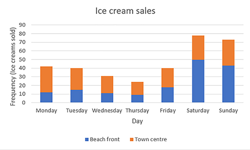
A composite bar chart is useful when the two sets of data are connected, as the frequencies are combined. (Figure 20) For example, when recording the takings from two branches of a shop, a composite bar chart will show the total takings from both branches but also show the breakdown of sales from each shop.
Line graphs
Line graphs are often used to show changes or trends over time. They are produced by plotting a series of points which are joined up by a straight line.
The general shape of a line graph allows some interpretation at first glance. For example, in Figure 21, it is clear that the rainfall was highest on the third day.
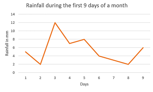
Activity 13 Interpreting a line graph
- On which day was the rainfall lowest?
- On which day did 7 mm of rain fall?
Discussion
- Days 2 and 8 both had the lowest rainfall of 2 mm.
- A total of 7 mm of rain fell on day 4.