3.2 Pie charts
In this section you will read about using pie charts, how to draw pie charts and the important point that pie charts demonstrate the proportions of each type of data rather than the frequency of each type of data.
Understanding and interpreting pie charts
Pie charts use different sized sectors of a circle to represent data.
The pie chart below represents the first instrument played by a sample of people.
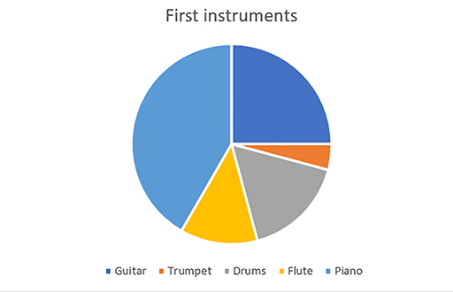
Understanding this pie chart
In this example, the most common instrument is the piano. This can be seen easily as the light blue part of the pie chart, representing the piano, is much larger than any of the other sectors.
It is also straightforward to see that ¼ of the people in this sample had a guitar as their first instrument. You can see this because the angle within the dark blue section, representing guitar, is 90°.
Using this information, you know that if the total number of people in this survey was 80, there must be 20 people who play guitar (80 divided by 4).
Similarly, if you knew that 6 people play guitar, you could work out that the total number of people in the sample must be 24 (6 × 4).
Using angles in pie charts
In the example above, we used the fact that ¼ of the pie represented the number of people for whom guitar was their first instrument. But it would have been more difficult to give an accurate answer if the question had asked about the number of people whose first instrument was drums.
Since pie charts use sectors of circles, we can relate the proportions of the circle, in degrees, to the proportion of the sample and use this to find out how much each sector represents (Figure 23).
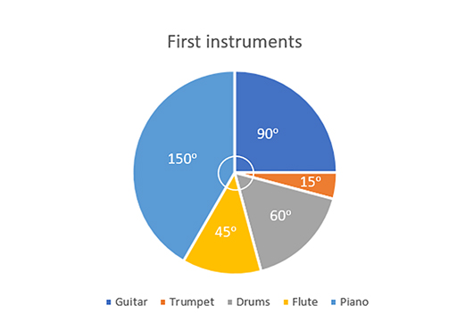
We need some more information, either the total number of participants in this survey or the value for one of the categories.
There were 48 participants in this survey. We can now calculate how many people each of the sectors of the pie chart represent.
| Instrument | Angle | Frequency | |
|---|---|---|---|
| Guitar | 90° | 90/360 × 48 = | 12 |
| Trumpet | 15° | 15/360 × 48 = | 2 |
| Drums | 60° | 60/360 × 48 = | 8 |
| Flute | 45° | 45/360 × 48 = | 6 |
| Piano | 150° | 150/360 × 48 = | 20 |
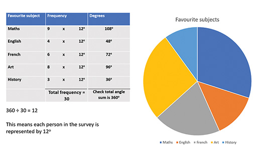
To check for accuracy, it is important first to check that the angles sum to 360° and, second, that the total frequency sums to what you expect, in this case to 48.
Drawing pie charts
Drawing pie charts accurately requires the same process in reverse (Figure 24).