

Using angles in pie charts
In the example above, we used the fact that ¼ of the pie represented the number of people for whom guitar was their first instrument. But it would have been more difficult to give an accurate answer if the question had asked about the number of people whose first instrument was drums.
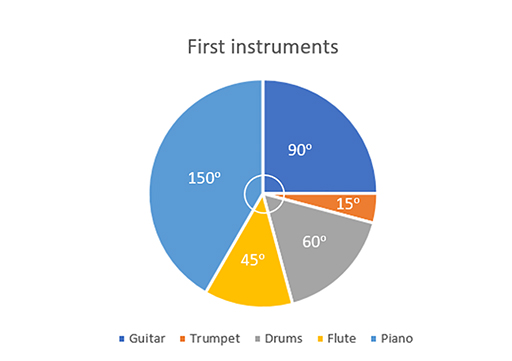
Since pie charts use sectors of circles, we can relate the proportions of the circle, in degrees, to the proportion of the sample and use this to find out how much each sector represents (Figure 23).
We need some more information, either the total number of participants in this survey or the value for one of the categories.
There were 48 participants in this survey. We can now calculate how many people each of the sectors of the pie chart represent.
| Instrument | Angle | Frequency | |
|---|---|---|---|
| Guitar | 90° | 90/360 × 48 = | 12 |
| Trumpet | 15° | 15/360 × 48 = | 2 |
| Drums | 60° | 60/360 × 48 = | 8 |
| Flute | 45° | 45/360 × 48 = | 6 |
| Piano | 150° | 150/360 × 48 = | 20 |
To check for accuracy, it is important first to check that the angles sum to 360° and, second, that the total frequency sums to what you expect, in this case to 48.