Teaching idea: Do Smarties® have the answer?
In Week 3, we discussed the use of concrete materials, including edible resources when appropriate.
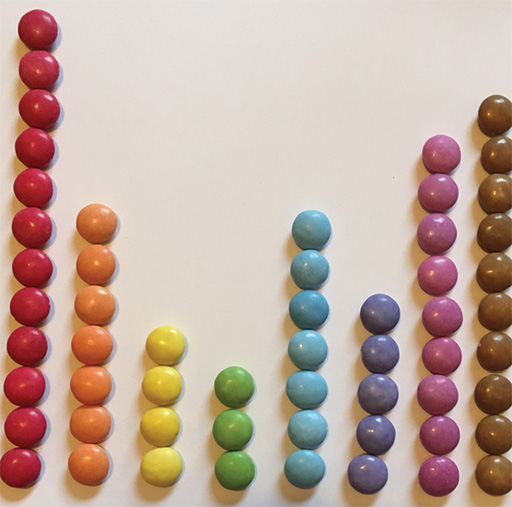
In this classroom activity, learners are given a tube of Smarties® (or similar sweets with a range of colours), either one each or in pairs.
The learners are then required to record the frequency of each colour of sweet in a tally and frequency chart. Learners can use the sweets to create their own visual representations of data. Bar charts work really well – see Figure 25.
Data from each individual, or pair, can then be added to a whole- class table of results. Using an Excel spreadsheet is a good idea here.
Learners can compare their frequency charts and bar graphs with the whole class results, allowing for discussions about natural variation in samples. This will lead to the understanding that larger samples will generally be more representative of the whole population.
This fun investigation allows learners to use the PCAI cycle, while thinking about how they can visually represent data.