

5 Using available statistics
Sometimes, quantitative data are generated as a normal part of the operation of an organisation, as in the case of financial statements published by public organisations. Other data, however, are specially collected by organisations as an adjunct to their work: for example, most governments produce a considerable amount of statistical data about the societies in which they operate, which is used as a basis for policymaking. There is also quantitative data produced by inspection and auditing organisations. As noted earlier, there are also sets of data generated by previous research studies.
Available quantitative data, of these various kinds, can be a very important source of evidence for researchers. Indeed, often they will provide information that it is simply not possible to obtain otherwise, or that would be prohibitively expensive for an individual researcher to try to collect. At the same time, usually they will by no means provide all of the sorts of information that are important for a particular study. The available data, having been gathered for a different purpose, may not exactly fit the requirements of a particular research. At the same time, quite often underlying assumptions and definitions are not made clear in the publication of secondary data.
Activity 3
Much of the research in finance is based on secondary data sources that researchers do not collect themselves. In fact, researchers now have access to an unthinkable amount of financial and economic data, some of which are publicly available without any cost. You can check out some interesting online data sources (from either international organisations or well-known individual researchers), which are quite user-friendly and do not require any subscription (you can download data for free):
- Statistics of BIS [Tip: hold Ctrl and click a link to open it in a new tab. (Hide tip)] . The Bank for International Settlements (BIS) is an international organisation that serves as a bank for central banks aiming at international monetary and financial cooperation. On its website it offers several financial data series including data on: banking, basic financial securities, derivatives, exchange rates, property prices, credit to private sector and some global liquidity indices.
- OECD statistics. The Organisation for Economic Co-operation and Development (OECD) is an international economic organisation of 34 countries founded in 1961 to stimulate economic progress and world trade. From its online database one can easily download a wide range of data from economics and finance to demography, social protection and well-being.
- Eurostat database. Eurostat is located in Luxembourg and its main responsibilities are to provide statistical information and promote harmonisation of statistical methods across European Union member states. The user can find some key macroeconomic and financial series.
- The World Top Incomes Database. The World Top Incomes Database aims at providing convenient online access to all the existent historical series on the distribution of top incomes using tax data for several countries. It also provides information on the distribution of earnings and the distribution of wealth.
- Online data of Robert Shiller. [
 ] Robert Shiller is an American academic economist, well-known for his research on the efficiency of financial markets and behavioural finance. He jointly received the 2013 Nobel Prize in economic sciences (with Eugene Fama and Lars Peter Hansen). His online dataset offers some interesting long term time series such as: monthly stock price, dividends, earnings data and the consumer price index starting from January 1871 for the US stock markets; historical housing market data in the US since 1890; annual series for long-term stock, bond, interest rate and consumption data since 1871.
Take some time to familiarise yourself with the above online data sources. Download some of the economic or financial variables and plot them on graphs using Microsoft Excel.
Discussion
Here are some suggestions:
From BIS statistics: you can trace and download the available data for credit to private sector for the UK. On the main homepage of BIS select ‘Statistics’ and then ‘Credit to private sector’ from the menu on the left hand side. Read the brief description of the database and select ‘Data’; the dataset will automatically open in Microsoft Excel. In the second worksheet, named ‘Documentation’, you can locate the links to the time series for the UK private debt of ‘households and NPISHs’ and ‘non-financial corporations’ (note that NPISHs stands for Non Profit Institutions Serving Households; choose the ‘adjusted for breaks’ time series).
Copy and paste the relevant variables to a separate new spreadsheet. Then plot the size of credit to households and NPISHs and non-financial corporations. The data is provided quarterly and the numbers are expressed in billions of pounds. Use the series that are adjusted for breaks in order to make safer historical comparisons. The figure below should look similar to yours. Have in mind that you present the actual size of debt in millions of pounds.
A better understanding of the developments in private indebtedness would require us to plot debt as a ratio if income or GDP were available. For instance, you can find quarterly figures (in order to match the frequency of the debt data) of UK GDP in the OECD database (see below). Our attached spreadsheet contains both GDP data and the corresponding debt of households and non-financial corporations as ratios to GDP.
The second figure below presents the results. The debt of households and non-financial corporations was increasing from the beginning of the 1980s reaching 100% of GDP just at the outbreak of the 2008 global financial meltdown. The crisis originated a deleveraging phase for the private sector as is obvious from the same figure.


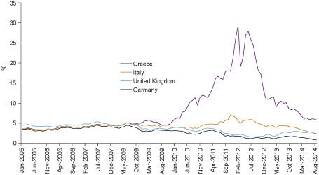
OECD statistics: From this very rich data source we can plot the long term government borrowing costs (or, alternatively, the long term interest rates) for some countries.
The figure below shows the trends of monthly prices of long term annual interest rates for the UK, Germany, Italy and Greece from January 2005 to September 2014. You can find these time series as follows: from the menu of the main OECD webpage select consecutively: ‘Finance’ > ‘Monthly financial statistics’ > ‘Monthly monetary and financial statistics’ > ‘Long term interest rates’. Then you can customise your search specifying several criteria: time, countries etc.
When you finish your search you can export the selected time series into a Microsoft Excel spreadsheet from the menu on the top of the table simply by choosing ‘export’.
When you download the data, they will have the standard OECD structure and format. You can easily reorganise them into a different spreadsheet.
You can see that before the outbreak of the 2008 financial meltdown, these four countries were having similar borrowing long term costs. Risk repricing in the wake of the crisis radically reshaped the trends triggering a serious sovereign debt crisis in the Eurozone.
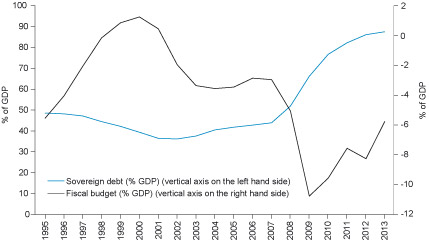
Eurostat database: From this database, for instance, we can have a look at the UK sovereign debt and budget. The figure below shows these variables as percentage of GDP.
To find the variables, in the main Eurostat webpage select ‘Data’ and then ‘Database’. In the next page select the category ‘Economy and finance’ and then: ‘Government statistics’ > ‘Government finance statistics’ > ‘Government deficit and debt’ > ‘Government deficit/surplus, debt and associated data’. A new webpage will pop up and then you will be able to specify your selection according to several criteria: country, variable, sector, time and unit of measurement.
After you specify your search you can download the data from the menu in the top of the webpage. Given the amount of information in the Eurostat database, it may take some time to familiarise yourself with the working environment and be able to specify your selection.
The downloaded data will have the standard Eurostat structure and format. You can easily reorganise them into a different spreadsheet.
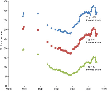
The World Top Incomes Database: One of the key themes in contemporary discussions in academic literature and financial press is the increase in income and wealth inequalities associated with the post-1970s financial innovations.
This database summarises valuable information about the historical trends in inequality for many different countries. You can find and plot the time trends of the top 1%, 5% and 10% income share for the UK.
In the main webpage you choose ‘The Database’ and then in panel 1 of the next webpage you choose ‘United Kingdom’. In panel 2 you define the time range. Data are available from 1908 to 2011, although series before 1960 are incomplete.
In panel 3 you select the variables that you would like to download: ‘top 10% income share’, ‘top 5% income share’ and ‘top 1% income share’. When you press the ‘download’ button you can automatically get the selected time series in a Microsoft Excel spreadsheet.
Note that there are two different layouts and you can find information about them in the first spreadsheet. You can plot data of layout-A synthesising the available time series before and after 1990. The three variables are shown in the figure below.
The figure presents a clear rise in income inequalities in the last three decades, particular after the 1980s. The same tendency also characterises other developed capitalist economies. Note that for many years relevant data are not available. You can repeat the same exercise for the same (or other) variables in different countries and make comparisons.
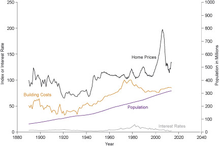
From Robert Shiller’s database: The database offers long term monthly historical trends in US home prices from 1890 to the present. To download the time series just press ‘US Home Prices 1890-Present’ on the main webpage and open the file with Microsoft Excel. These trends are already plotted in the first spreadsheet against historical trends in building costs, interest rates and population. Related data can be found in the second spreadsheet of the same file.
The figure captures the recent price inflation in the US house market which was associated with the 2008 financial meltdown. Changes in home prices cannot be easily explained by the trends in building costs, interest rates or population growth.
Note that ‘home prices’, ‘building costs’ and ‘interest rates’ are indices and measured by the vertical axis on the left hand side of the figure.
Activity 4
Having in mind the above discussion on quantitative research, what problems can you identify in using available statistics in general?
Add your notes here and then compare them with the feedback provided below.
Discussion
There are several issues that need to be taken into account in using available statistical data:
- First, we must remember that the available data have not always been produced for the particular purposes for which they are now to be used in a research project, and that the functions they were generated to serve may have shaped them in ways that are relevant to their interpretation. Furthermore, while data are produced by organisations in order to provide important information on the basis of which they will make decisions, they are also sometimes produced for self-justification or propaganda purposes. In addition, there may be different levels of commitment to producing sound data on the part of those in different positions in an organisation. Indeed, some people may have a motive for systematically manipulating the data, for example where their performance is being measured. It is also the case that, very often, organisations, including governments, do not deploy sufficient resources for high quality information to be produced. As a result, there may be missing data and some error in available statistics. In government statistics published at regular intervals, these and other factors often lead to variation in modes of presentation that can seriously hinder the investigation of changes over time. How important these failings are depends upon the purposes for which the statistics are to be used.
- A second set of problems that needs to be taken into account in the use of available statistics is the fact that the availability of particular sorts of data (and not others) may shape the course and focus of research in a field. For example, while the rise in household indebtedness has triggered relevant research, available official statistics in several countries do not always capture the significant cross-sectional differences in relation to geographical, age and income criteria. Relevant statistics that measure only age differences in household debt will encourage quantitative research that downplays and possibly misrepresents the effects of other important differences for the explanation of the phenomenon.
- A third problem is that the categories or measurement scales used in available statistics may not be those that would have been most useful from the point of view of the new piece of research. For example, the category systems or scales usually employed to represent ethnicity and social class in available statistics are far from ideal for many research purposes. Also what is involved here is not simply a contrast between data collected by researchers and that generated by organisations with other purposes. Even where data generated in other research projects are being re-used, there will often be a mismatch between how the data were collected and what would have been best for the purposes of the new research.
The significance of the problems we have identified here will vary considerably across different sets of statistics, and (as we have emphasised) will also vary according to how they are going to be used. The key point is that these potential problems must be given attention. Remember that numbers can have a beguiling tendency to lull us into an exaggerated sense of their likely validity or value.