4 Reading maps
4.1 Understanding the relationship between data and space
A map on its own is meaningless. Try showing one to a person from a culture which does not include mapmaking as we know it. A map is neither a picture nor a story – unless we know how to ‘read’ it. You have already developed ‘reading skills’ which will help in reading maps. For example, noting the title and the sources are common to all the uses of evidence in the social sciences. Critical awareness is vital in recognising how mapmaking involves selection, distortion and generalisation just as with text, photographs and statistics. None of these issues is necessarily a problem so long as you know about them. Maps, then, are an abstraction involving science and technology, imagination and skill and, above all, decisions. In order to bring a map alive, therefore, we need to know about the codes and conventions that lie behind its production and, also, to understand both the obvious messages and the underlying, often hidden, meanings.
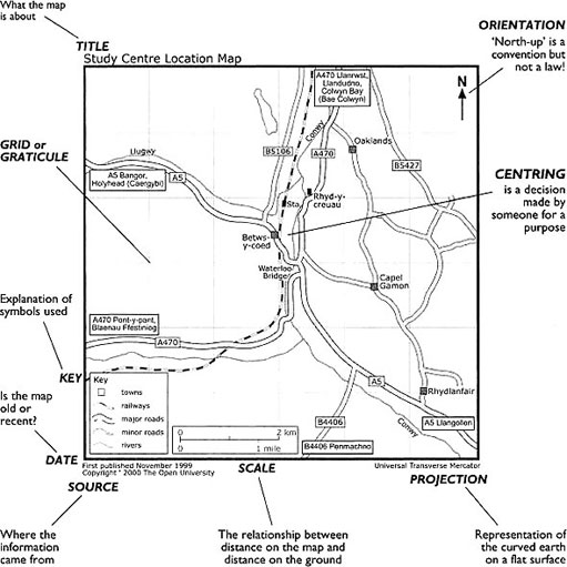
Fundamental to producing a map is the relationship between data (the information you wish to display and convey) and space, both the geographic space being represented and the space available on the sheet of paper. Data is represented by points (to show location) and lines (to show connections), by symbols (to convey features) and by colour and/or shading (to represent areas). These are the codes which are part of the language of maps. The other side of that basic relationship between data and space is the classic problem of representing a spheroidal earth (or, globe) on a plane surface. The resulting ‘projections’ are often controversial. There are also conventions which are observed in mapmaking. Look at Map 6 which highlights the main conventions.
Some of the features on the diagram will be self-evident and, as noted above, you already know about viewing titles, sources, dates and authors critically, so I shall not discuss those things any further. Other conventions, like ‘projections’, may need some explanation. Our diagram does not mention the use of colour and our illustrations in this text are in black, white and shades of grey. Colour can play a major role in conveying messages on a map; for example, the use of red to show the British Empire or of black for a country to which ‘we’ are hostile. How colour or shading are used is important in reading maps because it may carry an otherwise hidden message.
In the following discussion of the conventions in Map 6, I shall follow another reading convention and work from the top-down.
Orientation
‘Orient’ is associated with the rising of the sun in the east and, in earlier times, many maps were drawn with east at the top. The convention of ‘north at the top’ is a northern hemisphere notion (compare with map 6 – click on 'view document' below) which possibly derives from the importance of the North (Pole) Star to the (North) Western maritime nations. The importance of the orientation of a map lies in the need to be able to ‘read’ directions (e.g. if north is at the top of the map, then we know that something in the lower left-hand corner is to the south-west of something in the centre). Orientation can be manipulated to make places seem more or less important, usually by putting them at the top – as with North. On a more personal level, it can be important to know the orientation of a map of a street or estate of houses in order to know at what time of day the sun will shine into the living room!
Click to view Map 7 [Tip: hold Ctrl and click a link to open it in a new tab. (Hide tip)] which shows Australia at the top.
The grid or graticule
The grid is the ‘net’ of lines on a map which are used to establish a location. A rectangular grid can be used at, say, national level where the curvature of the earth's surface does not create significant distortion of distances when transferred to the flat page. The British and Irish Ordnance Surveys have their own grids which are printed on maps of England, Scotland, Wales and Ireland. They assume north to be at the top of each vertical line but, if this were really the case, they would not converge at the Poles. A graticule represents the meridians running north-south and the parallels of latitude running east-west.
Centring
What goes to the centre of a map will become the focus of attention and it can be manipulated according to the purpose of the map. On world maps produced in Western Europe, it is common to find Europe on or near the centre. This was reinforced by the international agreement which fixed the previously movable Prime Meridian (or 0 degrees of longitude) to run through Greenwich in southern England. This probably reflected Britain's political power, though it is sometimes said to be a tribute to John Harrison, the English clockmaker who invented the accurate means of establishing longitude. However, maps produced in the USA, for example, often have the Americas in the centre.
Key
Maps should have a key (sometimes called a legend) which describes and explains the symbols used to depict features on the map. We may be accustomed to the symbols used by our Ordnance Survey, but maps are made by many different people and organisations for many different purposes and it is important to check how lines, dots, icons, shadings and colour are used. Ideally, each map will carry its own key.
Scale
Scale is literally the distance on the map related to distance on the ground. For example, one centimetre on the map may represent one kilometre. Choice of scale is important because, as the area covered becomes larger, the scale is said to be smaller, and the smaller the scale the more detail is lost. For example, individual buildings become subsumed in a monocoloured patch representing a town – or even just a dot; twists and turns in rivers are represented as straight lines. A boundary measured on a small-scale map could seem to be much shorter than when measured at a larger scale because all the irregularities would be missing from the calculation. If you can find a map of part of the British or Irish coast and compare it with a small map of the whole of the British Isles, you will observe a similar phenomenon. If you hear a reference to, say, ‘300 miles of coastline’ you might pause to wonder how it was measured. Scale can be deliberately manipulated to ensure the inclusion or exclusion of certain things, with a technical excuse available to mask a deliberate ploy.
Projection
As noted above, this is about representing the globe on a flat sheet of paper. The classic image is of peeling an orange by slitting the skin down the lines of the segments and then trying to press the pieces of orange peel on to a flat surface. The result is some slight bulges and a lot of gaps! The point is that, no matter how we represent ‘the world’ on a flat surface, we lose some major property of scale or shape. Mercator's projection successfully represented direction, was quite good for shape with smaller outlines, but was bad for area and distance. Of the many attempts to improve on Mercator, one of the commonly used is the Peters projection which elongates landmasses but is better than Mercator in terms of area. You can see the world represented using the two different projections by opening Map 8 (Mercator) and Map 9 (Peters) below. Click on the 'view document' links and the maps will open in separate windows..
Click to view Map 8 (Mercator).
Clickto view Map 9 (Peters).
Because the Peters map is ‘equal area’, no place looks too big or too small, but Africa is made to look twice as long as it is wide. In fact, Africa is as wide as it is long. Compromise between the size distortion of Mercator and the shape distortion of Peters is reached by making ‘cuts’, which goes back to our notion of flattening out the orange peel. Cuts can be made in the oceans but, for this kind of projection to be used to represent the whole world, it is necessary to make a cut into the Asian continent southwards from the north coast. Clearly, this is a problem if you are interested in that part of the world! Because no projection can truly represent the globe (the world) we need to be aware of the strengths and weaknesses which the various projections have and evaluate the resulting maps accordingly. If you have an atlas to look at, you will find several different projections used in representing different parts of the world. Your atlas might also have a section which explains something about the different methods of projection. Basically, we cannot have a map of the world which is accurate for size and shape, distance and direction. We have to decide what we want to show and select a projection that best meets our purposes. These purposes may be sincere or misleading – and there is great capacity within projections to distort and mislead. However, at a more local level within, say, Britain or Ireland, we can largely ignore the problem of the curvature of the earth's surface and use a simple grid to construct a map.

