The standard view of this forum does not always work well with
assistive technology. We also provide a simpler view, which still contains all features. Switch to simple view.
My OpenLearn Create Profile
- Personalise your OpenLearn profile
- Save Your favourite content
- Get recognition for your learning
Already Registered?
Page path
Course content
View course content
- Expand
- ExpandGeneral introduction
- ExpandModule 1: Use of visualisations for better policy making
- ExpandModule 2: Creating visualisations for policy co-creation
- ExpandModule 3: Managing & evaluating policy using visuals
- Chapter 3.1: Reading the policy visualsView
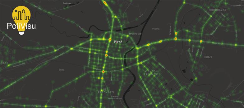
- Activity 3.1.1: Pilsen Traffic Intensity MapReceive a gradeReceive a passing grade
- Activity 3.1.2: Flanders Safe Roads MapReceive a gradeReceive a passing grade
- Chapter 3.2: Co-creation with stakeholdersView
- Forum discussion: Transport policy co-creation
- Chapter 3.3: Evaluating the policy decisionsView
- Activity 3.3.1: Issy Mobility DashboardReceive a gradeReceive a passing grade
- Module 3 quizReceive a gradeReceive a passing grade
- Chapter 3.1: Reading the policy visuals
- ExpandConclusion
About this course
- 5 hours study
- 0Level 0: Beginner
- Course description
Course rewards
Free Statement of Participation on completion of these courses.

Better policy making through data and visualisations
If you create an account, you can set up a personal learning profile on the site.
For further information, take a look at our frequently asked questions which may give you the support you need.
If you have any concerns about anything on this site please get in contact with us here.