Chapter 3.3: Evaluating the policy decisions
In this chapter you will learn how to assess the impact of policy measures using data visualisations.
Previous chapter explained how visualisations can be used to support policy stakeholders by increasing their capacity to understand data and participate in the development and subsequent delivery of a new service/policy. In this chapter, we focus on the last stage of the policy cycle and examine more closely the role of data visualisations in evaluating policy outcomes.
Defining the scope of discussion
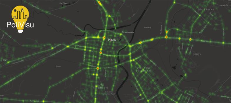
As all visualisations in PoliVisu are spatially referenced, we narrow our discussion to geo-visualisations, which can be complex or simple depending on policy goals, evaluation needs, data availability and other resources. More complex maps, such as those created for Pilsen and Flanders, can be customised to visualise large datasets linking spatial (where), temporal (when) and semantic (what) dimensions in a single interface. Simpler tools, such as the Issy Mobility Dashboard, despite the lack of dynamic views, can still offer valuable insights by way of illustrating policy impacts on local traffic conditions.
Data visualisations and evaluation: a brief history
Even though geospatial visualisations have a lot to offer to policy evaluators, their application in the evaluation practice is relatively recent and remains underutilised especially when compared to more traditional approaches e.g. cost-benefit analysis, ROI (Jamieson & Azzam 2012). The idea that geo-visualisations can be used for policy evaluation began to gain traction almost two decades ago. However, the initial discussions were quite technical (Ringer et al. 2002). The focus was more on the ‘backend’ (e.g. shapefiles, database manipulation) rather than how geospatial analysis can be used to answer common evaluation questions or how best to integrate it throughout the evaluation process.
The growing importance of data visualisations in evaluation practice
But thanks to advances in ICTs the role of data visualisations in policy evaluation began to change. We are now collecting more data than ever before. New technologies allow us to visualise the collected information in an interactive way and share the results almost instantly not just to local stakeholders but across the globe. This has influenced how we conduct evaluations, interact with stakeholders and communicate findings.
International examples
In recent years, more and more places across Europe and beyond have relied on geospatial visualisations to achieve their policy (evaluation) goals. Examples include
United States: Researchers at Columbia University used GPS data to visualise the environmental cost of the fragmented taxi licensing regime in the New York City region.
Spain: The Cambrils municipality applied spatial analysis to determine the effectiveness of public transport networks in the context of tourist mobility (Domenech and Gutierrez 2017).
Germany: Telefónica recently created an interactive map that visualises nationwide traffic flows using anonymised mobile phone data. The goal is to evaluate commuter behaviour and allow transport stakeholders to develop new services based on real citizen needs.
France: Ville d'Issy-les-Moulineaux created the aforementioned Mobility Dashboard to measure the impact of an ambitious project - Grand Paris Express - on traffic flows in and around the city. By completing the following activity, you will be able to play with the dashboard and learn about the role of data visualisations in evaluating policy decisions.
▶ A hands-on activity built around the Issy Mobility Dashboard
