Chapter 2.3: Types of data visualisations
This chapter provides a brief introduction into data visualisations and explains how they can support policy making using real-life examples from PoliVisu.
You have found the data you’ve been looking for but how do you actually use it to answer a policy question? One solution would be to use data visualisations. However, as you will learn in this chapter, some visualisations are better than others depending on context, target audience and policy needs.
Evolution of data visualisations
Over the past few decades, many programming languages, toolkits and libraries have emerged to support web-based visualisations. An early example is Prefuse, a visualisation framework based on Java. But as the latter gradually became outdated, new languages (e.g. JavaScript) have emerged as the preferred choice for creating interactive online graphics. Today, many web-based data visualisations are built with D3, WebGL and other JavaScript enabled frameworks.
In parallel, another important change has been taking place. Until recently, visualisations beyond simple graphs and charts were the preserve of specialists trained in computer science. However, in recent years we witnessed the emergence of a new class of self-service applications oriented toward non-experts.These apps allow ad hoc visual analysis and dynamic data querying to be carried out without advanced knowledge or software.
As well as offering an easier way to detect patterns, anomalies and trends, interactive visualisations empower people to explore data for themselves without relying on someone else’s expertise. This makes them appealing to citizens and policy makers alike, and that is the reason why PoliVisu opted for interactive visualisations, not static ones, as a means to support pilot cities in reaching their policy objectives. Different objectives necessitated the use of different visualisation techniques. In this chapter, we’ll consider three examples:
-
Integrated dynamic data visualisation (Flanders)
-
Dynamic scenario analysis (Pilsen)
-
Integrated open policy dashboard (Mechelen)
Integrated dynamic data visualisation
Dynamic visualisations are gaining traction, with many data portals now providing this capability for at least a small portion of their data collection. However, such visualisations are often one-dimensional, typically focusing on time or location but rarely both. In PoliVisu, spatio-temporal aspects have been integrated into a single interface to provide a more holistic view of the data. The WebGL-based Flanders accident map is a case in point, where map selections are automatically reflected in the chart view and vice versa.
Video 5: Integrated dynamic visualisation of Flanders accidents
Dynamic scenario analysis
Making the results of policy planning accessible to the public is an important step in developing a strong, citizen centric e-government culture. As citizens learn about the impact of proposed changes by playing with interactive tools online, service planners can collect valuable feedback to improve policy making. Dynamic scenario analysis can also be used by senior politicians who don’t necessarily have the skills to perform sophisticated GIS work but wish to obtain instant insights without having to wait for a report from the transport department. A tool that achieved this dual purpose within the context of PoliVisu is the map of Pilsen roadworks built with Traffic Modeler.
Video 6: Dynamic scenario analysis of Pilsen traffic
Integrated open policy dashboard
Visualising the impact of policy measures in a transparent manner requires a lot of political will. But it is equally important to have strong grassroot demand for such data to be shared in an accessible, easy-to-understand way. The PoliVisu pilot in Mechelen, which focuses on school streets, was able to achieve that by i) involving citizens in data collection, ii) building a multi-stakeholder coalition involving the local government, citizens, schools and research organisations, and iii) using advanced web-based tools to visualise citizen science data. The end result is an online dashboard that visualises the impact of school streets (i.e. streets that are closed to cars when children arrive at and leave the school) on traffic conditions in the neighbourhood.
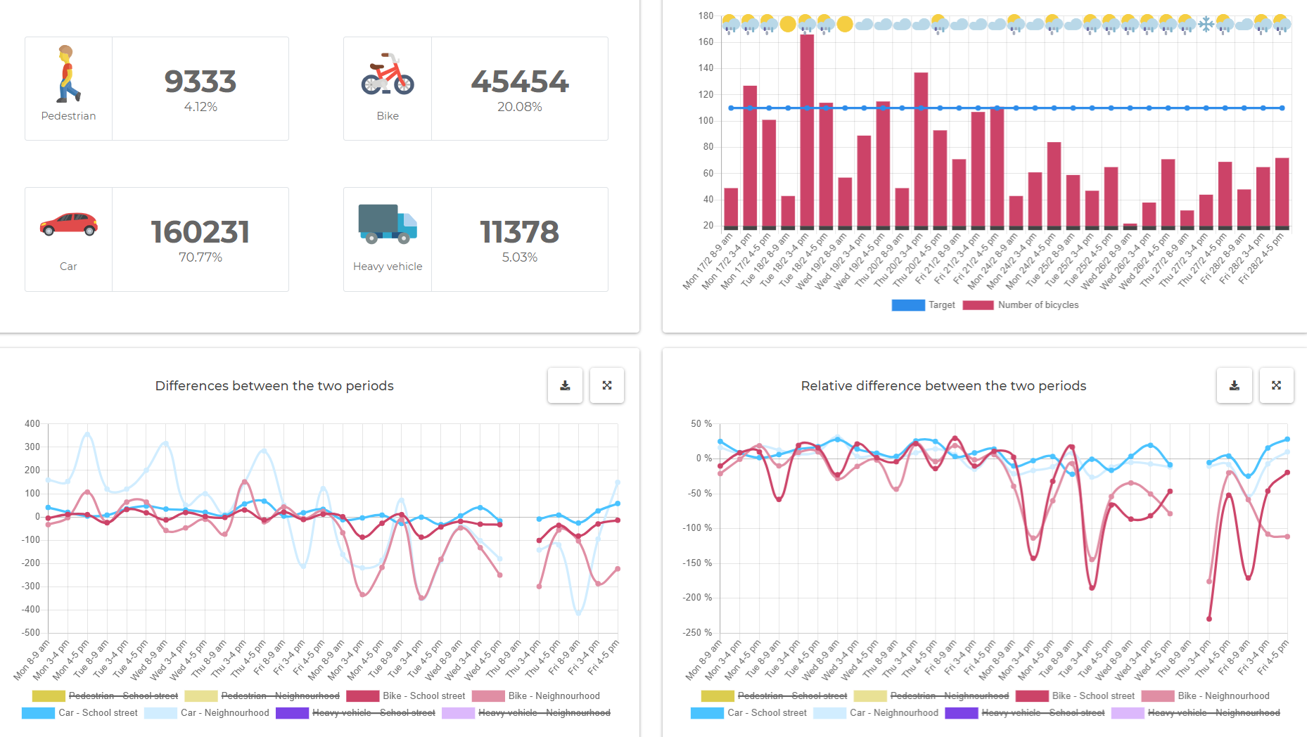
Figure 9: Integrated open policy dashboard of Mechelen's citizen science data