Chapter 3.1: Reading the policy visuals
This hands-on chapter teaches how to derive relevant information from data visualisations to inform decision making.
Good data visualisations should help people make robust decisions based on the presented information. So in order to be fit for purpose, visualisations must provide an accurate representation of the underlying data and communicate it in a way that can be easily understood by non-experts. A good visualisation has big potential to aid the analytical process, enabling users regardless of background to identify patterns, detect anomalies, make predictions, estimate future changes, and more. Today those who use and benefit from visualisations are not just deep domain experts but also senior policy makers engaged in strategic planning, service managers involved in day-to-day operations and also citizens looking for information about their living context.
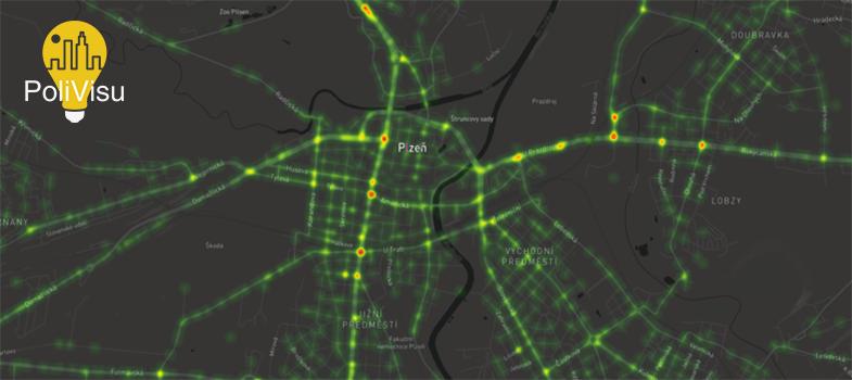
In this chapter, you will learn how to read data visualisations as a traffic expert and policy maker. To aid the learning process, two maps based on real-world data are provided: one for Pilsen, Czech Republic, another for Flanders, Belgium. After playing with the maps you will be asked to review what you learned by answering some questions.
We invite you to watch the presentation below to get an overview of the maps that you are about to use and what you can do with them. The first map reports on traffic in Pilsen using big data for the past four years. The second one visualises accident hotspots in Flanders. In the two following activities you will get a chance to examine the maps in more detail before finally testing your knowledge through a short quiz.
Video 7. WebGLayer presentation
