3.4 Accessible text
Here are some guidelines to consider when creating text for learners.
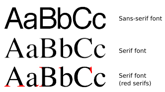
- For any on-screen materials, use a sans serif font. This will suit a majority of your students, especially those with dyslexia (Rello and Baeza-Yates, 2013).
- Left-align long passages of text rather than justifying them. Justified text can contain ‘rivers’ of white space due to the uneven word spacing, making it more likely that readers will ‘slip’ up or down a line and hence it slows their reading speed (Wikipedia, 2017).
- Ensure bulleted lists have a punctuation point at the end of each list item – this helps indicate to screen readers to pause briefly after each item, as one would if reading the list aloud.
- If you wish to highlight a certain passage, such as a quote, indent or use bold type, rather than using italics which are harder to read. Of course, none of these techniques will highlight the passage for screen reader users, so ensure you explain the presence of the quote in advance of the reader arriving at it.
- If you are supplying a text document for download, ensure you have used Heading Styles to denote headings and subheadings. This makes the document much more navigable (especially to screen reader users) and will also ensure that if you then convert the document to a PDF, this too will possess this accessibility feature.
- An audio version of text in your eLearning materials can greatly enhance their usability, as your students can choose which version they want to access. Audio explanations of images in particular can be very helpful.
- If you are providing PDF documents for download (a useful way to provide an alternative mode of accessing the course materials to the online version) ensure the source text or slide document is accessible according to the above points – these features (such as font and colour choice, Heading Styles and Notes field text (see below) should be carried through to the PDF document.

