3.2 Cheating with bar charts
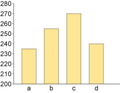
Bar charts are subject to various sorts of ‘creative’ use. For example, the bar chart in Figure 7 shows huge differences in the four charted quantities, does it not?
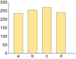
Or maybe not – see also Figure 8.
Many spreadsheet packages that are used to create charts also allow the user to employ shapes other than simple bars when constructing a bar chart. This may not be a good thing.
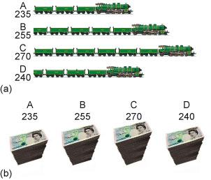
For example, chart widgets like the ones shown in Figure 9 are available from Google Charts. As well as being potentially misleading because it’s not immediately clear where zero lies (the train chart ranges from 200 to 270 whereas the piles of money chart ranges from 0 to 270), the imagery can also be a distraction. Where different 2D shapes are used for the bars, the area of the shape may change out of proportion with the height or length of the ‘bars’, which would mislead the reader at a perceptual level. Where 3D imagery is used, the reader can be confused (even unconsciously) about whether the height or the volume of the chart is what is significant.