

5.5 Choropleth maps
Choropleth maps are some of the most widely used maps for depicting country- or region-based numerical data on a map. Rather than using markers or proportional symbols to render information about a dataset in a visual way, choropleth maps use shading or different colours (often along a spectrum) to colour well defined geopolitical areas of a map, such as a country, state or county, according to a given dataset.
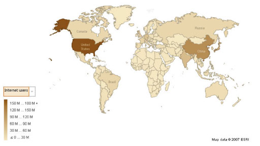
For example, the choropleth map in Figure 16 visualises the same internet usage data that was used to illustrate the proportional symbol map (data source CIA World Factbook; map produced using Many Eyes).
Activity 12 (exploratory)
Read through the notes on creating World Map based visualisations on Many Eyes [Tip: hold Ctrl and click a link to open it in a new tab. (Hide tip)] .
Using this dataset (which is slightly more recent than the one used to produce Figures 15 and 16), a dataset that you have found, or a dataset that you have uploaded, use Many Eyes to create both a proportional symbol map view and a choropleth map view of the data.
Note that if you use the foregoing dataset you will have to resolve some incompatibilities between the country names in the dataset and those that the Many Eyes mapping tool expects. Mostly the suggestions of the dialogue box are correct, but you will have to tell it, for example, that Burma is the same as Myanmar.
- a.How do the map views compare in terms of impact and ability to understand the story being told by the data compared to its numerical, tabular representation?
- b.How effectively does the choropleth map communicate the relative extent of internet usage across the world compared to the proportional symbol map?
- c.What drawback do you think there could be to using proportional symbol maps?
Comment
- a.Both maps make it easy to see how the data values vary by country. You probably found that both of them had more impact and gave you a better understanding of the story being told by the data than did the tabular representation.
- b.To some extent the answer to this is personal. For example, if you are used to using maps where countries are coloured to distinguish them then you may find the choropleth map easier to relate to. On the other hand, you may feel that too much significance is given to large countries (whose colours tend to stand out more than do those of small countries) in the choropleth map and so prefer the proportional symbol map.
- c.The principal problem with a proportional symbol map occurs when the symbol size is large compared to the country size. If proportional symbols were used on a higher scale map, for example to display statistics about different postcode areas in a town or city, it might be quite hard to identify which particular area each symbol corresponded to, particularly if some of the symbols overlapped.
Activity 13 (exploratory)
Now read Perceptual Scaling of Map Symbols, a blog post by John Krygier.
How does our perception of area compare with the way we perceive length? What lessons do we need to bear in mind from a psychophysical point of view when choosing between the use of a choropleth map and a proportional symbol map?
Comment
As with many other visualisation techniques, the way we perceive choropleth and proportional symbol maps can be influenced by perceptual psychological and other psychophysical factors.