

3.3 Cheating with pie charts
Pie charts are some of the most commonly found graphical devices, although they can be difficult to read and are often misleading. (Several commentators suggest they are always misleading, and that, because they only make visual sense for visualising small data sets, it is often better just to use a numerical table.)
So what actually are they used for? Pie charts are charts that are used to represent the distribution of ‘proportions of a whole’. For example, if you conduct a survey of 100 people, you might use a pie chart to display how they answered a question of the form ‘choose only and exactly one item from the following list’, such as ‘which brand did you buy in your most recent purchase of a mobile phone?’ However, if you then went on to ask an optional, ‘yes/no’ question that only 27 of the 100 people were prepared to answer, representing the results from just those respondents in a pie chart would potentially be misleading – a reader might assume that the results applied to the whole survey population of 100. So in that case it might be better to show a chart with three sectors – one for ‘yes’, one for ‘no’, and one for ‘did not answer’.
Changing the size of the whole referred to in different charts in the same report is one way of potentially misleading the reader of a report. But it is also possible to mislead readers in their perception of a single chart. For example, in the pie charts in Figure 10, which sport has the biggest proportion? Which has the smallest?
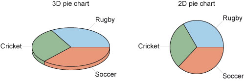
The actual distributions are: soccer 100, rugby 90 and cricket 80 (in a situation where 270 people were asked to choose their favourite among these three sports). In this case, the 3D chart does manage to suggest this, although the differences are harder to spot than in the 2D chart. However, it is also possible to orientate the 3D chart so as to make one sector appear larger or smaller than another, similarly sized one. And colour can also have an effect on how we perceive the relative sizes. A full consideration of the perceptual effects that can be exploited to highlight particular results (or even to attempt to mislead a reader) when designing a chart will not be given here.
And the lesson of Section 3? Choose your axes, origins and colour schemes carefully. And take particular care with 3D charts. If you want to be able to read actual data values, a table may be more appropriate than a visual representation.