

10 Visualising your own demand
Sometimes you won’t have access to large data sets that will give you a definitive answer about what demand is coming in. However it is worth looking at the data just to gain an impression of what might be happening.
Activity 9 Arrival patterns in A&E
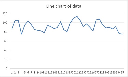
The table below contains real data of patients arriving at a small emergency department of a hospital, recorded by day of week.
| Monday | Tuesday | Wednesday | Thursday | Friday | Saturday | Sunday |
| 86 | 104 | 105 | 75 | 95 | 103 | 96 |
| 85 | 83 | 82 | 78 | 94 | 91 | 87 |
| 89 | 102 | 85 | 80 | 99 | 109 | 114 |
| 105 | 91 | 97 | 90 | 82 | 106 | 107 |
| 95 | 88 | 90 | 86 | 91 | 76 | 75 |
How might you first look at the data? What sort of analysis might you first undertake? Have a think and then click the discussion button below.
Discussion
The first action could be to plot the data on a simple chart just to see if there are any apparent trends or patterns that are obvious. We might be looking for any growth or decline trends, but these are unlikely to be seen in such a small data set. There could be cyclical patterns based around day of week but these are not immediately obvious from this graph, so more work can be done there. It is obvious that the data has some random variation.
What day of week effects might be seen? How can you analyse this?
Discussion
| Monday | Tuesday | Wednesday | Thursday | Friday | Saturday | Sunday | |
| Max | 105 | 104 | 105 | 90 | 99 | 109 | 114 |
| Mean | 92 | 93.6 | 91.8 | 81.8 | 92.2 | 97 | 95.8 |
| Min | 85 | 83 | 82 | 75 | 82 | 76 | 75 |
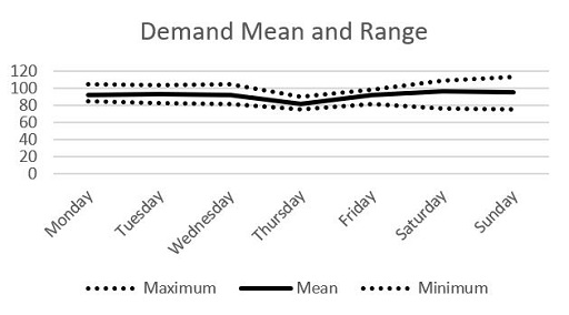
In this case the data tells us that most weekdays are very similar in terms of the number of people coming into the department for some kind of treatment. A typical day would have around 92 patients to treat over the 24-hour period. Thursday seems to be unusual – but there isn’t an obvious explanation. There does appear to be a slight difference at the weekends, which seem to be slightly busier but also the numbers seem to vary more as well. This might need to be explained. Obviously, only a much bigger data set would give us statistically significant results, but at least we now know something about the likely patterns in the data. We’d also need a much bigger data set to look at annual variation etc. (e.g. summer vs winter).
How might this outcome affect capacity planning?
We would need to look at the distribution of arrivals over the 24-hour period to fully understand what to do here. However, if we need to treat every patient how many should we be capable of seeing each day? If we plan for 92 patients per weekday would this be enough?
Discussion
If we only planned for 92 patients per day we would most likely not have enough capacity about half the time. To absolutely guarantee meeting demand we would have to take a look at our busiest ever day. As we have only a small amount of data demand can be even higher, as natural variation and special events would occasionally take it beyond our observed maximums. In practice we would have to also consider having some time of capacity on standby, maybe working other roles but brought in if demand goes higher than expected. In the next section we will also consider how this demand and capacity balance can affect how long people wait in a queue.
We next look at the causes of waits and delays in services, such as how queues form.