

1.3 Comparing data sets using boxplots
Example 1.2 Infants with SIRDS: boxplots
Boxplots are particularly useful for making quick comparisons. The following example relates to birth weights of infants exhibiting severe idiopathic respiratory distress syndrome (SIRDS), and the question ‘Is it possible to relate the chances of eventual survival to birth weight?’ The data in Table 1.3 are the recorded birth weights of infants who displayed the syndrome.
| 1.050* | 2.500* | 1.890* | 1.760 | 2.830 |
| 1.175* | 1.030* | 1.940* | 1.930 | 1.410 |
| 1.230* | 1.100* | 2.200* | 2.015 | 1.715 |
| 1.310* | 1.185* | 2.270* | 2.090 | 1.720 |
| 1.500* | 1.225* | 2.440* | 2.600 | 2.040 |
| 1.600* | 1.262* | 2.560* | 2.700 | 2.200 |
| 1.720* | 1.295* | 2.730* | 2.950 | 2.400 |
| 1.750* | 1.300* | 1.130 | 3.160 | 2.550 |
| 1.770* | 1.550* | 1.575 | 3.400 | 2.570 |
| 2.275* | 1.820* | 1.680 | 3.640 | 3.005 |
| *child died | ||||
van Vliet, P.K. and Gupta, J.M. (1973) Sodium bicarbonate in idiopathic respiratory distress syndrome. Arch. Disease in Childhood, 48, 249–255.
An initial investigation of the question might involve histograms of the two sets of birth weights, as well as calculating their sample means, standard deviations and skewnesses. The results in this case would show that the mean birth weight of the infants who survived is considerably higher than the mean birth weight of the infants who died, and that the standard deviation of the birth weights of the infants who survived is also higher. Using boxplots we will now be able to make some further headway with the question.
For the birth weights (in kg) of the infants who survived, the lower quartile, median and upper quartile are, respectively, 1.72, 2.20 and 2.83. For the infants who died, the corresponding quartiles are 1.23, 1.60 and 2.20. Using these figures, together with the original data in Table 1.3 above, boxplots of the two data sets can be constructed. Notice that in both cases (as in Activity 1) the adjacent values are equal to the sample maxima and minima, so that the whiskers extend to the ends of the sample range. Plotting both boxplots against the same scale produces the diagram in Figure 1.6.
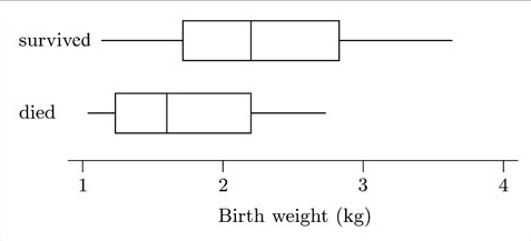
As you saw in Subsection 1.1, a boxplot gives graphical information on the location, the dispersion and the skewness of a data set – that is, on the three aspects of the data set for which summary measures were introduced in Unit A1. In addition, a boxplot draws attention to certain potential outliers. Thus comparative boxplots, as in Figure 1.6, can be used to compare these four features in the data sets shown. This has been done in producing the following discussion of the SIRDS data.
Comparison of location: Figure 1.6 shows that the median birth weight of infants who survived is greater than that of those who died.
Comparison of dispersion: The interquartile ranges are reasonably similar (as shown by the lengths of the boxes), though the overall range of the data set is greater for the surviving infants (as shown by the distances between the ends of the two whiskers for each boxplot).
Comparison of skewness: Though both batches of data appear to be right-skew, and the batch for the infants who died is slightly more skewed than that for those who survived, the skewness is not particularly marked in either case. (In fact, the sample skewness for the birth weights of the infants who survived is 0.25; and for the infants who died, it is 0.53. Both skewnesses are positive; the value for the infants who died is rather larger, corresponding to a more marked lack of symmetry, but neither skewness is particularly large.)
Comparison of potential outliers: Neither data set shows any suspiciously far out values which might require a closer look.
General conclusions: Overall, the two batches of data look as if they were generally distributed in a similar way, but with one batch located to the right (larger location) of the other. You can see immediately that the median birth weight of infants who died is less than the lower quartile of the birth weights of infants who survived (that is, over three-quarters of the survivors were heavier than the median birth weight of those who died). So it looks as if we can safely say that survival is related to birth weight.
You can see how comparative boxplots give a compact, quickly assimilated summary of the data, suggesting that infants who survive and infants who do not may typically have different birth weights.
When using boxplots to compare two or more batches of data, it is usually best to compare individual features in a methodical way. You may find the following guidelines helpful.
Guidelines for comparing boxplots
Compare the respective medians, to compare location.
Compare the interquartile ranges (that is, the box lengths), to compare dispersion.
Look at the overall spread as shown by the adjacent values. (This is another aspect of dispersion.)
Look for signs of skewness. If the data do not appear to be symmetric, does each batch show the same kind of asymmetry?
Look for potential outliers.
After discussing these features, general conclusions should be summarized briefly.
Let us look at another example. This time, you are asked to do the work!