
12.5.1 Epidemic monitoring charts using ‘second largest number’ method
An epidemic monitoring chart is a chart drawn on a large sheet of paper. The x-axis (bottom or horizontal axis) of the chart shows the number of weeks, and the y-axis (the left-side, or vertical axis) shows the number of malaria cases (see Figure 12.2).
The epidemic monitoring chart is a tool that you can use only if you have data on malaria cases for the past five years.
You construct the epidemic monitoring chart using the second largest number seen on a weekly basis, in order to determine the expected number of malaria cases in your village.
Weeks are labelled as 1, 2, 3, 4 up to 52, which sometimes becomes 53. They are World Health Organization (WHO)’s epidemiological weeks. Week 1 always starts around the end of Tahsas. Note that every week starts on Monday and ends on Sunday. Table 12.1 shows the exact dates of the start of the weeks for the Ethiopian calendar (EC) for 2003, 2004, 2005 and part of 2006. Following the same pattern, you can calculate the week number for any year in the future.
| Week No | 2003/2004 EC | 2004/2005EC | 2005/2006 EC |
|---|---|---|---|
| Week 1 | Tahsas 25–Tir 1/2003 | Tahsas 23–29/2004 | Tahsas 22–28/2005 |
| Week 2 | Tir 2–8/2003 | Tahsas 30–Tir 6/2004 | Tahsas 29–Tir 5/2005 |
| Week 3 | Tir 9–15/2003 | Tir 7–13/2004 | Tir 6–12/2005 |
| Week 4 | Tir 16–22/2003 | Tir 14–20/2004 | Tir 13–19/2005 |
| Week 5 | Tir 23–29/2003 | Tir 21–27/2004 | Tir 20–26/2005 |
| Week 6 | Tir 30–Yekatit 6/2003 | Tir 28–Yekatit 4/2004 | Tir 27–Yekatit 3/2005 |
| Week 7 | Yekatit 7–13/2003 | Yekatit 5–11/2004 | Yekatit 4–10/2005 |
| Week 8 | Yekatit 14–20/2003 | Yekatit 12–18/2004 | Yekatit 11–17/2005 |
| Week 9 | Yekatit 21–27/2003 | Yekatit 19–25/2004 | Yekatit 18–24/2005 |
| Week 10 | Yekatit 28–Megabit 4/2003 | Yekatit 26–Megabit 2/2004 | Yekatit 25–Megabit 1/2005 |
| Week 11 | Megabit 5–11/2003 | Megabit 3–9/2004 | Megabit 2–8/2005 |
| etc. | etc. | etc. | etc. |
| Week 35 | Nehase 23–29/2003 | Nehase 21–27/2004 | Nehase 20–26/2005 |
| Week 36 | Nehase 30–Pagume 6/2003 | Nehase 28–Pagume 4/2004 | Nehase 27–Pagume 3/2005 |
| Week 37 | Meskerem 1–7/2004 | Pagume 5–Meskerem 6/2005 | Pagume 4–Meskerem 5/2006 |
| Week 38 | Meskerem 8–14/2004 | Meskerem 7–13/2005 | Meskerem 6–12/2006 |
| etc. | etc. | etc. | etc. |
| Week 51 | Tahsas 9–15/2004 | Tahsas 8–14/2005 | Tahsas 7–13/2006 |
| Week 52 | Tahsas 16–22/2004 | Tahsas 15–21/2005 | Tahsas 14–20/2006 |
Steps for plotting an epidemic monitoring chart
To establish a threshold or reference line for the expected number of malaria cases, you need to have data for malaria cases over the past five years, week by week (as shown in Table 12.2). Using the data you need to follow the steps below to graphically plot the relevant information on the epidemic monitoring chart. This will help you to detect a possible malaria epidemic as early as possible.
| Week No. | 1998 | 1999 | 2000 | 2001 | 2002 | Second largest number (1998–2002) | Current year (2003) |
|---|---|---|---|---|---|---|---|
| 1 | 8 | 42 | 6 | 36 | 14 | 36 | 20 |
| 2 | 12 | 42 | 27 | 38 | 17 | 38 | 22 |
| 3 | 10 | 42 | 43 | 49 | 21 | 43 | 35 |
| 4 | 20 | 17 | 34 | 59 | 32 | 34 | 37 |
| 5 | 34 | 17 | 46 | 20 | 30 | 34 | 36 |
| 6 | 18 | 10 | 34 | 22 | 23 | 23 | 30 |
| 7 | 12 | 19 | 33 | 24 | 25 | 25 | 29 |
| 8 | 37 | 10 | 27 | 41 | 23 | 37 | 32 |
| 9 | 32 | 18 | 37 | 29 | 26 | 32 | 30 |
| 10 | 31 | 24 | 28 | 17 | 13 | 28 | 25 |
| 11 | 22 | 19 | 22 | 12 | 23 | 22 | |
| . | . | . | . | . | . | . | . |
| 51 | 26 | 40 | 34 | 32 | 39 | 39 | |
| 52 | 23 | 35 | 10 | 27 | 25 | 27 |
Step 1 The villages that your Health Post serves is your catchment area. Therefore the data you use to determine the upper limit of the expected number of malaria cases are the cases from your catchment area.
Step 2 Check whether your data are arranged in weeks, as indicated in Table 12.2. One of the sources of the weekly data is the weekly surveillance report that you send to the higher level health facility. The weeks you use are the same as those used in your weekly surveillance report.
Step 3 Tabulate your malaria case data for the previous five to six years (as in Table 12.2). Look at the data: if there was a major epidemic with a large number of malaria cases in the previous five years ignore that year and consider data from the year before.
Step 4 If you have weekly data on malaria cases for five years, note the second largest number of cases from the previous 5 years’ data for a particular week. For example in the five years from 1998 to 2002 (EC), the second largest number of cases during week one is 36, and in week two it is 38 (see Table 12.2). Identify the second largest number of cases for each of the 52 weeks.
Step 5 Plot the second largest number for each week on the epidemic monitoring chart. The line in blue ink in Figure 12.3 is a plot of the upper limit or second largest number, based on the data in Table 12.2. (Note that not all the data plotted in Figure 12.3 are shown in Table 12.2, for reasons of space). This line represents the normal upper limit for the number of cases, or the expected cases of malaria, in the catchment area. It is called the reference line, because it serves as a reference point with which to compare weekly data on malaria cases for the following year.
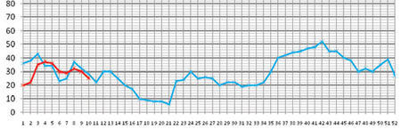
Step 6 During the following year (in the case of Table 12.2 this is 2003, EC), using a different colour of ink, plot the number of malaria cases seen each week on the epidemic monitoring chart (on which you already have the reference line). Plot the previous week’s data on Monday morning.
Step 7 If the number of cases for a particular week in 2003 exceeds the number on the reference line, it indicates the beginning of an epidemic. For example in Table 12.2, in weeks 4, 5 and 6, the number of malaria cases seen are above the reference line. Therefore, by definition, there is an epidemic in these weeks. We say an epidemic has stopped when the weekly number of cases drops below the reference line.
Step 8 After data from all 52 weeks have been plotted for comparison with the reference line, you should draw a new reference line, using the most recent five-year data, to use for the following year. For example in Table 12.2 you would drop the 1998 data, and using the 1999–2003 data, identify a new second largest number for each week. Then using the new second largest number, you would plot the new reference line, against which you would plot data from 2004.
12.5 Detection of malaria epidemics