3 The power of infographics
Infographics can be more eye-catching than the printed word, using images and colour to attract the reader’s attention. For example:
- the brain can see images that last for just 13 milliseconds (Trafton, 2014)
- our eyes can register 36,000 visual messages per hour (Jensen, 2008, p. 55)
- we can get the sense of a visual scene in less than one-tenth of a second (Semetko and Scammell, 2012)
- 90 per cent of information transmitted to the brain is visual (Hyerle, 2000).
Another enormous strength of infographics, especially those for complex datasets, is that it is easier to experience them non-linearly than with text. The viewer’s gaze can shift from point to point, or rescale from overall view to a narrow focus.
Infographics have the potential to create an immediate and lasting impact in communicating research results. They can also aid comprehension of a message, for example, by presenting statistical analyses in a format accessible to non-specialists (if accurately compiled). Perhaps, just as importantly, infographics draw on the techniques of visual artists in their use of colour, shape and figurative content. As a visual art form, they have the potential to affect our emotions in the same way that visual art can, heightening the impact of the message they are intended to convey.
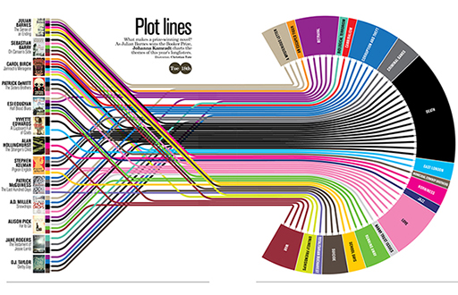
Finally, as already mentioned, infographics are very easy to share via social media. Figure 5, an infographic depicting the plot lines of best-selling novels, shows that it’s possible to create infographics out of almost any type of data. You can click to see a larger version below, or on the Slow Journalism website [Tip: hold Ctrl and click a link to open it in a new tab. (Hide tip)] .
We’ve already noted that infographics are closely related to, but not quite the same as, data visualisations, and that the terms ‘infographic’ and ‘data visualisation’ are often used interchangeably. While infographics present a static view of data, data visualisations are designed to allow the viewer to apply filters to explore a subset of the available data. For example, the ‘World inequality database on education’ (UNESCO, n.d.) shows the powerful influence of circumstances such as wealth, gender, ethnicity and location on people’s education and life opportunities. The visualisation draws on data from the Global Education Monitoring Report (UNESCO, n.d.) and allows filtering by several indicators, including by country. In addition, data visualisations sometimes allow chronological changes to be tracked – for example, changes in primary-school attendance over time.
Infographics can achieve their expressive power through combinations of many different elements. These two resources give an overview of the various components that can appear in infographics and data visualisations.
- Periodic Table of Data Visualization Methods (Visual Literacy, n.d.)
- Introduction to Data Visualization: Visualization Types (Duke University Libraries, 2017)
In the next section you’ll explore ways of assessing the quality of infographics.

