6.2 Pie charts: Activities
Activity 14
To see what we mean, you should follow our calculation of a pie chart using the data in Table 8.
| Race | Number of people (thousands) |
|---|---|
| African–American | 1756 |
| Asian, Pacific Islander | 322 |
| Caucasian | 9511 |
| Native American | 25 |
| total population | 11614 |
-
Collect the data so the number per category can be counted. Table 8 shows the data.
-
Decide on a clear title.
Title: ‘1992 Illinois population by race (thousands)’.
-
Decide on the total number of responses.
The number of categories is four (the four races).
-
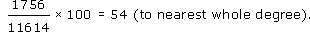
Calculate the degree share in each category.
As an example, here is the calculation of the degree share for African-Americans:
The degree share for each category is shown in Table 9.
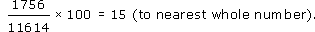
Alternatively, you could calculate the percentage share of each category. Percentage share is calculated as follows (for the share of African-Americans):
| Race | Number of people (thousands) | Degrees (to nearest degree) |
|---|---|---|
| African–American | 1756 | 54 |
| Asian, Pacific Islander | 322 | 10 |
| Caucasian | 9511 | 295 |
| Native American | 25 | 1 |
| total population | 11614 | 360 |
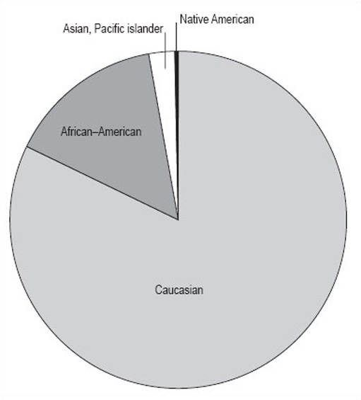
If you are working by hand, it is best to work to the nearest whole number because it is hard to be more accurate than this when drawing. Make a final check that the number of degrees adds up to 360, then draw the pie chart (Figure 13). If you are using a computer to draw the chart, the raw data will be enough and the computer will do the calculation for you.
Activity 15
What do you think Figure 14 shows us?
Discussion
It shows the proportions of the population of Illinois by four different races. It gives a clear picture that the biggest racial group is Caucasian, and that there were only relatively small numbers of Native Americans in Illinois in 1992. However, remember that this data is in thousands of people, and the total population is 11 614 000 people. The actual number of Native Americans is 25 000; don't be misled by the fact that the number looks small in comparison to the others in the pie chart.
Activity 16
Now you can try drawing up a pie chart for yourself from the information below.
The Retail Price Index (RPI) is a UK index that looks at the expenditure habits and costs in the UK of a ‘basket’ of goods. The basket contains all the consumer goods that an ‘average’ household can expect to buy over time, 600 in total. Two groups of households are excluded from this, to make it more representative: pensioners and the high earners. 120 000 measurements are taken each month. The index is calculated monthly, and you may be aware of it as the basis for the monthly headline inflation rate.
The 600 consumer goods are split into areas of general consumption, such as food or housing. Table 10 shows some data on the relative expenditure of an ‘average’ household on goods in the housing sector of the basket. The relative expenditure on each of these goods is expressed in terms of a weight. So, for example, Table 10 shows that in 1998, in the ‘average’ household, three times as much was spent on council tax and rates as was spent on repairs and maintenance. As can be seen from the table, these weights change from year to year as expenditure changes. This is just a part of the data from the RPI.
| Consumer price index | Weight 1998 | Weight 1999 |
|---|---|---|
| housing | 197 | 193 |
| rent | 47 | 47 |
| MIPS | 45 | 42 |
| Council Tax and rates | 30 | 33 |
| water and other charges | 12 | 12 |
| repairs and maintenance charges | 10 | 10 |
| DIY materials | 14 | 12 |
| dwelling insurance and ground rent | 7 | 7 |
| house depreciation | 32 | 30 |
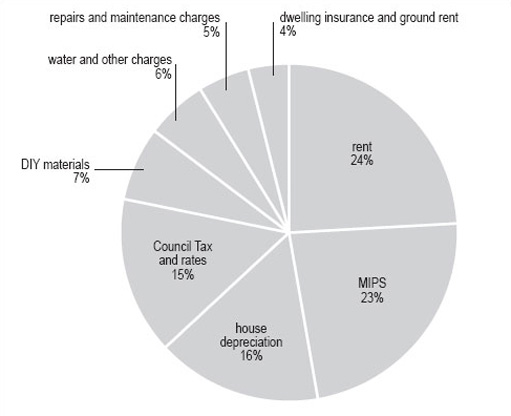
Using the steps we have shown you, try to draw a pie chart using the 1998 data.
Discussion
-
Collect the data so the number per category can be counted. The 1998 data are shown in Table 11.
-
Decide on a clear title.
The title can be derived from the heading of Table 11 and the question. Hence, ‘Consumer price indices housing 1998 weights’.
-
Decide on the total number of categories.
There are eight categories (the ‘housing’ row shows the total of the categories). This is a good number of groups for a pie chart as too many groups make the chart hard to follow.
-
Calculate the degree share in each category.
-
Table 12 shows degree share in each category (the row ‘housing’ has been removed as it is not a category).
For clarity, we have given the degree share to the nearest whole number, but you may, on occasion, be required to use greater accuracy and give the figures to a number of decimal places.
-
Make a final check that the number of degrees adds up to 360, then draw the pie chart.
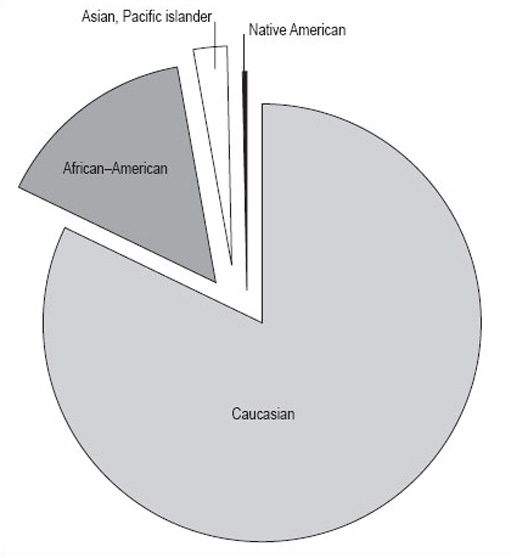
Your pie chart should look like Figure 15 . Note that the inclusion of percentages by each segment makes the pie chart clearer for the reader.
| Consumer price index | Weight 1998 |
|---|---|
| housing | 197 |
| rent | 47 |
| MIPS | 45 |
| Council Tax and rates | 30 |
| water and other charges | 12 |
| repairs and maintenance charges | 10 |
| DIY materials | 14 |
| dwelling insurance and ground rent | 7 |
| house depreciation | 32 |
| Consumer price index | Weight 1998 | Degree(to nearest whole number) |
|---|---|---|
| rent | 47 | 86 |
| MIPS | 45 | 82 |
| Council Tax and rates | 30 | 55 |
| water and other charges | 12 | 22 |
| repairs and maintenance charges | 10 | 18 |
| DIY materials | 14 | 26 |
| dwelling insurance and ground rent | 7 | 13 |
| house depreciation | 32 | 58 |
| total degrees | — | 360 |