
7.3 Frequency tables
So far you have looked at small sets of data, which are relatively easy to analyse. Naturally, this is not always the case and you need to consider how to work with a larger set of data. Data set B shows 30 TMA scores recorded by a tutor in the order that the scripts were marked.
Data set B:
| 86 | 78 | 93 | 89 | 65 | 92 | 84 | 66 | 91 | 90 |
| 85 | 87 | 92 | 73 | 90 | 84 | 79 | 60 | 87 | 96 |
| 81 | 42 | 56 | 84 | 92 | 53 | 85 | 88 | 74 | 77 |
An array of scores, presented like this is hard to read and to interpret, so you need to rewrite the information in a way that makes it easier to understand.
First, arrange the 30 scores in (ascending) order of size:
| 42 | 53 | 56 | 60 | 65 | 66 | 73 | 74 | 77 | 78 |
| 79 | 81 | 84 | 84 | 84 | 85 | 85 | 86 | 87 | 87 |
| 88 | 89 | 90 | 90 | 91 | 92 | 92 | 92 | 93 | 96 |
Now that the data has been arranged in order it is called a distribution.
If you look at this distribution, you can see that all the scores lie between 42 and 96, and you can find the median. In this case, the median is the mean of the 15th and 16th scores (underlined above):
(84 + 85) ÷ 2 = 84.5
In order to find the mean score, you need to add up all the scores and divide by 30. This is a fairly laborious task so you don't have to do this unless you want to check our answer. The total of all the scores is 2399 and, as there are 30 scores, the mean for this set of data is 80 (to the nearest whole number).
It is not possible to find the modal score for this set of data as there are two scores that occur three times, 84 and 92.
Even with the mean and the median for data set B, it is still quite difficult to get a feel for the distribution of these scores. There is one further thing that you can do and that is to group the data into 10-mark intervals.
| Score | Number of students (frequency) |
|---|---|
| 40–49 | 1 |
| 50–59 | 2 |
| 60–69 | 3 |
| 70–79 | 5 |
| 80–89 | 11 |
| 90–99 | 8 |
This is called a grouped frequency distribution. It makes the overall pattern of the data more clear but you have now lost information about the individual scores.
If you now draw a graph using this information, the pattern will be even clearer. Note that, as this data has been grouped into intervals of 10, you should use a histogram to illustrate this data (Figure 16 ).
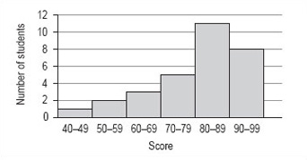
Although there is no modal value for the individual values of data set B, you can now see that there is a modal group or class. This is the group of scores 80–89.
It is not possible to find the precise value of the median from the frequency distribution or histogram. The best you can do is to identify the group that contains the median by adding up the frequencies of each of the groups until you have included the 15th and 16th score. The total of the first four groups is 11 and for the first five groups is 22 so that the 15th and 16th scores must fall within the fifth group, which is the modal group 80–89.
From the histogram and frequency distribution, you can see that most of scores fall in the upper two groups, 80–89 and 90–99. However, the value of the mean was 80, which is at the lower end of these groups. This set of values has a small number of rather low scores and these have the effect of pulling down the mean as compared to the median. This effect is similar to that of the large distance walked by one of the group of students affecting the value of the mean in data set A.