

4.4 Bar charts
Bar charts show data in the form of bars that illustrate the relationship between the items of information in terms of size: the bars get larger (generally taller) as the amounts being shown increase.
When the bars touch, they show continuous data. In other words, data that changes gradually along some sort of a scale, for example weight, height, temperature, or length (these charts are called histograms, see Section 4.5). When the bars are separate, they show discrete data. This is data that changes in whole units, such as the number of eggs, children, cars being produced, or TMAs in a course.
In particular, bar charts are useful to show comparisons. For example, male and female earnings over time, or the company car comparisons that we talked about earlier in this section.
Activity 8
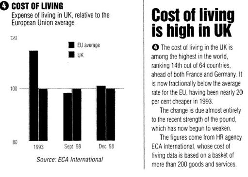
Look at the short article entitled ‘Cost of living is high in the UK’ and the accompanying bar chart, which shows discrete data at particular points in time. Then answer the questions that follow.
-
What is the chart about?
-
How has the cost of living in the UK changed in the period since 1993?
-
Where was the data in the bar chart derived from?
-
How does it relate to the article?
-
What conclusions can you draw from the bar charts and related text?
Discussion
-
It shows the UK cost of living in comparison to an EU average.
-
This is quite confusing. The graph is hard to read, and it doesn't use a consistent scale on the horizontal axis. As you can see, it starts at 1993 and then gives two dates in 1998. In the article, it says that the UK cost of living has now risen in comparison to the rest of Europe, by nearly 20 per cent since 1993. The cost of living index is based on a ‘basket of goods’, much like the Retail Price Index in the UK. This means that specific goods, such as food, housing costs, transport, etc., are monitored and changes in price are recorded.
-
The bar chart has data provided by ECA International. This is a human resources agency. (It seems likely that it is an organisation that relocates staff within Europe, which would mean that it needs this data to supply to clients.)
-
The bar chart relates to the article to only a small extent, most of the article talks about other data that can't be seen from the diagram. It also seems that the data that has been chosen in the article is slanted, as it only talks about France and Germany, while referring to the fact that the UK is 14th in a table of 64 countries. Unless we know all the data, we can't tell if these are the best comparisons to make, although most readers will certainly understand them. In addition, as the EU doesn't have 64 member states, the article is clearly including data that is outside of the scope of the information on the bar chart.
-
We found the chart very confusing to read. The authors, whether Personnel Today or ECA International, have taken the UK index as the standard, and used this as 100 on the vertical axis, hence the horizontal line. They haven't said anywhere that this is what they have done, and it alters how we read the picture. Also, the chart starts the vertical axis at 80, and the normal convention would be to start it at zero. The chart would be clearer in terms of proportion if this were the case, because the differences would not be as marked. You might like to sketch this graph, starting the vertical axis at zero, and see if you can see what difference it makes.