

5 Interpreting graphs and charts
5.1 Difficulties in interpretation
Graphs and charts are often used to illustrate information that is discussed in course materials or a newspaper article, so it is important to be able to interpret them correctly. Often, the authors of an article will attempt to emphasise the point they are trying to make by presenting the facts and figures in such a way as to confirm their argument. This is a commonly used journalistic approach, which means that it is essential to examine graphs and charts used to support arguments very carefully.
In this section we are going to look at the aspects of a graph or a chart that need to be considered in order to interpret the information correctly. We are not going to consider in detail how to draw graphs or create charts, as this is not something that most people find that they need to do.
The examples that follow have all been taken from journals and newspapers, but we have not included the articles from which they are taken from. Our main purpose is to explore some of the difficulties that people face in interpreting information presented in charts and graphs.
Activity 15
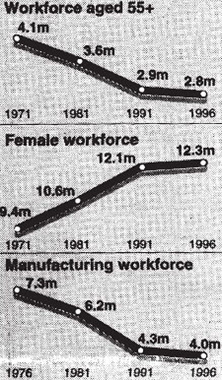
This set of line graphs appeared in an article about the transformation of the workforce over the past two decades. Look at the graphs and try to answer the questions.
-
What do you think 4.1m means?
-
What do you think 55+ means?
-
What impression do you get about the workforce aged 55+ and the manufacturing workforce?
-
Describe what appears to have happened to the female workforce in comparison to the workforce aged 55+.
-
What can you say about the time scales of these graphs?
Discussion
-
‘m’ is an abbreviation for million, so 4.1m is 4.1 million or 4 100 000 people.
-
55+ is a short hand way of indicating all those older than 55.
-
If you compare the top and bottom graphs, your first impression is likely to be that the workforce aged 55+ has declined by much the same amount as the manufacturing workforce. However, the workforce aged 55+ has declined by 1.3m (4.1m − 2.8m), which as a percentage is a decrease of
 × 100, approximately 32 per cent. The manufacturing workforce has declined by 3.3m and this is a percentage decrease of
  × 100, approximately 45 per cent. This means that the manufacturing workforce has actually declined more significantly than the workforce aged 55+ in the last 20 years or so.
 -
The impression given by the graph of the female workforce is that the number of women in work has risen steadily over the last 20 years, in direct contrast to the workforce aged 55+. The actual increase in the female workforce is 2.9m. As a percentage, this is
 × 100 which is approximately 31 per cent. Here our initial impression is the correct one.
 -
The first two graphs give figures from 1971 and the third one starts in 1976. All three graphs have the same distance between each year given on the graph. However, this distance should be less when there is a gap of 5 years than when there is a gap of 10 years.
The horizontal scales are not the same for each graph. It is possible that the 1976 in the third graph is a misprint but even if it is not, the horizontal scales are still misleading. Each of the graphs has the years 1981, 1991 and 1996 evenly spaced along the horizontal axis but the intervals are not the same. 1996 should be closer to 1991 and this would mean that each of the graphs would flatten off less.
Every graph should have a vertical and a horizontal scale. The main purpose of each scale is to allow us to read the values from the graph at any point that we want. None of these graphs have a vertical scale, instead figures are given at intervals corresponding to the vertical scale. If you look carefully at these figures you will see that each graph has a different vertical scale. The top graph goes from 4.1m to 2.8m, a difference of 1.3m, the middle graph goes from 9.4m to 12.3m, a difference of 2.9m and the bottom graph goes from 7.3m to 4.0m, a difference of 3.3m. The height of each of the graphs is roughly the same but as we can now see, the scale is different in each case. This gives a misleading impression of the numbers involved and means that only the general trend of each graph can be compared. For a fairer comparison the vertical scale should be the same for all three graphs.
Activity 16
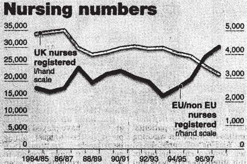
This line graph appeared in an article about the number of non-UK registered nurses with the NHS (National Health Service). After you have looked at the graph, try to answer the questions below.
-
What impression do you think the author is trying to give?
-
There appears to be a crossover point, when did it take place?
-
How many UK nurses were registered with the NHS at this time?
-
How many EU/non-EU nurses were registered with the NHS at this time?
-
Describe what the actual situation as regards UK and EU/non-EU nurses was at this time.
Discussion
-
The author would like us to believe that the number of EU/non-EU nurses registered with the NHS is now greater than the number of UK nurses registered with the NHS.
-
The crossover point appears to have occurred some time between 1996 and 1997. However, the horizontal scale is very difficult to read and it isn't clear where each year starts and finishes.
-
At the point where the lines cross, there were approximately 25 000 UK nurses registered with the NHS.
-
At the same time, there were approximately 2500 EU/non EU nurses registered with the NHS.
-
Contrary to the impression given by the graphs, the number of UK nurses registered with the NHS far exceeded the number of EU/non-EU nurses also registered with the NHS. The total number of nurses registered at that time was 27 500. If we calculate the number of EU/non-EU nurses as a percentage of the total number of nurses (
 × 100) we find that they accounted for 9 per cent of the total. It is fair to say that the number of UK nurses registered is declining but the number of EU/non-EU nurses registered has a long way to go before it over takes the UK number.
First impressions can be very misleading. ‘Nursing numbers’ shows two graphs with two different vertical scales superimposed on one another. As the scales are different, it is incorrect to draw any conclusions from the visual impression of how the two graphs compare to each other. A fairer picture would have been given if the same scale had been used for both. However, given that the number of EU/non-EU nurses registered with the NHS has never exceeded 5000, the resulting graph would not be very meaningful. You might like to have a go at sketching it.
Activity 17
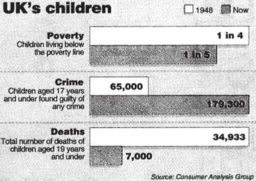
This horizontal bar chart appeared in an article about the pros and cons of modern life for children. After studying it, try to answer the questions that follow.
-
What impression do you get about the number of deaths in 1948 compared with the number of children aged 17 years and under found guilty of any crime now?
-
Do we have any idea of the number of children living in poverty in 1948?
-
Can we tell from the bar chart if the number of children living in poverty has increased or decreased since 1948?
Discussion
-
The bar representing the number of deaths in 1948 appears to be exactly the same in length as the bar representing the number of children found guilty of any crime now. If you looked at this chart quickly, you could easily come away with the impression that the numbers were the same in both cases. However, the numbers given tell a completely different story: the number of deaths in 1948 was 34 933, and the number of children found guilty of any crime now is 179 300.
-
The chart gives the number of children living in poverty in 1948 as 1 in 4, but the number of children living in Britain in 1948 is not given on the chart. The ratio 1 in 4 tells us that
 (which is the same as 0.25 or 25 per cent) of the number of children living in Britain in 1948 were living in poverty.
 -
No, because we don't know the number of children. The chart gives the impression that the number has reduced as the ratio today is 1 in 5, which tells us that
 (which is the same as 0.2 or 20 per cent) of children are living below the poverty line. Since the chart does not give the number of children living in the UK in 1948 or now, we can't be sure whether or not there has been a drop in the actual number of children living below the poverty line.
In order to get a feel for the actual number of children living below the poverty line, you need the figures given in the article, namely that there were 14.5 million children living in the UK in 1948 and there are 14.8 million now. This makes the number of children living below the poverty line in 1948, 3.625 million (![]() × 14 500 000) and now there 2.96 million (
× 14 500 000) and now there 2.96 million (![]() × 14 800 000). These values are very much larger that those relating to crime and death but this is not evident when you first look at the charts.
× 14 800 000). These values are very much larger that those relating to crime and death but this is not evident when you first look at the charts.
The three charts do not have a common scale and therefore should not be compared directly. Here it is very important to consider each chart separately, particularly as the information in the first one is given as a ratio and the other two quote actual numbers. The bar for 65 000 is less than half the length of the bar for 34 933 so unless you look at the figures carefully, your brain can be deceived.
Activity 18
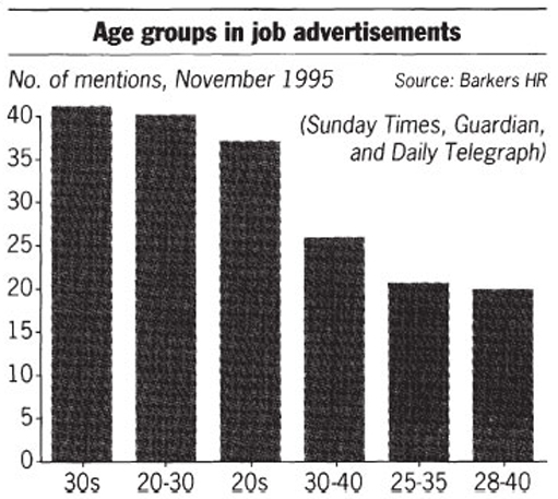
This bar chart shows the number of mentions that each age group got in job advertisements appearing in the Sunday Times, The Guardian and The Telegraph during November 1995.
-
Which age group got the largest number of mentions?
-
Which age group got the fewest mentions?
-
What does this chart tell us?
-
Look at the horizontal scale and comment on it.
Discussion
-
The age group which got the largest number of mentions is 30s.
-
The age group which got the least number of mentions is 28–40.
-
The answers to the first two questions are somewhat contradictory since the age group 28–40 covers the 30s. The introduction to this example says that this chart gives the number of mentions of different age groups in job advertisements in November 1995. It appears that the age group given in each of the advertisements was recorded with the number of each being recorded by this chart. In other words, the chart is simply recording how often each age group description was used.
-
The horizontal scale is simply being used to record the different age groups. Normally you would expect the values to increase from left to right but in this case it is difficult to order the different age groups. The author has chosen to given the age groups in descending order of the number of mentions, which gives the visual impression that the younger age groups got more mentions.
This chart actually tells us very little. The overall impression is that 20s, 20–30 and 30s get mentioned most and no mention is made of 40+ age groups orthose under 20. Given the confused nature of the horizontal scale, it is pointless to look for any meaningful trend in the graph. However, it is interesting to note that this graph appeared in an article claiming that age discrimination still exists.
Activity 19
This bar chart gives the percentage of women giving birth by caesarean section since 1970. Have a look at the chart, bearing in mind the points that have been made so far.
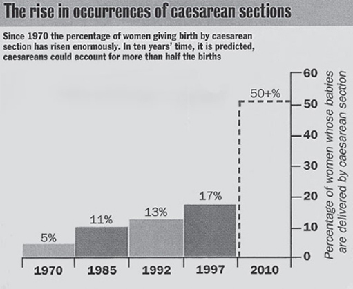
The author of the article in which this bar chart appeared makes the following final comment in the accompanying text:
One specialist I spoke to reckons that the rate could rise to over 50% within the next 20 years. A quick look at the graph suggests he could be right.
What do you think about this statement?
Discussion
You might agree, as the numbers are increasing and the projection has been drawn on the chart. But if you look more closely at the figures given, you will probably feel that the projection is somewhat exaggerated. You might feel that we should be able to make a stab at what the figure will be and this is exactly what we will now do.
In order to decide if the statement is correct we must first look at the horizontal scale. The interval between 1970 and 1985 is 15 years, there are 7 years between 1985 and 1992, and 5 years between 1992 and 1997. However, there is not a regular interval between each of the years given on the chart which means that it is not possible to extrapolate the diagram to predict the value in 2010. The easiest way to decide what the figure might be, is to redraw the chart as a line graph with an evenly spaced scale on the horizontal axis. When we do so, we get this line graph.
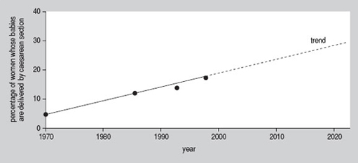
By extending the line drawn through the data values we were given, we can now see that the possible value in 2010 might be 22%. When we consider the 20-year interval that the author refers to, in 2019 the value only increases to about 28%. This is somewhat less than the 50% suggested by the article.
The article discusses whether or not women should be allowed to have a caesarean section on demand and cites evidence to show that more and more women are opting for this. Even if we allow forthe fact that the number of caesarean sections is growing more quickly now than in the 1970s or 1980s, it is not obvious from the figures that the rate could rise to over 50 per cent within the next 20 years.
Activity 20
This line graph gives the age distribution of the working population in Great Britain (GB). After you have considered it, try to answer the questions alongside.

-
What trend do you think that this graph is trying convey?
-
Do you find it easy to interpret this graph?
Discussion
-
You may well feel that there is no obvious trend. However, you might have said that the graph shows that the number of people aged 44+ is going to increase. You may also have said that the other two age groups will see a slight drop in numbers.
-
The graph is not very easy to read. It is not immediately clear whether one is looking at the space between the lines or the three lines themselves. If we consider the spaces, in 2006 the working population is predicted to be made up of about 5 million people aged 16–24, about 3.5 million people aged 25–44, and about 5.5 million people aged 44+. This suggests that the total working population will be 14 million. However, if we consider the lines, in 2006 the working population is predicted to be made up of about 5 million people aged 16–24, about 14 million people aged 25–44 and 10.5 million people aged 44+. This suggests that the working population will be 29.5 million. This figure is more believable since the actual working population is currently about 27.5 million.
This is an example of how an author can try to emphasise the point they want to make by the way that they draw the graph. We need to take great care when we look at a graph or chart in case we are misled by it. The original graph also used colour to emphasise the spaces: the 16–24 space was blue; the 44+ space bright yellow; and the 25–44 space, orange. It would make more sense for the graph to have the 44+ band on top, but the author has chosen to sandwich it in the middle. The accompanying article was about age discrimination and it maybe that the author felt that by structuring the graph in this way, it highlighted the situation for the over 44s.