

3 Reading articles for mathematical information
We gain much of our mathematical information from our surroundings, including reading newspaper and magazine articles. A skill that will be useful to all of us in our studies is the ability to do this in a structured way, as it is very easy to be uncritical of the information that we see. Newspapers and magazines frequently place mathematical information in the form of graphs and diagrams. All too often, we tend to assume that the information is correct, without questioning possible bias or inaccuracy by the author or authors.
When you next look through a newspaper or magazine, try to get an idea of which ones use some form of mathematical representation. We noticed that some magazines rarely use this form of information, and that broadsheet newspapers were more likely to use mathematical information than the tabloid newspapers.
Activity 2
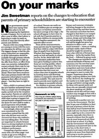
To show you what we mean we have included a newspaper article, ‘On your marks’ taken from The Guardian. Read it now and then answer the questions below before moving on to the discussion. You can download a more easily readable Word version here: On your marks [Tip: hold Ctrl and click a link to open it in a new tab. (Hide tip)] .
-
What influences might the identity of the newspaper have had on how you react to the diagram or article and, in particular, to the conclusions drawn?
-
Where was the data in the graphs derived from?
-
How does it relate to the article?
-
What conclusions can you draw from the use of the graphs related text?
Discussion
-
This is difficult to answer. The Guardian is a broadsheet, and has a reputation for reasonably accurate reporting. This material is from The Guardian Education (published weekly on a Tuesday) – you might feel this tends to give an air of authority.
-
The data was taken from a Department for Education and Employment (DfEE) publication, called Excellence in Schools, and published in 1997. Therefore, the UK Government published the data. The data relates to the amount of homework and television that children in their last year of primary school were doing – in other words, while they were aged about 11 or 12.
-
If you look at this article carefully, you will see that the last paragraph of the article is the only one that discusses the data.
-
The author has linked the data to the discussions about changes in schools. He talks about the reduction in class sizes that was a pledge made by Labour at the 1997 election, and the baseline assessment tests. He suggests that the children who do least homework also watch the most television, but you can't see that from the figures given in the diagram. While the two activities do seem to be related, it is possible, for example, that some children don't watch any television and don't do any homework.
To find examples for the rest of this course, we looked through a variety of sources to see how mathematical information is presented in newspapers and magazines. We are not suggesting that the ones we selected are entirely representative, as we have deliberately chosen examples that will help you to question what you see. This means that some of the graphs and diagrams that we have used are accurate representations and others are less so. However, although we have chosen these representations carefully, we had no difficulty in selecting across the spectrum from completely accurate to misleading. We suggest that you bear this in mind as you look at the information you see around you.