

4.2 Treemaps
One colleague still talks about the impact of the first treemap he saw; it was in a blog post by book publisher Tim O’Reilly on the Book Sales as a Technology Trend Indicator (O’Reilly, 2005). It’s shown in Figure 12 below. The reason the treemap made such an impression on him was that one single diagram was capable of portraying several different sorts of information at the same time:
- the relative market share of different topic areas (systems and programming, business applications, and so on);
- the relative market share of different subtopics within each topic;
- the relative growth or decline in market share over the previous 12 months.
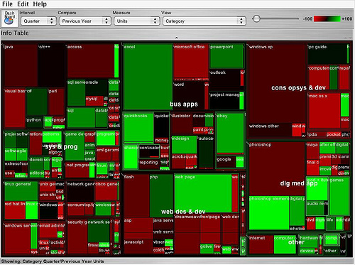
In addition, the controls at the top of the treemap suggested it was an interactive tool that could potentially be used to explore the data in different ways (the drop-down selection list boxes) or maybe even filter out different results (the −100 to +100 slider). In short, the graphic was powerful and unambiguous, and communicated a lot of different information in one image. The suggestion was also there that the tool that generated it provided a powerful and intuitive way of exploring hierarchically structured data in a dynamic way.
So let’s see how the treemap shown in Figure 12 depicts, at a glance, several different sorts of information at the same time. First, the relative size of the market for different categories of computer books (O’Reilly is one of the best known computer book publishers): the area of each rectangle reflects the relative sales volume of books in one category compared to the others. Second, the year on year change in the volume of sales per category: the chart shows this by using the dimension of colour, with red being market decline and green being market growth.
Activity 8 (exploratory)
Do a web or blog search for “state of the computer book market” to find the most recent O’Reilly review of the computer books market. Visit the review page, but before reading the commentary, just look at the treemap(s) that are presented, and write your own conclusions regarding what they say about the state of the market. Then read through the commentary and compare the conclusions to your own. How ‘intuitive’ did you find the treemap to read?
Comment
Depending on your prior experience and how you respond to visual data, you may find treemaps intuitive to use – or you may even find them confusing.
Have you spotted that the data shown on treemaps can be hierarchical, though only to two levels? For example, Figure 12 has major categories of books sold, indicated by rather cryptic abbreviations such as ‘sys & prog’, ‘web des & dev’, at the upper level. These refer to the ‘window panes’ of the treemap – the areas lying between the thick black lines. At the lower level in Figure 12 are the categories within these major categories. For example, within ‘sys & prog’ are ‘java’, ‘c/c++’ and so on.
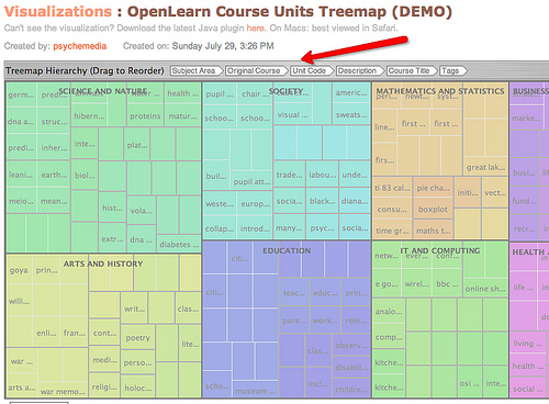
Treemaps are a good way of exploring various types of hierarchically organised data. For example, Figure 13 shows a screenshot from the IBM Many Eyes visualisation service, where a treemap has been used to represent the range of course units offered by OpenLearn during its first nine months of operation. Subject Area describes the topic area the course is released under; Original Course describes the course code for the course that the OpenLearn material was taken from; Course Code is the course course identifier for each course on OpenLearn. By rearranging the order of the headers, the treemap can be used to create different hierarchical views of the data, views which might be used to explore the data, or even potentially provide an interactive navigation menu for the materials.
You can find treemaps elsewhere on the web, either as working interactive treemaps, or as simple images (for example, search for treemap (all one word) using your favourite image search engine). One of the most compelling treemaps I have found is the Hive Group World Population treemap, which uses data from the CIA’s online World Factbook to provide a highly interactive way of exploring world population data. If you are interested and have time, you may like to spend a few minutes looking at the Hive Group World Population Statistics treemap [Tip: hold Ctrl and click a link to open it in a new tab. (Hide tip)] .
Activity 9 (exploratory)
Either:
Go back to the Many Eyes site, find the Many Eyes description page about treemaps and read through it. Using this data set based on the medals from the 2008 Summer Olympics, see if you can create your own treemaps to display:
- the distribution of medals by country, ordered by medal type and discipline;
- the distribution of medals by discipline, ordered by country and discipline;
- the distribution of medals by discipline, ordered by country and medal type.
Hint: click on the big ‘visualize’ button to load the visualisation selection page; then click on the big icon that depicts a Treemap to create the treemap visualisation. You should now have a Treemap visualisation.
Note that there may be some issues with running the Many Eyes treemap in certain browsers, including the possibility that your browser will hang. If this happens, force your browser to close using Ctrl+Alt+Del in Microsoft Windows or ‘Force Quit’ in Mac OS X.
Or:
You may prefer to create a treemap from a data set you have uploaded to Many Eyes yourself, either using a data set of your own, one you have discovered on Many Eyes, or one you have located elsewhere. (Take care uploading data to Many Eyes – if uploaded there, it will be made public.)
Read the guidance notes at Many Eyes: treemaps to see how to upload the data in an appropriate format.
As well as the ‘simple’ treemap, Many Eyes can also be used to identify changes in data values in a way reminiscent of the treemaps used in the O’Reilly ‘State of the Book Market’ reports, using the ‘Treemap for comparisons’ (sometimes referred to as a ‘change treemap’) visualisation. If you have a data set you think would benefit from visualisation using one of these types of treemap, the guidance notes on Many Eyes explain how to prepare the data.
Activity 10 (self-assessment)
- a.In what situations might you choose to use a hyperbolic tree visualisation?
- b.How might you use a treemap to display changes in a set of data over time?
Comment
- a.The hyperbolic tree is ideal for dealing with large hierarchical data sets because it allows for the dynamic resizing of parts of the tree that are not currently in focus. So, for example, if you had a very large tree plotted out in a traditional, 2D rectilinear tree view, you would either have to zoom in to areas of the tree you were interested in to look at them, or scroll to the part of the tree you were interested in. The hyperbolic tree makes far more efficient use of space, and allows you to navigate the whole tree, even a large one, in quite a small viewing area.
- b.Treemaps can be used to be display changes in data values between two points in time using the dimension of colour. Typically, the most recent data set will be used to determine the area of each block, and the colour then indicates the degree of change from the earlier data set. So for example, in the O’Reilly book sales treemap, the area of each block represented the current year’s sales, and the colour was the percentage growth (green) or decline (red) in volumes from the previous year, with the intensity of the colour indicating how large or small the change was.