

3.3.1 What would an equal distribution of income look like?
If incomes were distributed equally between deciles, each decile of households should have 10% of the overall income: the bottom 10% of the population of income earners should receive 10% of total income, the second decile should also receive 10% of total income right up to the top 10% of the population income.
However, this is very rarely the case. Many societies display inequality, which is shown by an unequal distribution of incomes. It may be that the top 10% of households receive 20% of the overall income in the economy while the bottom 10% only receive 7% of overall income.
Activity 6 Inequality and income shares
Figure 10 shows the income share from the late 1930s to 2010 for each decile in the UK economy. Each decile shows the share of total income going to that proportion of the population of income earners.
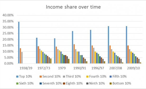
Notes: 1938/9 and 1972/3: Royal Commission in Income and Wealth; 1979; 1990/1 JRF 1995; 1996/7 onwards HBAI. Data on all deciles are not available in 1938/9. The 1938/9 and 1972/3 figures are not strictly comparable with the later series, and are merely indicative. The figures after 1979 are calculated after housing costs. Figures may not sum to 100 because of rounding.
Based on the graph, answer the following questions.
In which time period is the income share of the top 10% of the population at its lowest? Notice what happens to this share from the end of the 1970s.
Answer
Figure 10 shows that in the late 1930s the top 10% of the population received almost 35% of total income. This share fell substantially over the following years to just over 20% in the 1970s. However, this trend was reversed from the beginning of the 1980s as the income share of top decile rose to over 30% again over the course of the next three decades.
Describe what happens to the income share of the bottom 10% over the same time period.
Answer
Over the same period the bottom 10% of the population saw a corresponding decrease in the share of total income that they received. The bottom 10% of households saw their highest share of income in the 1970s although it still remained below 5%. The income share that this group receives declines steadily from 1980 to a very low level in 2009/10.
When does inequality seem to be at its lowest?
Answer
Inequality seems to be at its lowest in the 1970s. The bottom 10% has its highest share of total income in 1972/3 while the top 10% simultaneously has its lowest share in 1979, although these values are fairly stable over the 1970s as a whole. Inequality decreased in the 1970s as the share of the richest fell while the share of income going to those on lowest incomes rose. In general in 1979 there appeared to be a more equal spread of incomes.
This pattern of inequality has been observed in countries other than the UK. Well-known work by the French economist Thomas Piketty (2013) considers the income shares across high-income countries. He finds similar trajectory of falling income inequality in the early part of the twentieth century and rising inequality from the late 1970s onwards.
Activity 7 Top income shares across time and space
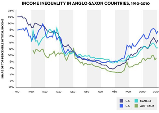
Rather than breaking down the distribution of incomes into deciles as in Figure 10, Figure 11 uses percentiles, i.e. the distribution of income across hundred equally-sized groups. The graph shows the share of total income going to the top percentile of the population, that is the top 1%, in UK, US, Canada and Australia.
Figure 11 shows that all 4 countries experienced an initial fall in inequality, measured by the share of income held by the top 1%, until 1980 followed by a rise in inequality since.
Out of the four countries in Figure 11, which one saw the greatest increase in inequality between 1980 and 2010?
Answer
Figure 11 suggests that since 1980 the USA saw the greatest increase in inequality, followed by the UK, with Australia seeing the smallest increase in the share of income going to the top percentile in the three decades 1980 to 2010.
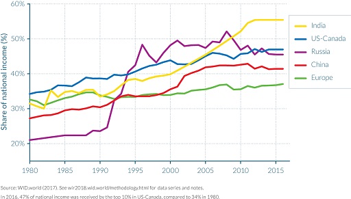
Figure 12 shows the share of income received by the top 1% of income earners in each of the following regions: India, US-Canada, Russia, China and Europe.
Using Figure 12, identify which region has seen the smallest increase in inequality over the time period shown in the graph?
What can you say about inequality in these regions from 2010 onwards?