

9.5 Multiple-cause diagrams
Multiple-cause diagrams are another way of using interconnectedness to structure a complex situation. In this case, the interconnectedness is that of causation. Multiple-cause diagrams represent both sufficient and contributory cause, without making a distinction between them. Drawing multiple-cause diagrams allows for the identification of systems of causation. Such a system can be pictured as an interconnected group of events or effects; the effect is of a system that behaves as if its purpose were to cause other events and effects. Sometimes, if one of the input causes is removed, the output effects continue to happen, either because feedback loops are present or because there are other causes to drive the effects.
The power of multiple-cause diagrams as ways of structuring complexity goes to the heart of the idea of complexity. This will be explored later, but I mention it here because complexity is typified by causal links. Multiple-cause diagrams allow me to see past the simple idea of single chains of causation and allow me to represent the webs of causation that lie at the heart of many complex situations.
In drawing multiple-cause diagrams, even more than other diagrams, I find using a pencil and rubber is essential. It is a process of untangling the causal links so that they lie flat on the page with the minimum number of lines crossing. This takes a lot of iterations. The fewer lines that cross, the more your diagram will reveal.
Expect to take about an hour for the following activity; more if this is your first attempt at a multiple-cause diagram.
Activity 24
Draw a multiple-cause diagram of the events or effects that seem to be central to the complex situation described in the case study.
You may like to draw several drafts. (You can find some further guidance on this type of diagram at this link [Tip: hold Ctrl and click a link to open it in a new tab. (Hide tip)] .
Make notes about what your diagram reveals, questions it raises and things you would like to know more about.
It may be you can, at this stage, begin to see ways the situation might be improved. Make notes about this.
SAQ 4
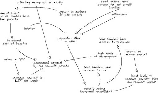
Examine the multiple-cause diagram in Figure 16. Identify the strengths and weaknesses in the diagram, as it relates to the case study. What do you like about it? What are the things you find hard to understand? Are there any technical difficulties with it?
Answer
There are quite a few good points in this diagram. There are also some problems. The diagram is about the right size; which is to say it contains about the right number of elements for the space, so it's easy to read. It has a title – although there are problems with it – and it is easy to follow the train of thought that led to the diagram's development.
Creating a good diagram takes skill developed through practice. This one has the makings of a good diagram but the following issues need attention.
The title needs to say what type of diagram this is, otherwise it is not possible to attribute any meaning to the arrows. This is intended to be a multiple-cause diagram so the arrows should mean ‘contributes to’, ‘causes’, or ‘leads to’. I can check whether this is what they do mean. I notice, for example, that some logical errors become evident when I apply this test. The survey in 1987 did not lead to an average payment of £27 per week. It was just one of the things it identified. The title also needs to suggest some of the events or effects whose causes the diagram is trying to explore: ‘… in the 1980s’ is rather vague.
Other logical errors include the connection from ‘parents on income support’ to ‘least likely to receive payment from non-resident parent’. I can't find a meaningful way to connect these using ‘contributes to’, ‘causes’, or ‘leads to’ – and certainly not in the context of the case study. The same is true of ‘court orders more common for better-off families’ and ‘payments wither in value’. In this instance, it looks as if a time sequence has crept in. There is no arrowhead at all between ‘inflation’ and ‘payments wither in value’ and it may be pointing in the wrong direction between ‘increased cost of benefits’ and ‘decreased payments by non-resident parent’.
There are several places in the diagram where the arrows cross each other and this effectively disguises the fact there are two quite separate chains of causation in the diagram. (Imagine ‘inflation’ moving to the right and ‘high levels of unemployment moving to the left.) This is an important insight that is likely to be overlooked because the drawer allowed herself to get away with avoidable crossings over.
It's not altogether clear what is meant by ‘indifference’ without a detailed reading of the text.
Sorting out the crossovers and re-thinking the title would prompt the drawer to think more clearly about what she was trying to explore and perhaps to rearrange the diagram so that there was a more obvious direction of flow. That would make it easier to read.
The next activity asks you to evaluate your learning needs. Notice it does not ask you to evaluate your diagram against a standard. (This is why I have not given you a version of my multiple-cause diagram.) If you really want to compare your multiple-cause diagram with someone else's you should refer to Figure 44, which shows a causal-loop diagram. Rather, you are asked to reflect on how pleased you are with your diagram.
Expect to take about 20 minutes on this activity.
Activity 25
Make some evaluations of your diagramming skills, using your multiple-cause diagram as the focus of your attention.
Identify the things in your diagram you are pleased with. This may be something quite technical, like a developing skill in reducing the number of crossed lines. Or it may be something like an increased ability to get insights from the diagram; the enjoyment of drawing the diagram; or the sense of achievement when you find yourself better able to understand the complexity of the situation.
Identify technical improvements you would like to see in your diagram. Improved neatness? More elements in the diagram? Less elements in the diagram? An ability to prune out elements that obscure the main points?
What changes will be needed to bring this improvement about?
Identify things you feel you should be getting from diagramming you are not getting yet? Are there things that still puzzle you? How are you going to resolve that puzzle? What sources of help and support do you have access to?