

2.2.2 Ungrouped frequency distribution tables
When you are summarising small amounts of data, then it is better to organise and represent it in an ungrouped frequency distribution table. This is a type of distribution that shows how many times each individual value occurs in a data set; they are usually used to calculate the accurate frequency of individual data values.
For example, say you are interested to know how many plants people have in their homes. A survey gives the following figures as number of plants that 18 different people have in their homes:
Number of plants = 1, 5, 2, 2, 3, 3, 5, 5, 1, 1, 1, 3, 4, 4, 2, 3, 3, 3
To answer your question, first you need to see the frequency of each value in the data. Value 1 occur 4 times, so you can describe it as 4 people having 1 plant. Then you do the same for the rest of the values, so: 3 people have 2 plants, 6 people have 3 plants, 2 people have 4 plants, and 3 people have 5 plants.
In the following activity, you will learn how to make ungrouped frequency tables in Excel.
Activity 2 How to make an ungrouped frequency table in Excel
In this activity, you will learn how to make an ungrouped frequency table in Excel. Once you have produced the ungrouped frequency table in Excel, you may need to compare it with the final output by clicking ‘Reveal discussion’. This will help you to see whether you have produced the accurate ungrouped frequency table or not.
Watch Video 1, which gives on how to create a frequency table, or follow the instructions below.

Transcript: Video 1
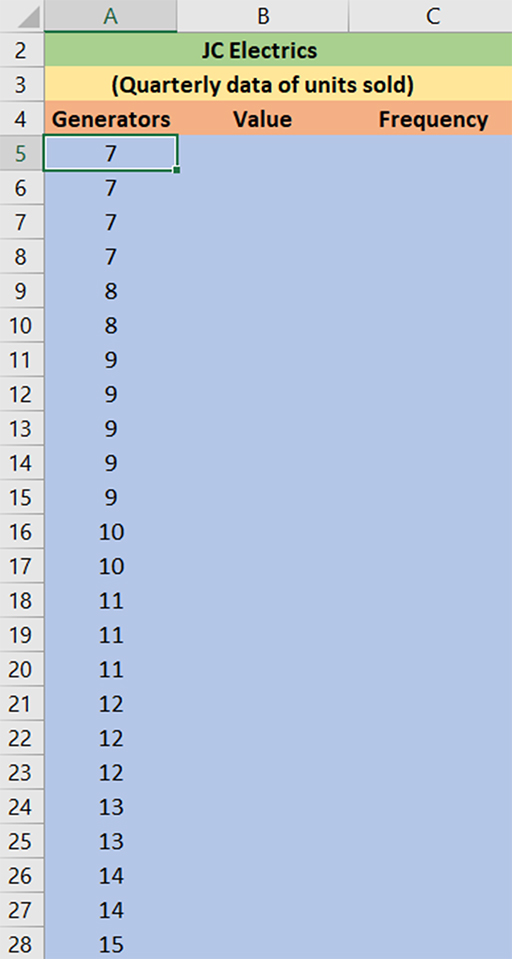
- Open the Excel file JC Electrics [Tip: hold Ctrl and click a link to open it in a new tab. (Hide tip)] . This file contains the quarterly data of number of generators sold. Make sure that the data is arranged in columns.
- Copy the data containing the number of generators sold to Column A of a new worksheet.
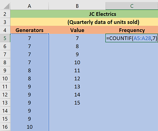
- Label Column B ‘Value’ and label Column C ‘Frequency’.
- Find the minimum and maximum value in the data. In this example: =MAX(A5:A28), which is 15, and =MIN(A5:A28), which is 7
- Calculate the range: (MAX – MIN), so .
- Arrange the values in Column A in ascending order. Select the values (A5:A28) in Column A, click Data in the toolbar and then click Sort, select Continue with current selection and press Enter. Figure 8 shows how your information should be displayed.
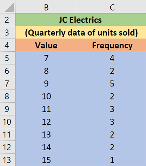
- To count the number of quarters in which 7 units were sold, you need to calculate the frequency in Column C. Type =COUNTIF (Range, value). For example, =COUNTIF (A5:A28,7)
- You should now save your file as you will return to this ungrouped frequency table in a later activity.
As is mentioned above, ungrouped frequency tables are useful when you have a small set of data and you want to easily observe the frequency of each value in the data set. However, if you have a large data set then a grouped frequency distribution table is the best option; you will learn about these in the next section.