2.3 Histograms: a graphical visualisation of frequency tables
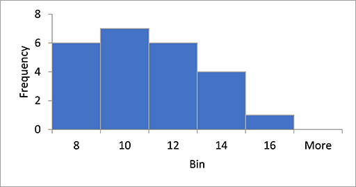
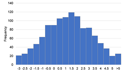
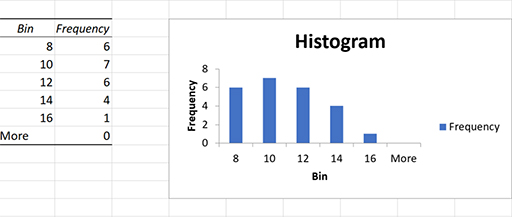
A histogram is a popular visualisation tool to summarise the distribution of continuous data. In a histogram, the variable is divided into intervals called ‘bins’. You then count the number of observations in each bin and plot the resulting table in a bar chart. The horizontal x-axis displays the ‘bins’ and the vertical y-axis displays the number of observations in each bin. Histograms can help you to see whether the data is clustered around certain values or whether there are many small or many large values. A typical histogram in Excel looks like the bar chart below. Note that the values on the x-axis show the upper limit of the interval. In a proper histogram, there are no spaces or gaps between the bars.
In the following activity, you will learn how to plot a histogram in Excel.
Activity 6 Using Excel to draw a histogram
In this activity, you will learn how to produce a histogram in Excel by following the instructions that are given below. Once you have produced the histogram in Excel, you can check your answer by clicking ‘Reveal discussion’ below.
- Open the Excel file called JC Electrics [Tip: hold Ctrl and click a link to open it in a new tab. (Hide tip)] , which contains the quarterly data of number of generators sold. The third column C contains information about the number of generators sold in each quarter of the year.
- Find the minimum and maximum value in the data set. You can obtain them through the min (range) and max (range) functions in Excel. Type =MAX(A5:A28) into cell L10 and =MIN(A5:A28) into cell L11. This will give the minimum and maximum values of the data set, which are 7 and 15.
- Next, you need to specify a range of intervals (often called ‘bins’) for which to count the number of observations that fall into each bin. The maximum value is 15 and the minimum value is 7, so you can make the class intervals 7–8, 9–10, 11–12, 13–14, 14–15, 15–16 etc. This means that the first class has the lower value 7 and the maximum value 8 and so on. See Columns C and D in the worksheet in Figure 18.
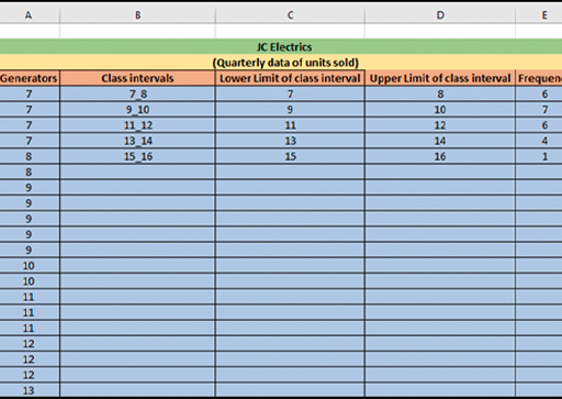
There are many ways to calculate the width of the bin in Excel. One of the easiest ways to calculate it is as the width of the bin or class intervals (sample size / range), which is 3 (i.e. 24/8=3). In this example, the bin width is 2.
- Click on ‘Data Analysis’ in the ‘Data’ ribbon. This will bring up a list of some of the statistical analyses that you can perform in Excel.
- Select ‘Histogram’ and click ‘OK’.
- Specify the input range as A5:A28 and the bin range as D5:D9
- Tick the box ‘Chart Output’ and specify the output location as H5, as shown in Figure 19 below.
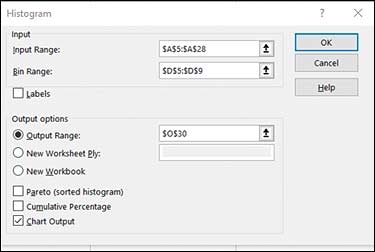
Click ‘OK’. Excel will put the histogram next to your frequency table.
- To remove the space between the bars, right click a bar, click Format Data Series, and change the Gap Width to 0%.
- To add borders, right click a bar, click Format Data Series, click the Fill & Line icon, click Border, and select a colour.
- Now click ‘Reveal discussion’ to compare what you have made against the answer.