3.2 Scatter diagrams
A scatter diagram is another way to visualise a quantitative bivariate data set. This is a two-dimensional diagram or graph with one variable on the x-axis (the independent variable) and the other variable on the y-axis (the dependent variable). You can then plot the corresponding point on the diagram.
In the next activity, you will produce a scatter diagram in Excel either by following the video or the instructions provided.
Activity 9 Drawing scatter diagrams
The screencast in Video 5 gives you instructions on how to draw scatter plots in Excel.
Transcript: Video 5
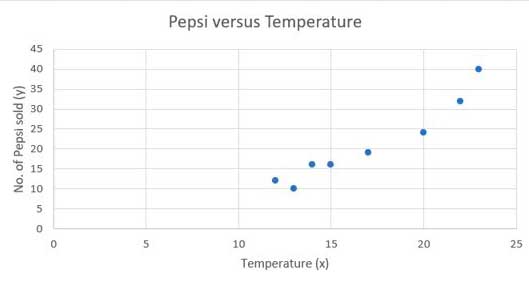
Look at the following example, which shows a data set relating to the temperature on several days in June, and the number of Pepsi drinks sold in a small shop.
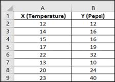
| Temperature (X) | 12 | 14 | 15 | 17 | 22 | 13 | 20 | 23 |
| Pepsi (Y) | 12 | 16 | 16 | 19 | 32 | 10 | 24 | 40 |
Here, temperature is the independent variable and number of drinks is the dependent variable, as the sale of Pepsi is affected by changes in the temperature. Hence, you will plot temperature on the x-axis and drinks on the y-axis.
To find out if there is any relationship between variable X (Temperature) and variable Y (Pepsi), execute the following steps in Excel.
- Select the range A1:B9
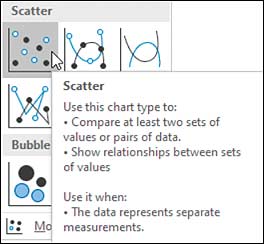
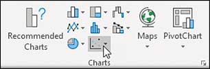
- On the Insert tab, in the Charts group, click the Scatter symbol.
- This will open a drop-down menu showing various types of scatter plots. The standard type is the one with unconnected dots in the top left. Click the Scatter symbol to insert this chart.