

2.2 Market demand and price
This subsection will explore the widely observed relationship between the quantity demanded of a good by consumers and the price of the good: the lower the price, the greater the quantity demanded. This relationship underlies the way in which falling prices are responsible for the rapid take-up of new products by consumers, as reported in the quotations above. We focus on the market demand curve, which represents the demand of all the consumers in a given market. However, as well as the price of the good, there are other influences on market demand, discussion of which will be postponed until Section 2.3. This makes it possible to take a step-by-step approach and to begin by considering the influence of price alone.
The relationship between demand and price can be represented in different ways: in words, in a diagram or by using algebra. We expressed it in words in the preceding paragraph: the lower the price, the greater the quantity demanded. This relationship can also be shown in a diagram, known as a demand curve (always by convention a ‘curve’ though it may be drawn as a straight line). Figure 3 shows a demand curve, and we look at it in detail in a moment. Note first that as part of the step-by-step approach, the demand curve is drawn on the assumption that the price of the product is the only relevant variable influencing demand for the product. A ‘variable’ is a precisely defined aspect of the economy, such as the price of a good, that can take a range of values (such as £1, £2, £3,…).
All the other influences on market demand are held constant while we look at the relationship between demand and price. This procedure is usually known by the Latin phrase ceteris paribus, which means ‘other things being equal’. It is the foundation for constructing economic models, which abstract from the complexities of real economic life to concentrate on one or two variables that seem to be important. Once we have understood how two variables are related – how a change in one affects the other, ceteris paribus – it is possible to move on, dropping the assumption that other things have remained equal. We can introduce other variables, gradually making the model more complex by considering the effects of changes in them.
An economic model therefore provides a systematic way of thinking about causal relationships. We can use them to formulate hypotheses about cause and effect, such as ‘lower prices caused the increase in sales’. That puts us in a position to look for evidence that might lead us to accept or reject the hypothesis.
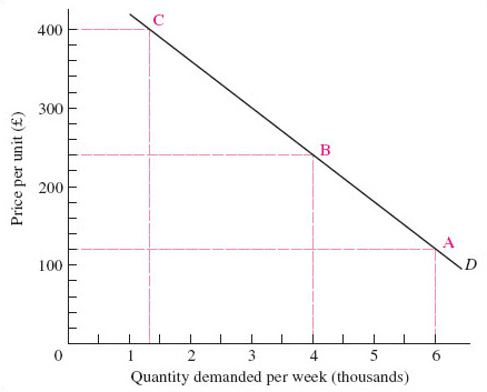
The market demand curve is a very simple economic model in that it abstracts from the many things going on in a market to focus on only two: the quantity demanded of the good and its price. Look at Figure 3, and notice that the vertical and horizontal axes are ‘anchored’ at the zero point, called the origin. As with all such diagrams, movements up the vertical axis, and along the horizontal axis to the right, represent higher values. Each point on the curve D shows the quantity demanded (measured on the horizontal axis) at a particular price (measured on the vertical axis). The market demand curve therefore shows the quantity demanded at each and every price by all the consumers in a particular market. We say ‘each and every price’ to draw attention to the fact that in drawing the market demand curve as a continuous line, economists are making estimates. The good may not have been offered for sale at ‘each and every’ price but only a small number of selected prices. Drawing the market demand curve as a continuous curve on a diagram such as Figure 3 shows estimates of what demand would be at other prices.
Figure 3 shows a hypothetical market demand curve for electronic personal organisers (hypothetical because it is not based on actual sales figures but is being used purely as an illustration of market demand curves in general). Electronic devices are particularly good at storing files, allowing them to be used in different ways, and have come to dominate the market for portable information storage. The market demand curve depicts the quantity consumers demand, depending on price. This ‘quantity demanded’ is not necessarily the number of electronic personal organisers that people need, but what they are willing and able to purchase at different prices.
The demand curve in Figure 3 shows that with a price of £120, the quantity demanded of electronic personal organisers is 6000 units per week (point A). For a higher price at, say, £240, ceteris paribus, we can find out how many units will be purchased by moving along the demand curve to point B, where the quantity demanded is only 4000. If the price was as high as £400 smaller quantities would be purchased; we move along the demand curve to point C, and see that the quantity demanded is only 1300 units. This inverse relationship between the price of a good (or service) and the quantity demanded (shown by the market demand curve sloping downwards and to the right) is known as ‘the law of demand’.
So economic models can be stated in words and represented in diagrams. They can also be represented by using algebra. The claim that demand depends on – or changes in response to – price can be written as:
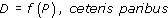
which is read as demand (D ) is a function of price (P), all other influences held constant. Both demand and price vary in this model; quantity demanded is the dependent variable, since it changes in response to price, the independent variable. So this algebraic statement makes clear the causal relation proposed by the model, while the diagram, Figure 3, showed the negative relationship it proposes between demand and price: a higher price results in a lower quantity demanded (ceteris paribus).
However, there may be some exceptions to this ‘law’ of demand. Early in the twentieth century, Thorstein Veblen, an American institutional economist, analysed cultural influences on consumption. In The Theory of the Leisure Class (Veblen, 1912) he suggested that it can be important to show off your wealth by means of conspicuous consumption. The rich can demonstrate their wealth by buying goods that are widely known to be very expensive and beyond the reach of most consumers. The term Veblen goods is used to denote luxury items, such as exclusive jewellery, cars or designer clothes which may therefore be in greater demand at higher prices.
At the lower end of the income scale, consumers in very poor countries may actually buy less of a very basic good, such as rice, when its price falls. This is because they can use the spending power released by the fall in the price of the basic foodstuff to replace some rice with a greater variety of foods. Such goods are called Giffen goods because the influential economist Alfred Marshall, apparently in error, gave Sir Robert Giffen credit for discovering this exception to the general law of demand.