
2.3a – Energy diagrams
View
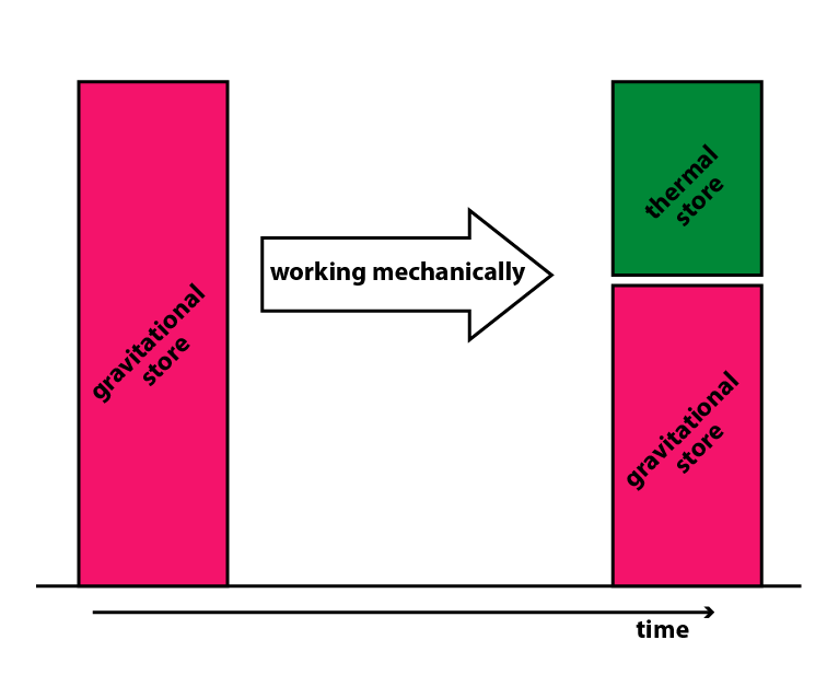
It is helpful to represent the amount of energy stored by systems as bar charts. There are a several ways of doing so, and a good way is to:
- Take two snapshots in time (defined moments before and after an event)
- Put time along the x-axis
- Use bars to show the way energy is stored (or the amount of energy in an imaginary store)
- Stack the bars to show that the total remains the same
- Insert an arrow for the pathway.
The diagram below shows an analysis for a rollercoaster running down a track.
If there is more than one pathway, then it is preferable to put these in parallel. I.e., avoid trying to model the situation as energy “flowing” along one pathway and then another. The pathways indicate the ways in which energy is transferred as time moves forwards. They are not pipelines for energy. The example below uses an alternative to the bars.
Back to previous pagePrevious
2.3 – The language of calculations
Last modified: Monday, 20 December 2021, 11:15 PM