

Short run average cost (SRAC) curves (2)
It’s often easier to represent cost curves graphically. Here the two columns of data in Table 4 are shown in separate graphs. The table is repeated below.
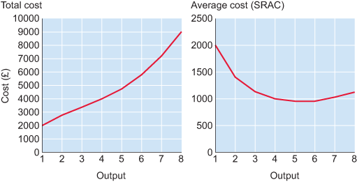
| Quantity of output (units) | Total cost (£) | Average cost (£/unit) |
|---|---|---|
| 1 | 2000 | 2000 |
| 2 | 2800 | 1400 |
| 3 | 3400 | 1133 |
| 4 | 4000 | 1000 |
| 5 | 4750 | 950 |
| 6 | 5800 | 967 |
| 7 | 7200 | 1029 |
| 8 | 9000 | 1125 |
Notice that total cost increases with output, albeit at varying rates. The SRAC captures how average cost (or unit cost) changes with output. When output is low, initially average cost falls, but as output increases, average cost starts to rise. Next let’s examine the components of average cost – fixed and variable cost.