
3.5 Problems with graphics
In this subsection we consider, briefly, some problems that can arise with certain ways of drawing bar charts and pie charts.
Figure 5 shows what is essentially the same bar chart as Figure 4, for the data on quality of tattoo removal. This time, though, the bar chart has been drawn in such a way as to suggest that the bars are ‘really’ three-dimensional. You can see that, compared to Figure 4, it is quite difficult to discern the corresponding frequency value for each bar.
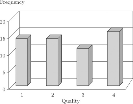
This kind of three-dimensional bar chart is commonly used as a graphic, in television reports or in the press, for showing data such as the results from an opinion poll on the popularity of the main political parties. Viewers or readers do not necessarily realise exactly how they are supposed to use the vertical scale to determine the heights of the bars. To interpret this kind of graphic properly, you need to be aware of how misleading it can be.