

3.6 Problems with graphics: USA workforce
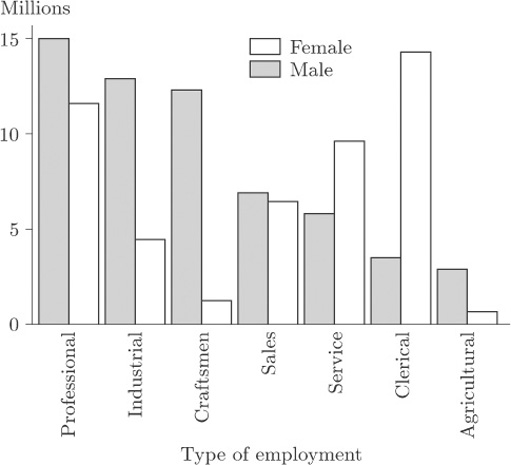
The danger of using three-dimensional effects is really brought home when two data sets are displayed on the same bar chart. Table 2 may be thought of as consisting of two data sets, one for male workers and one for female workers. On its own, each of these data sets could be portrayed in a bar chart like those you have seen earlier. However, one of the questions raised about these data in Activity 1 was how the data for men and for women could best be compared. Presenting them as two separate bar charts, one for males and one for females, is not the ideal way to support this comparison. We can produce a single bar chart that makes the comparison straightforward by plotting the corresponding bars for the two genders next to one another, and distinguishing the genders by shading, as in Figure 6.
Activity 4: USA workforce
On the basis of Figure 6, describe how the balance between the genders differs from one ‘employment type’ to another.
Discussion
This display clearly shows the predominance of men in the Professional, Industrial, Craftsmen and Agricultural categories. In Service and Clerical women outnumber men and, in Clerical in particular, there is a huge imbalance. In Sales the numbers of men and women are very similar.
Figure 7 is an attempt to display the same information using a three-dimensional effect.
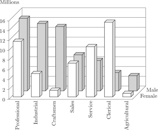
It is now much more difficult to identify values. Some blocks are hidden, which makes judgement difficult. The display for Sales is particularly misleading; in Figure 6 you can see that the bars are almost the same height, but in Figure 7 this is much less obvious.
Similar, and in some cases even more severe, problems arise with ‘three-dimensional’ pie charts.